BECO
BRAND STRATEGY | PACKAGING DESIGN | BRAND LANGUAGE | WEBSITE DESIGN
A much loved brand for their eco friendly outlook, we worked with Beco to revamp their branding, packaging and communication. Most developing categories start to see homogeneity early on- we chose to create distinction by going slightly against the grain. The Beco founders did just that when they started, and their customers were clearly thinking differently from the mainstream home care buyers.
Being sensitive to the environment had found a place of prestige, it reflected an intelligence of the buyer. We leaned hard into that. Let’s make being eco-friendly the outright cleverer thing to do. Let’s enable people to not hide away their cleaning products, and in fact put them in plain sight.
The wit of the writing and dramatic colour palette are expressions of a cool, modern, new age and intelligent customer + brand, that isn’t just green washing, but truly intends to make a palpable difference to the earth through their choices.
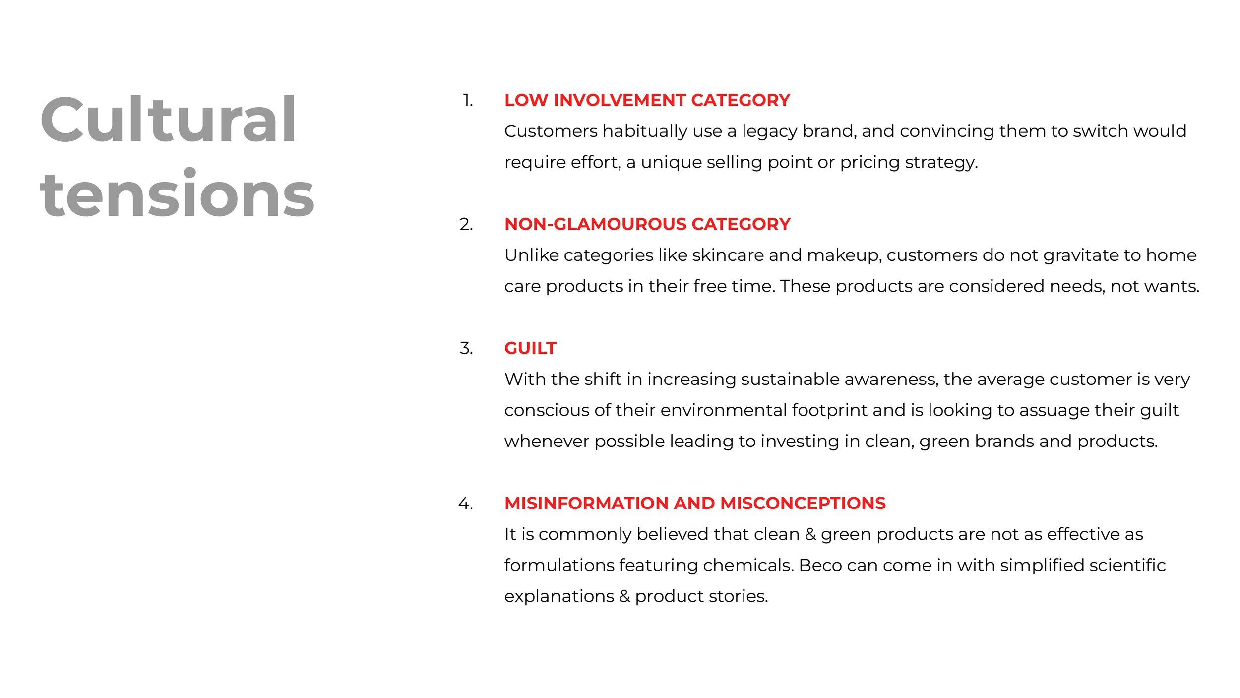
SURVEYING THE CATEGORY
Before we could create a brand foundation and personality for Beco, it was important to understand what our competitors were doing. Analysing and understanding how they present themselves would help us know how we want to be perceived. We examined other brands in the home and personal care space. Both Indian and international brands fell within the spectrum of our consideration.
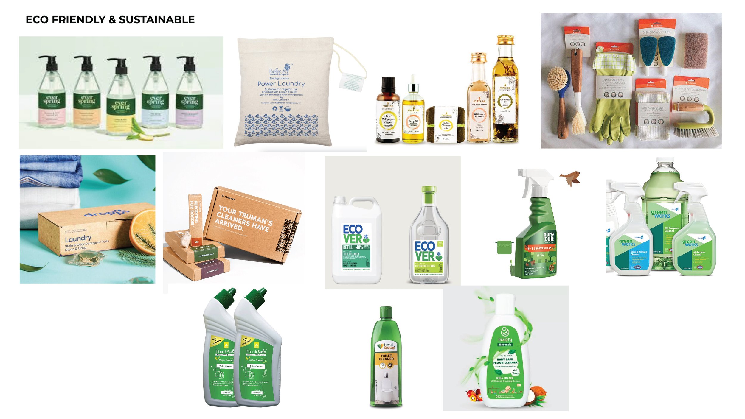
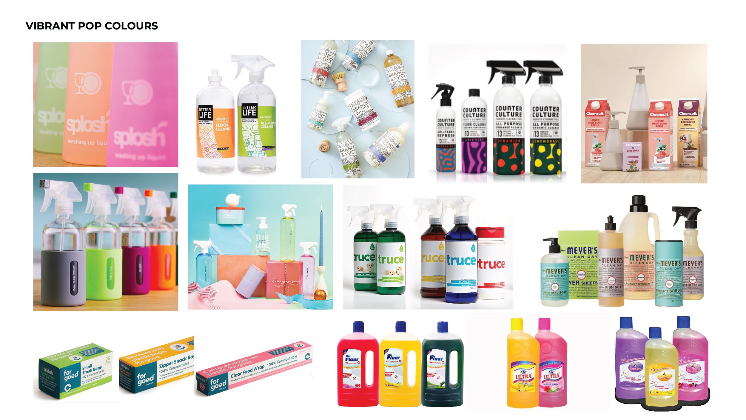
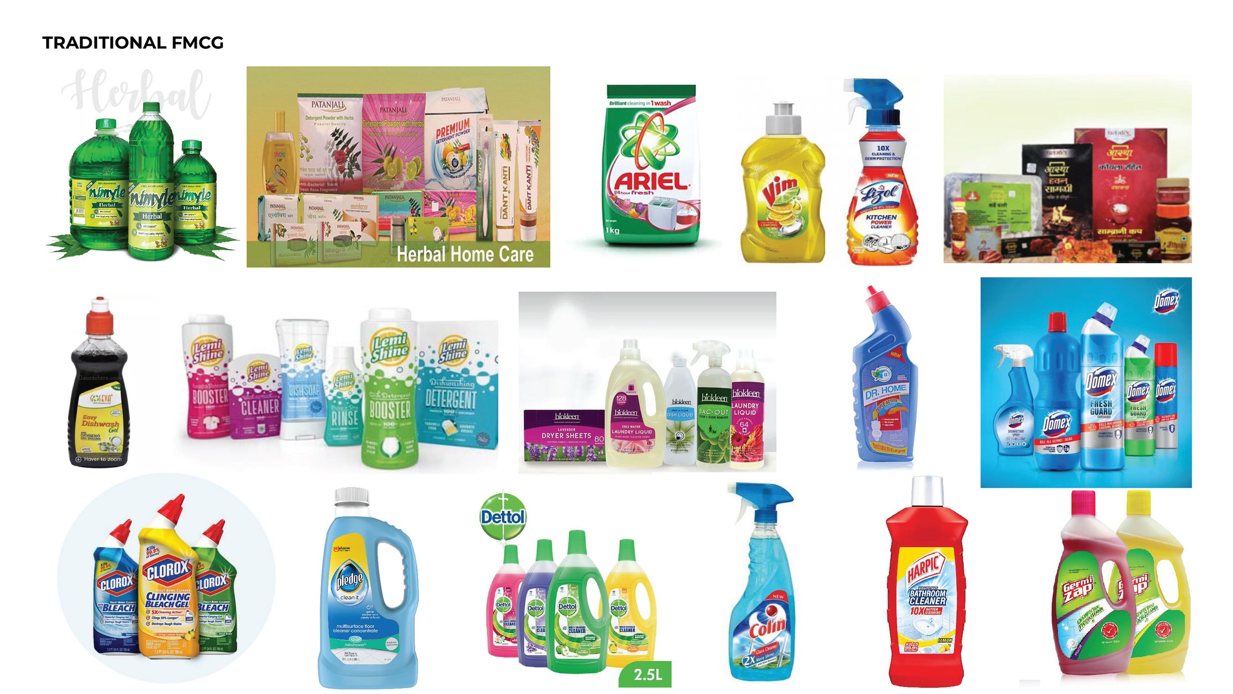
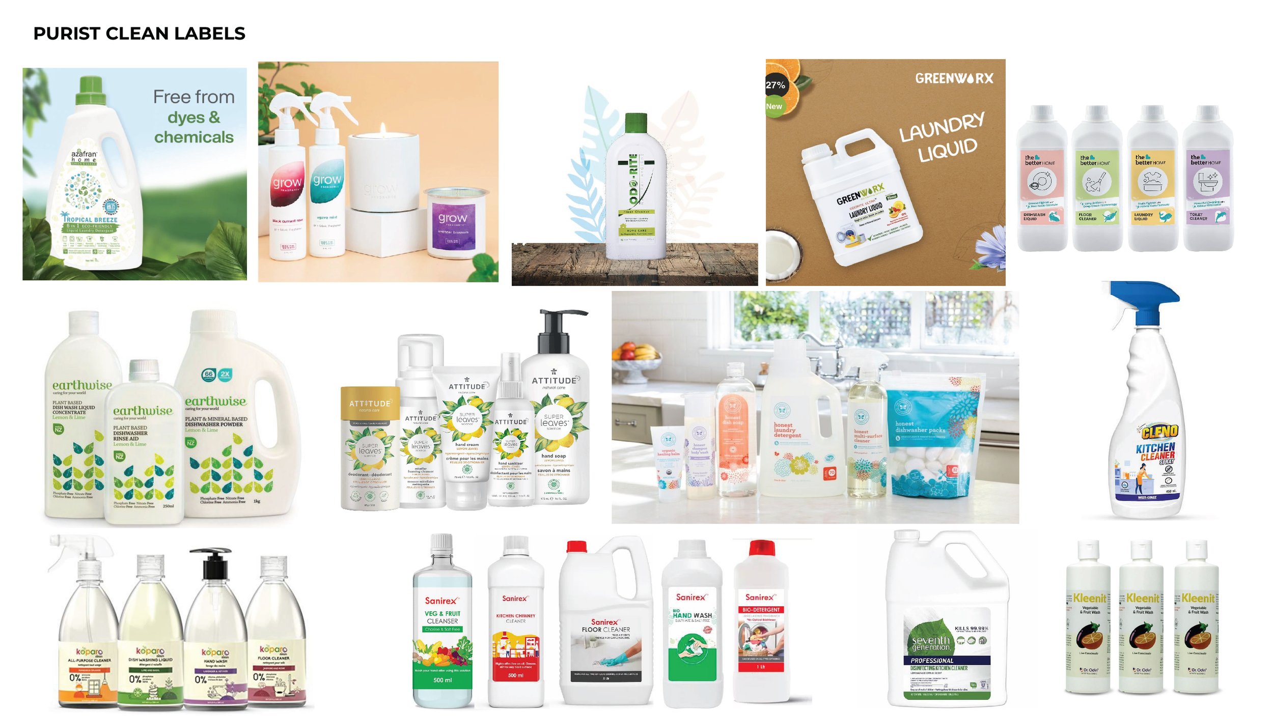
Looking at the INDIAN landscape we observed that:
Indian brands appear indistinguishable, and scatter similar feature benefits and ingredients as part of their brand identity, making them all appear similar.
Claims such as ‘Natural’, ‘Organic’, and ‘Eco-friendly’, all blur together and are not strong differentiators anymore.
Low innovation in this category in terms of formats, formulations, education and design.
Throughout communication, existing brands focus on their products and their benefits in a direct way, a lack of a differentiated personality makes all of them merge into one another.
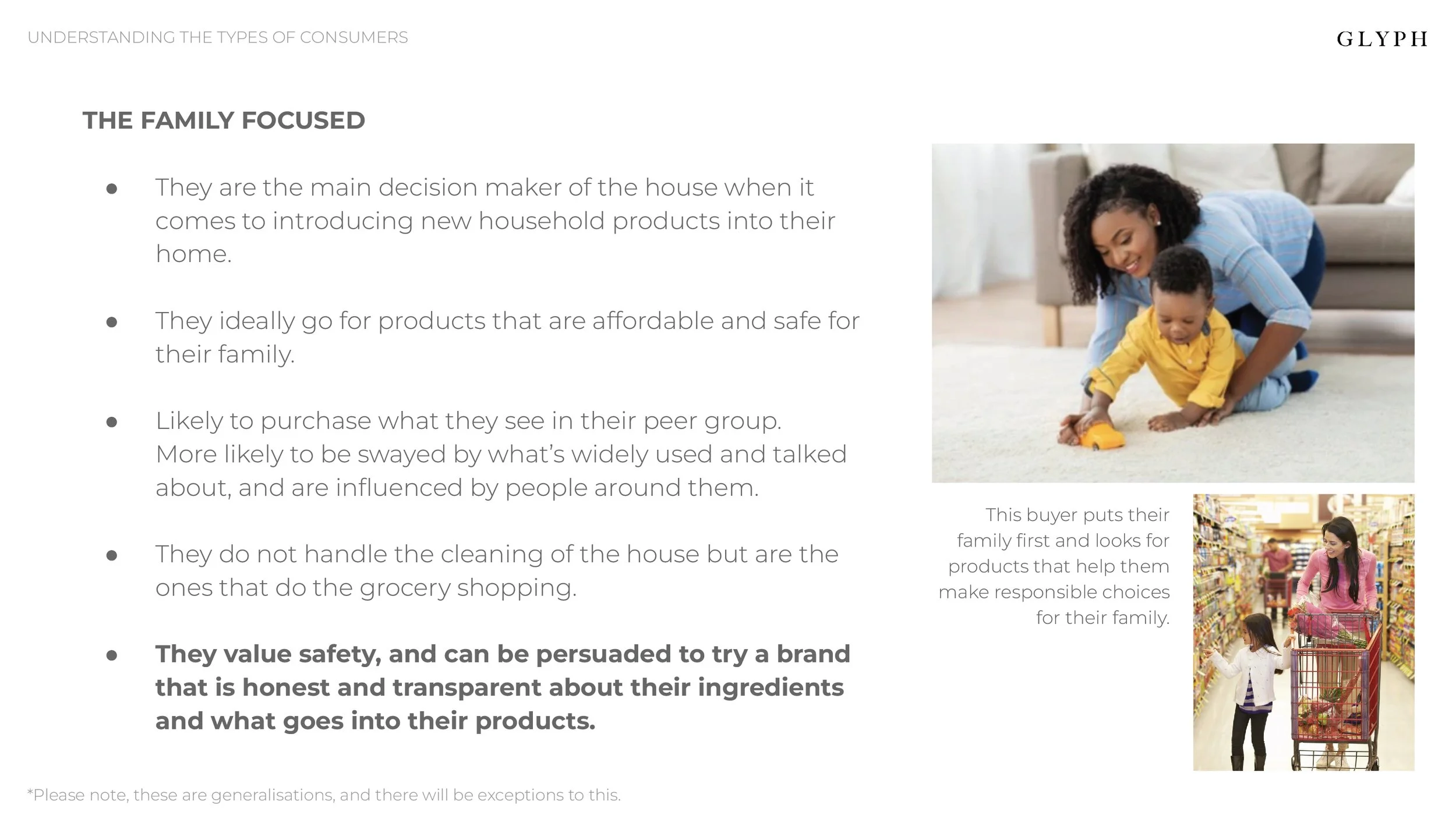
UNDERSTANDING THE CONSUMERS
The brand catered to a number of different customer cohorts ranging from the eco-conscious sustainability activist to the apprehensive family-focused buyer looking to buy safe and easy-to-use products. We kept all of their motivations and apprehensions in mind before diving into the design development.


Chosen Brand Archetype based on Research & discussion:
The Rebel
'How do we change anything at all
if we don't change?'
Changing the status quo is a lot about evolving with time, an attitude that requires rebels to look beyond traditional concepts and convictions.
With changing climate conditions and the domino effect of our choices, it is the need of the hour to go for sustainable, eco-friendly lifestyles.
The current market gives us next to zero eco-friendly options in the category. Beco comes in here, to challenge the status quo, to provide a little something cleaner, for us and for the world. Change. The one thing rebels are hell-bent on provoking.
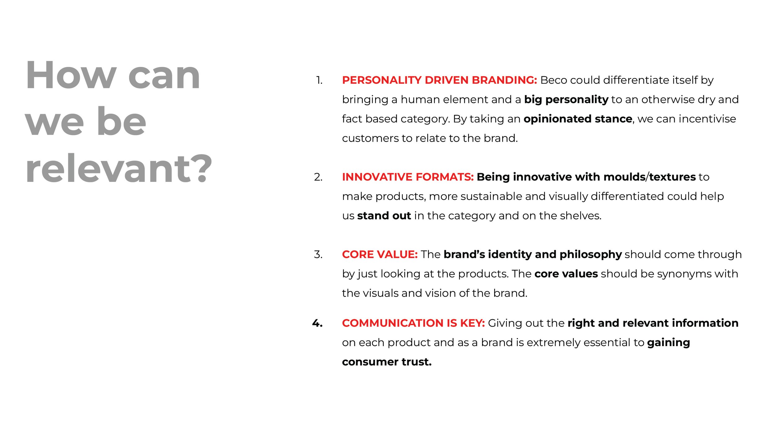
THE DESIGN EVOLUTION
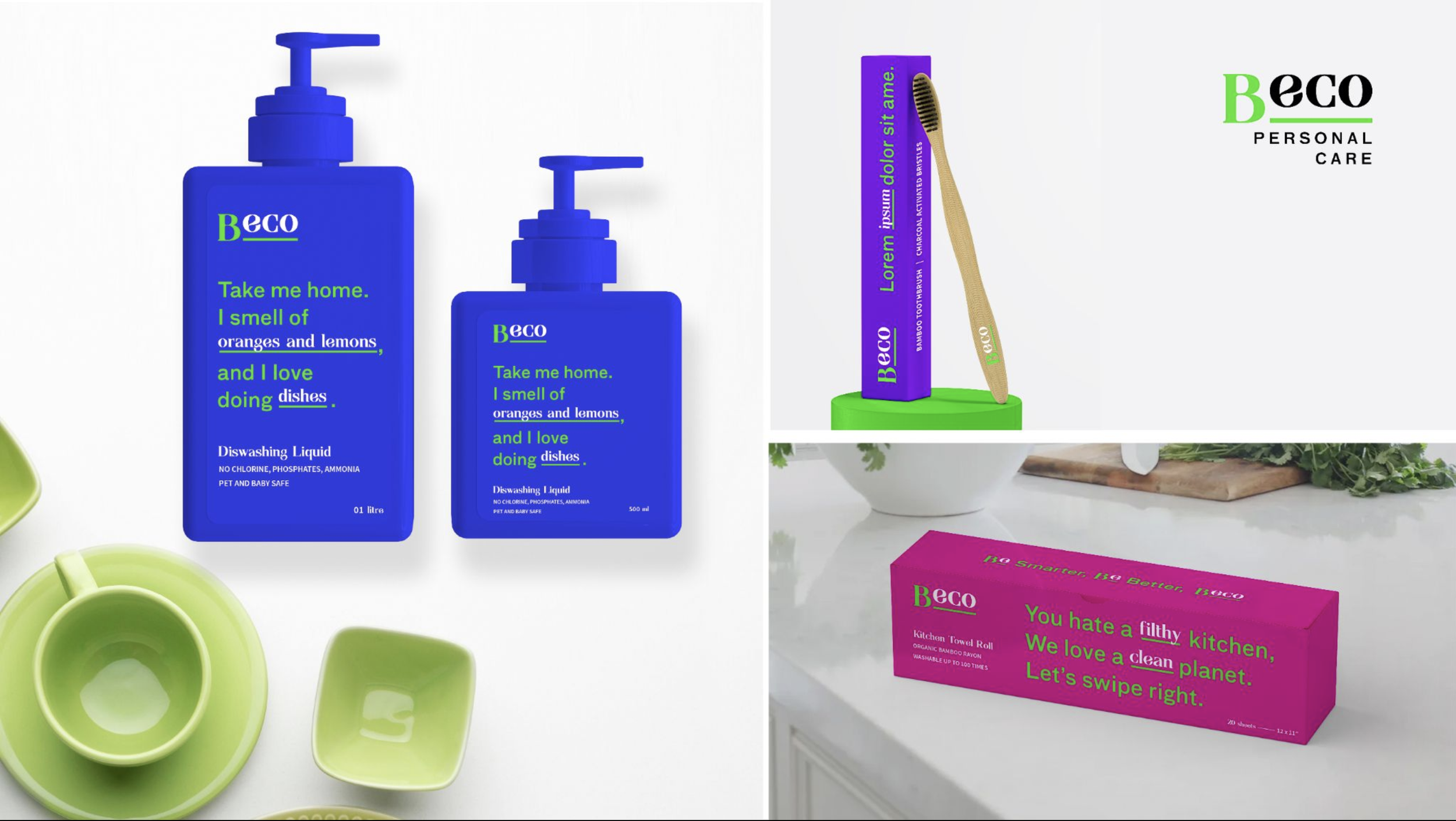
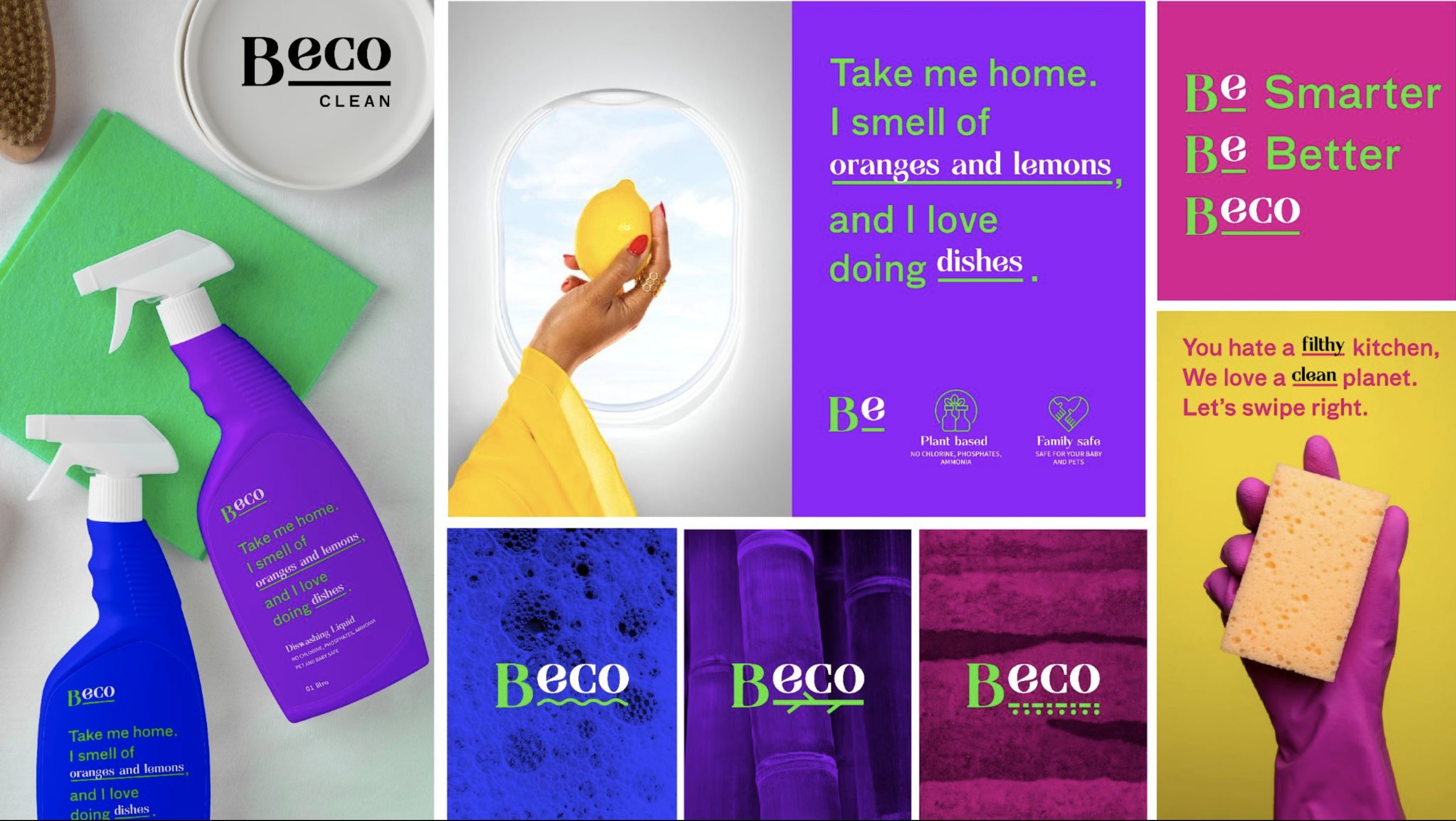
We developed 4 distinct mood boards that interpreted the rebel archetype in multiple ways from a visual as well as communication standpoint. We also suggested different structures and packaging finishes that was relevant with the different design directions.
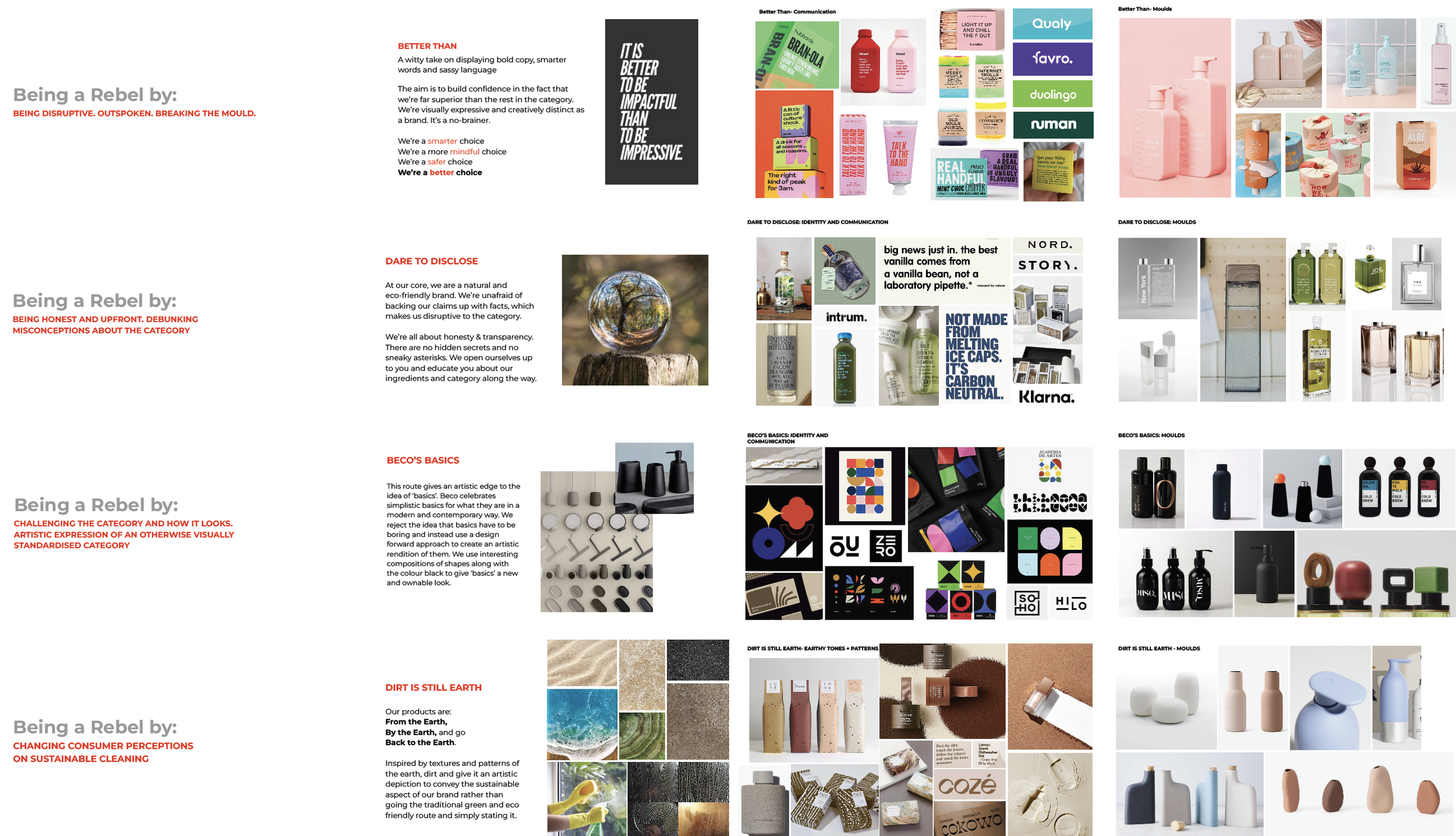
Using the selected mood board as our foundation, we created various packaging design and their communication extensions. Throughout this process, we maintained a focus on the brand's archetype and the challenges faced by consumers, ensuring that our options would distinguish the brand within the Indian market and resonate with the intended audience.
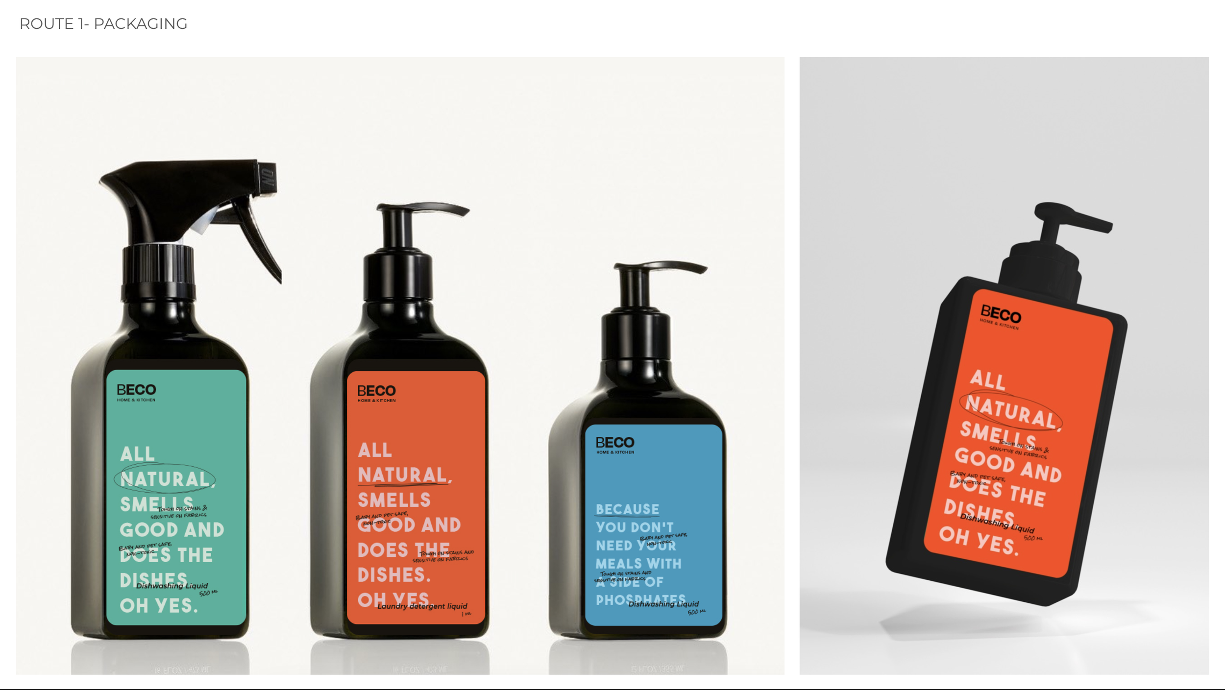
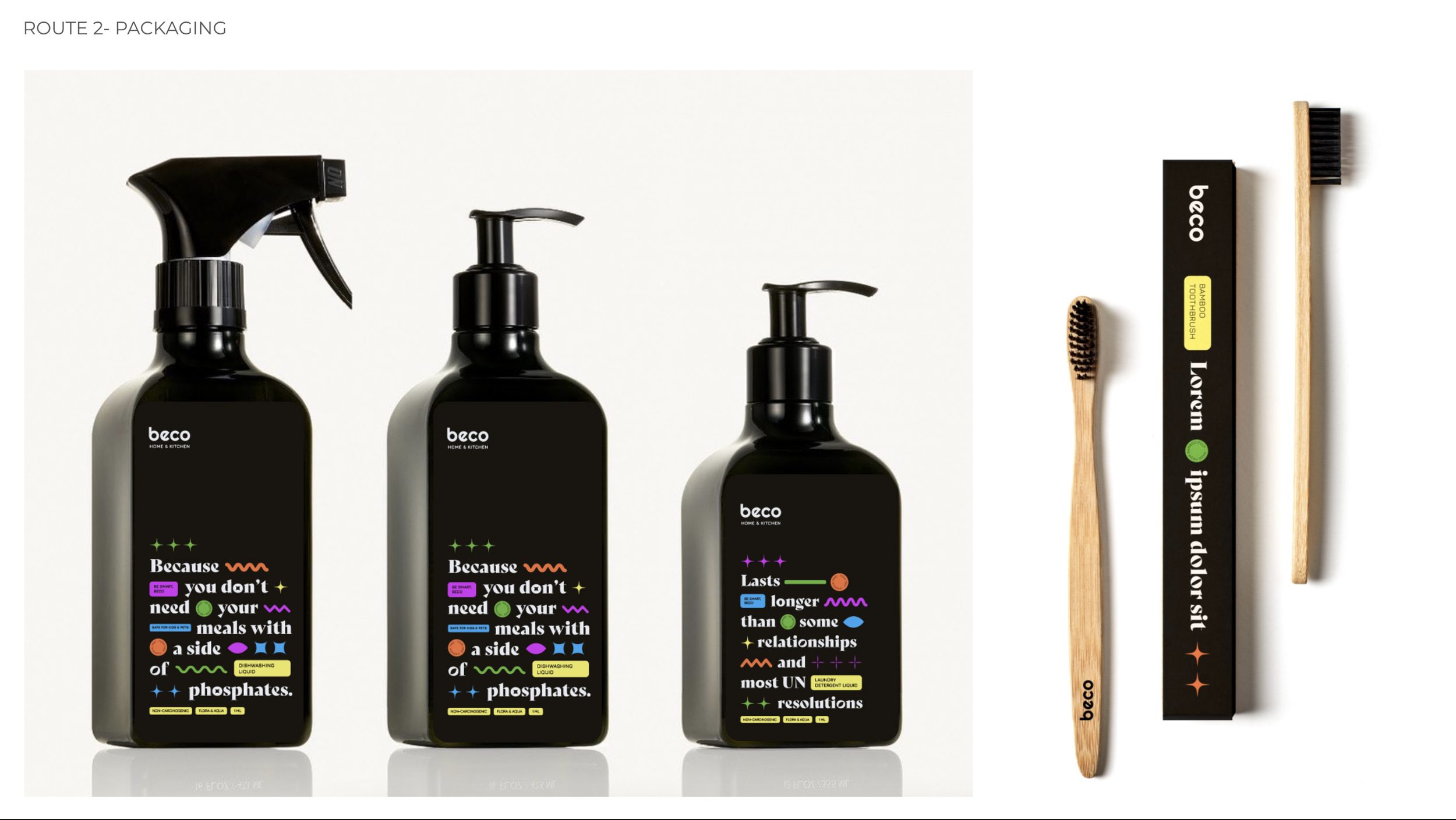
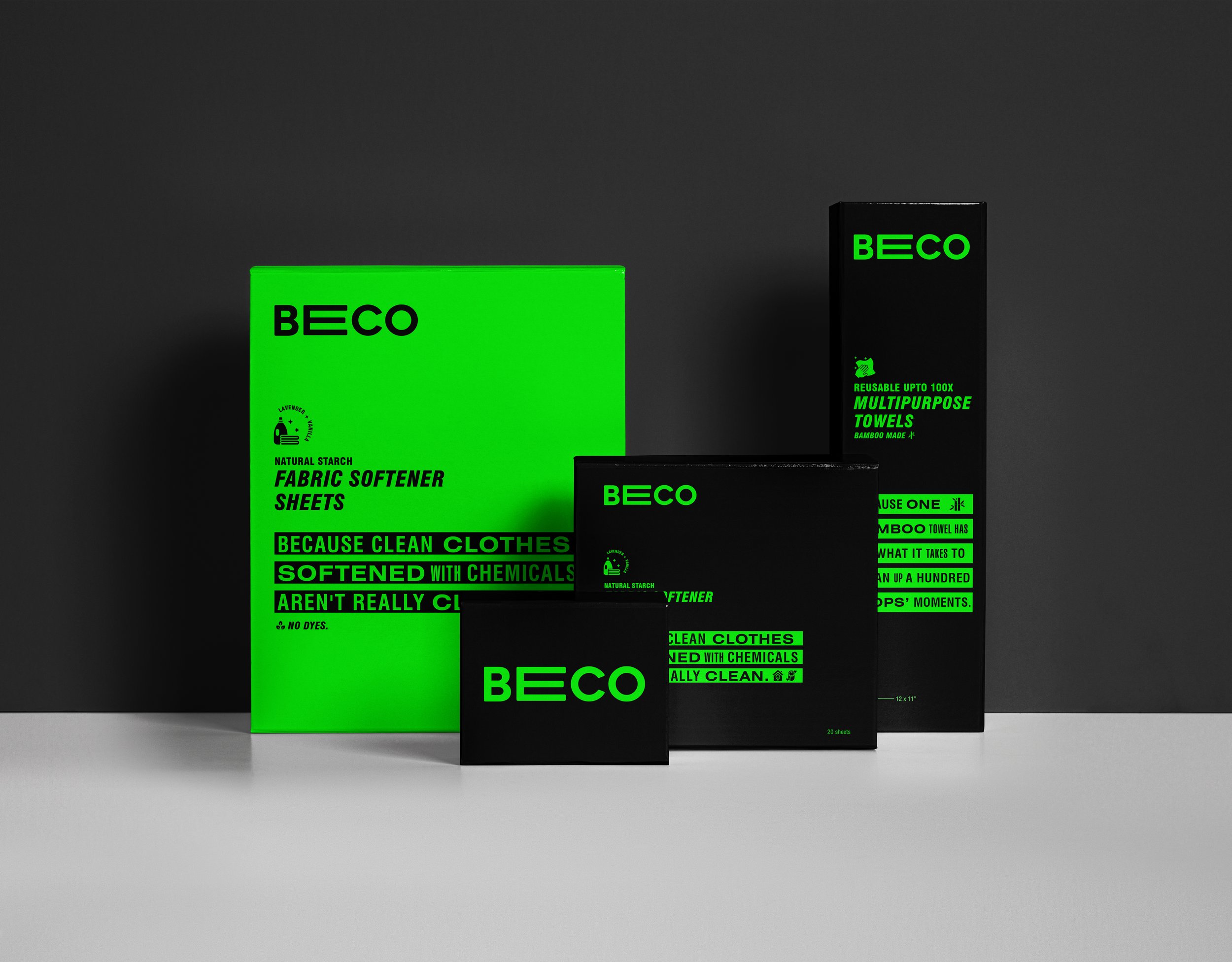
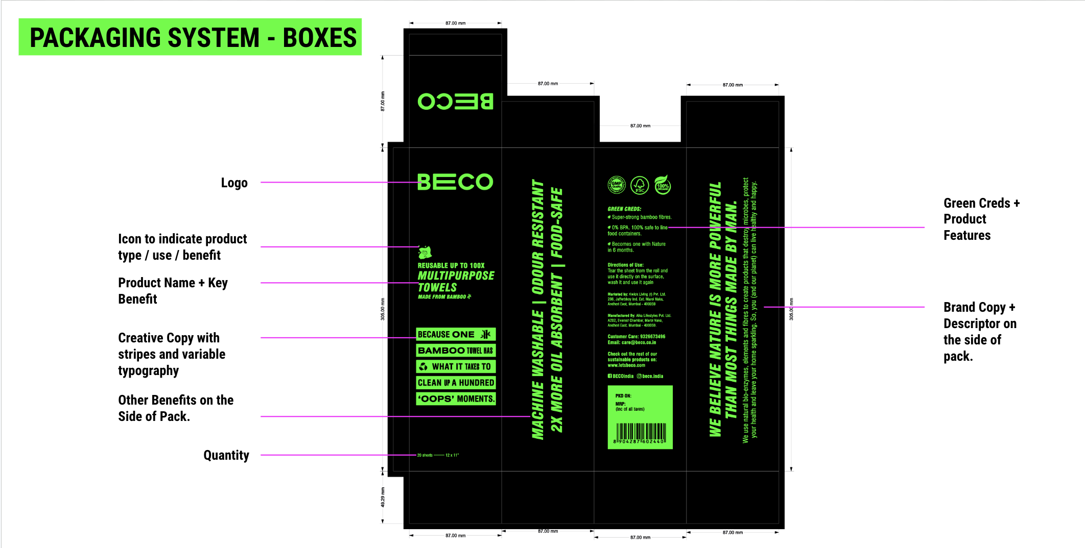
THE BRANDING & PACKAGING
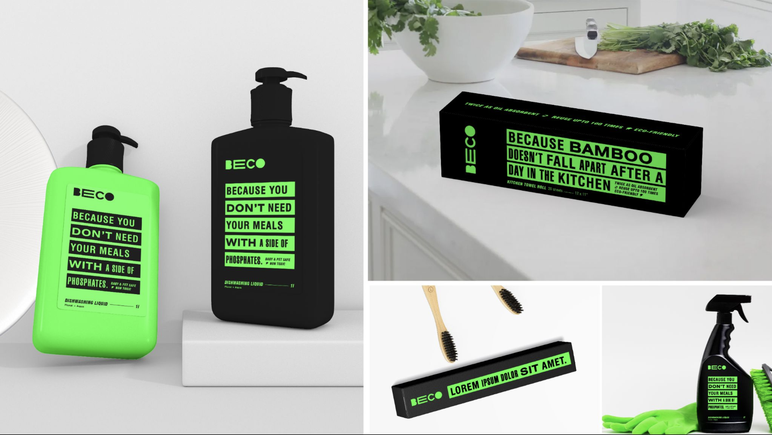
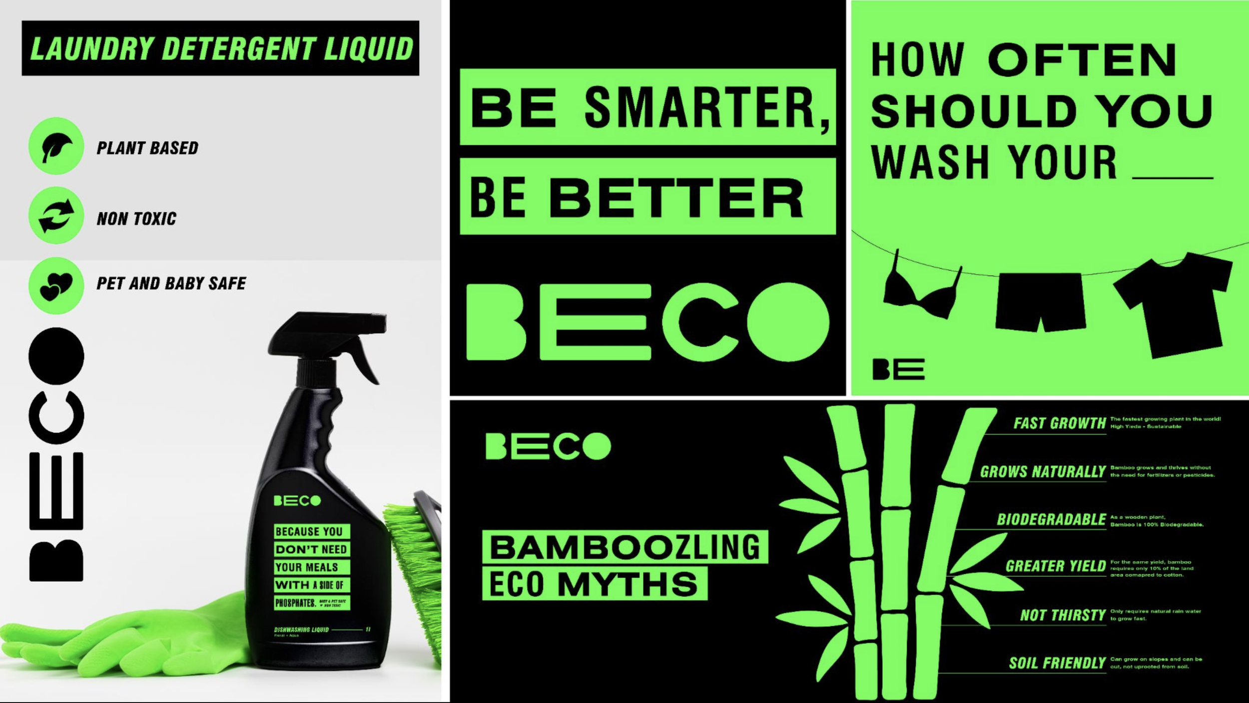
When we set out to give Beco a new look, one of the problems that we had found was that many customers mispronounced their name. Many didn’t recognise that the name was an amalgamation of ‘Be Eco’. To combat this, we decided to typographically lay emphasis on the keyword (ECO) that was so core to the brand’s existence by stretching the E. This gave shape to the treatment of typography on all of their packaging, and we extended it to their website too.

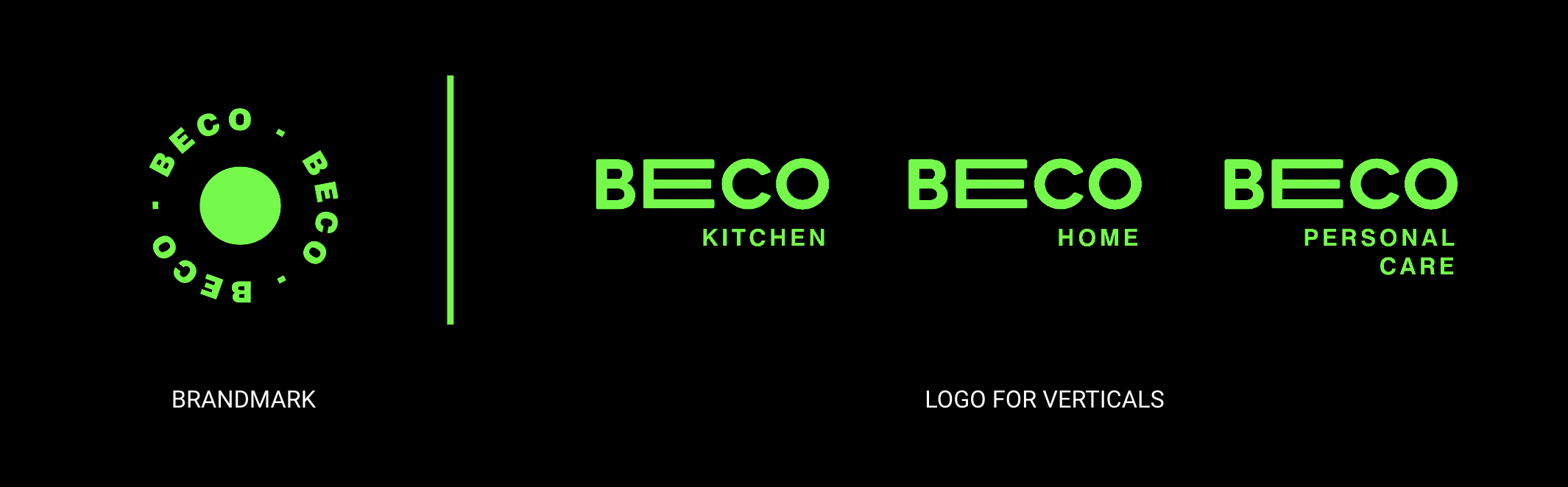
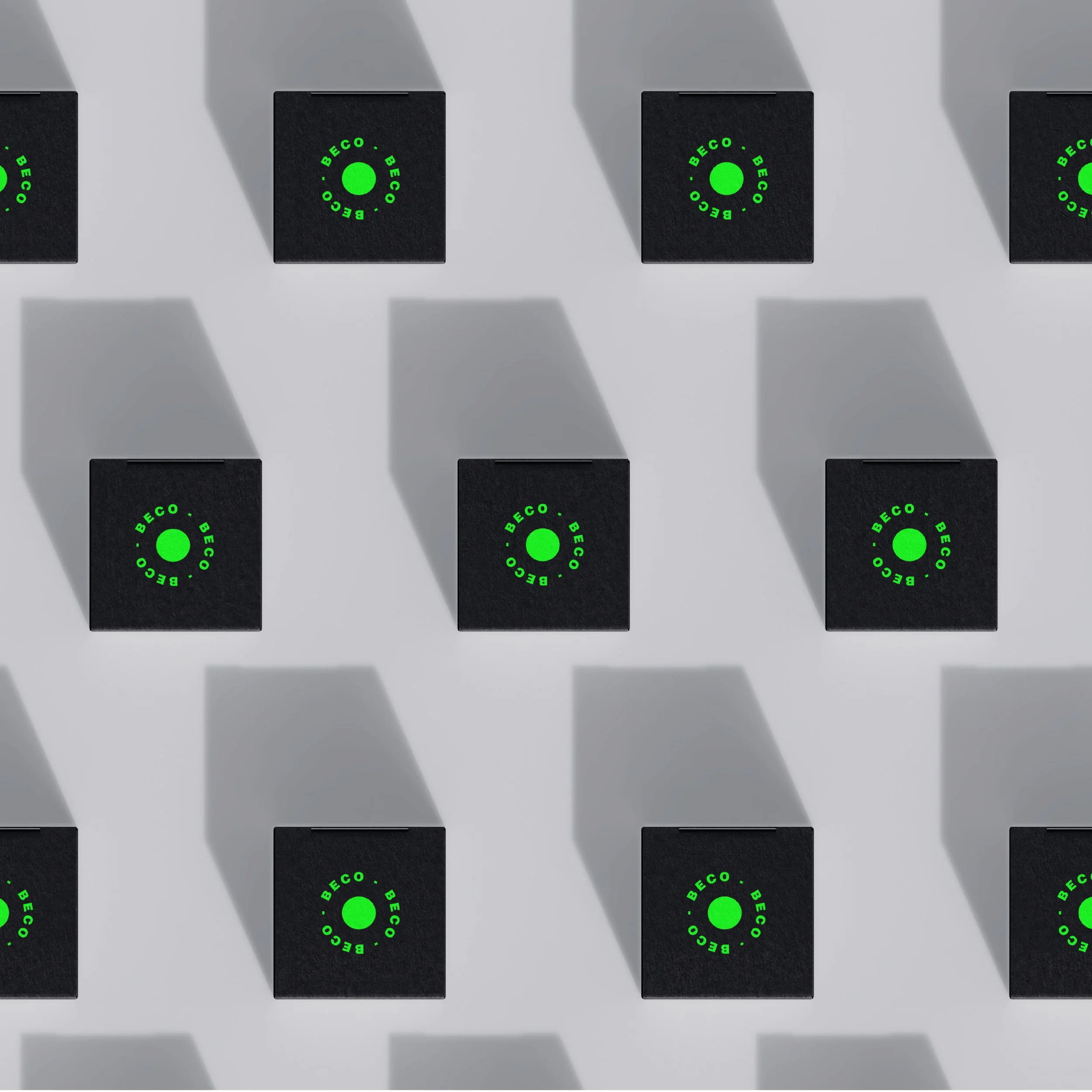
The various logo lockups.
Becos new avatar makes conscious consumption intelligent.
Because why can’t it be?
Why can’t household products have more personality?

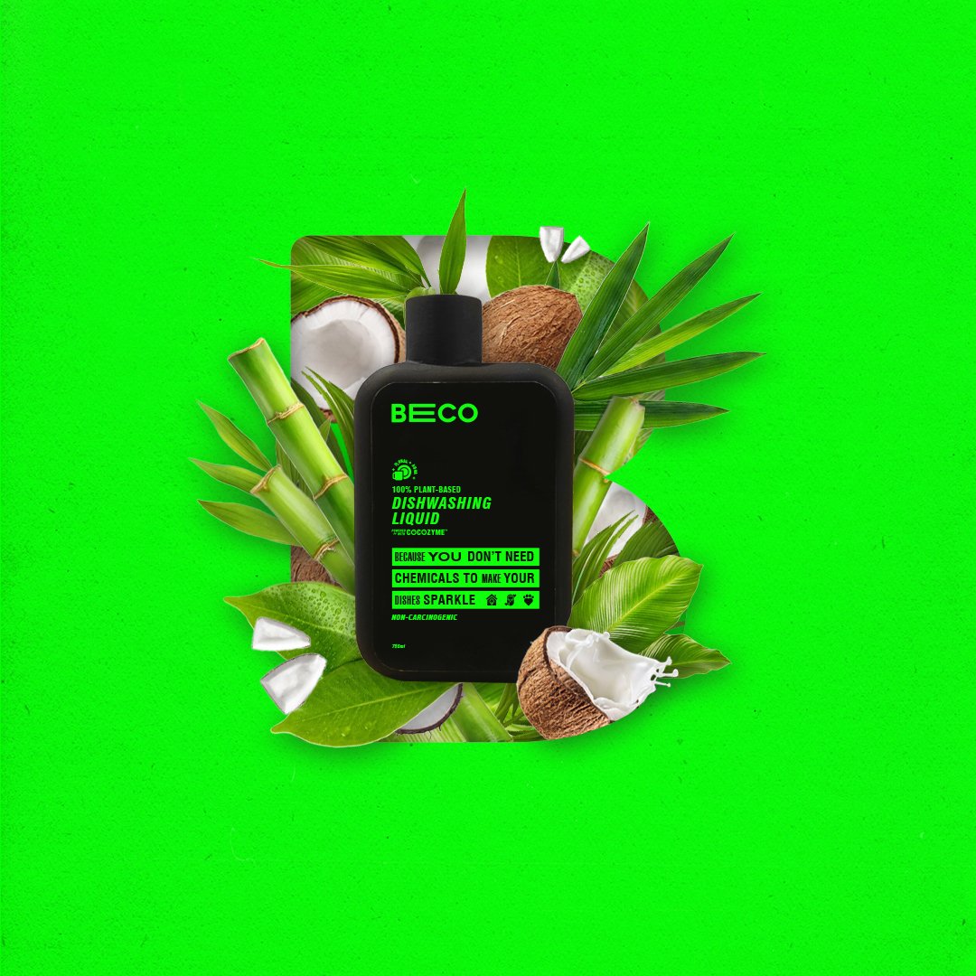


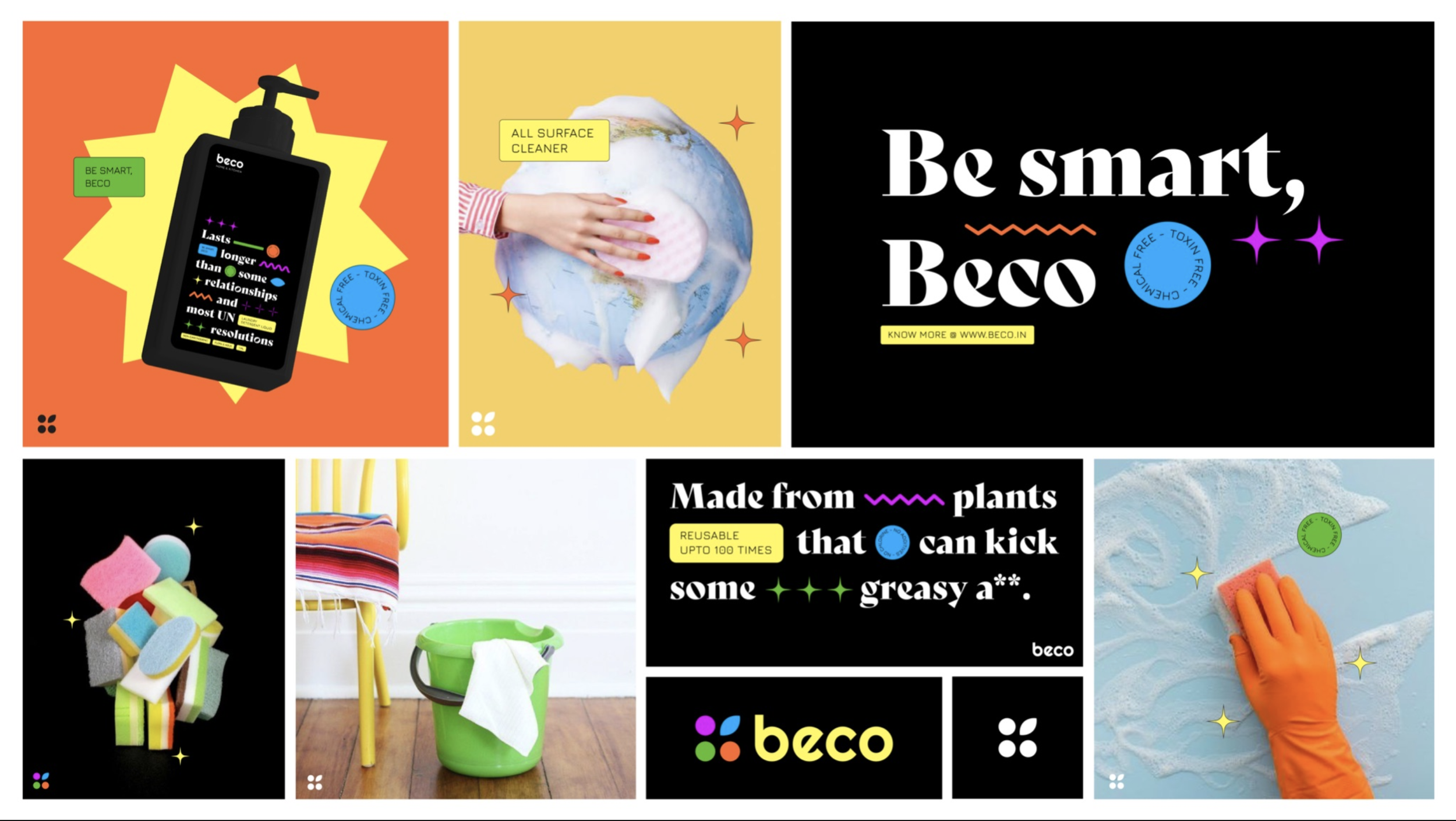
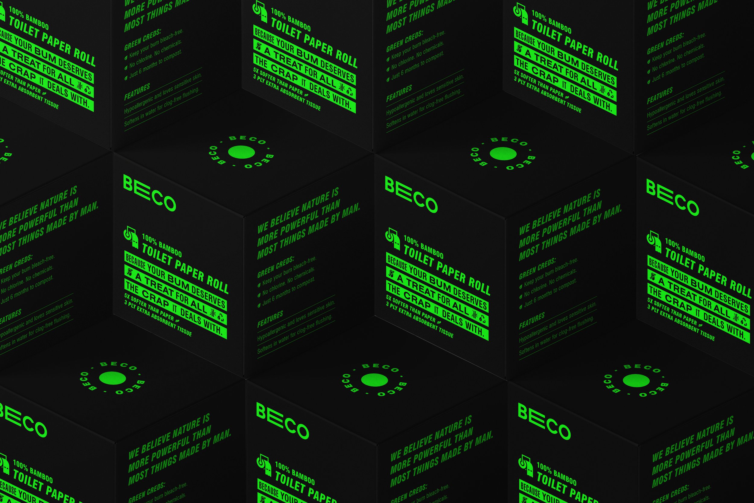
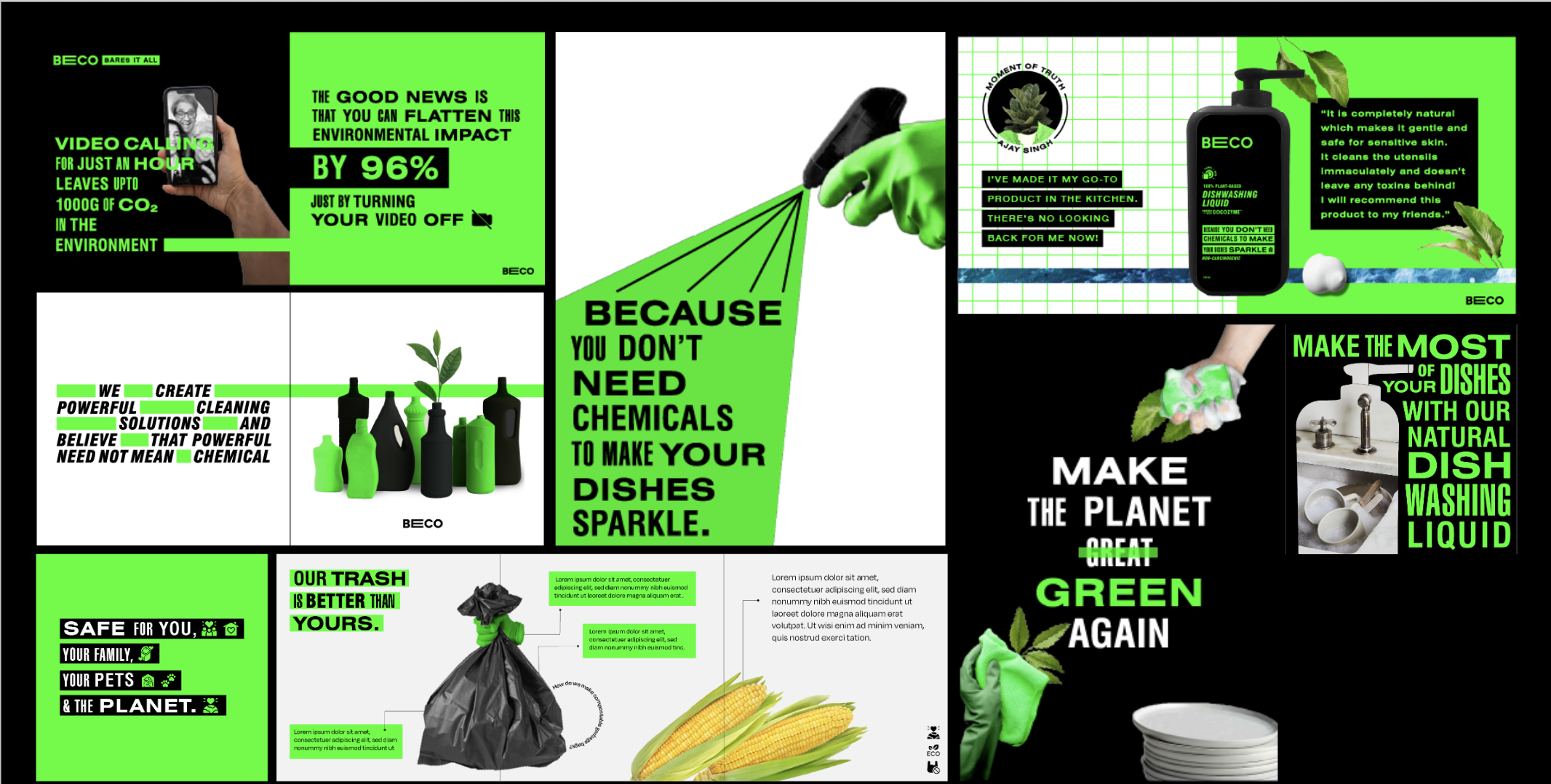
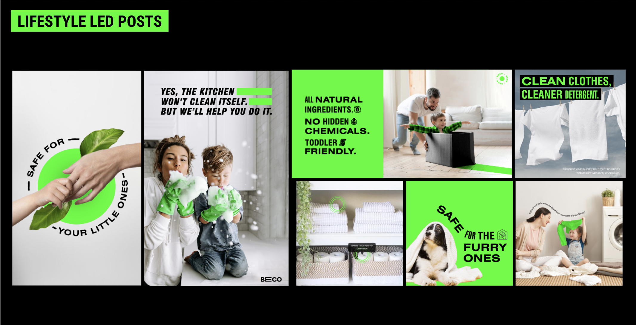
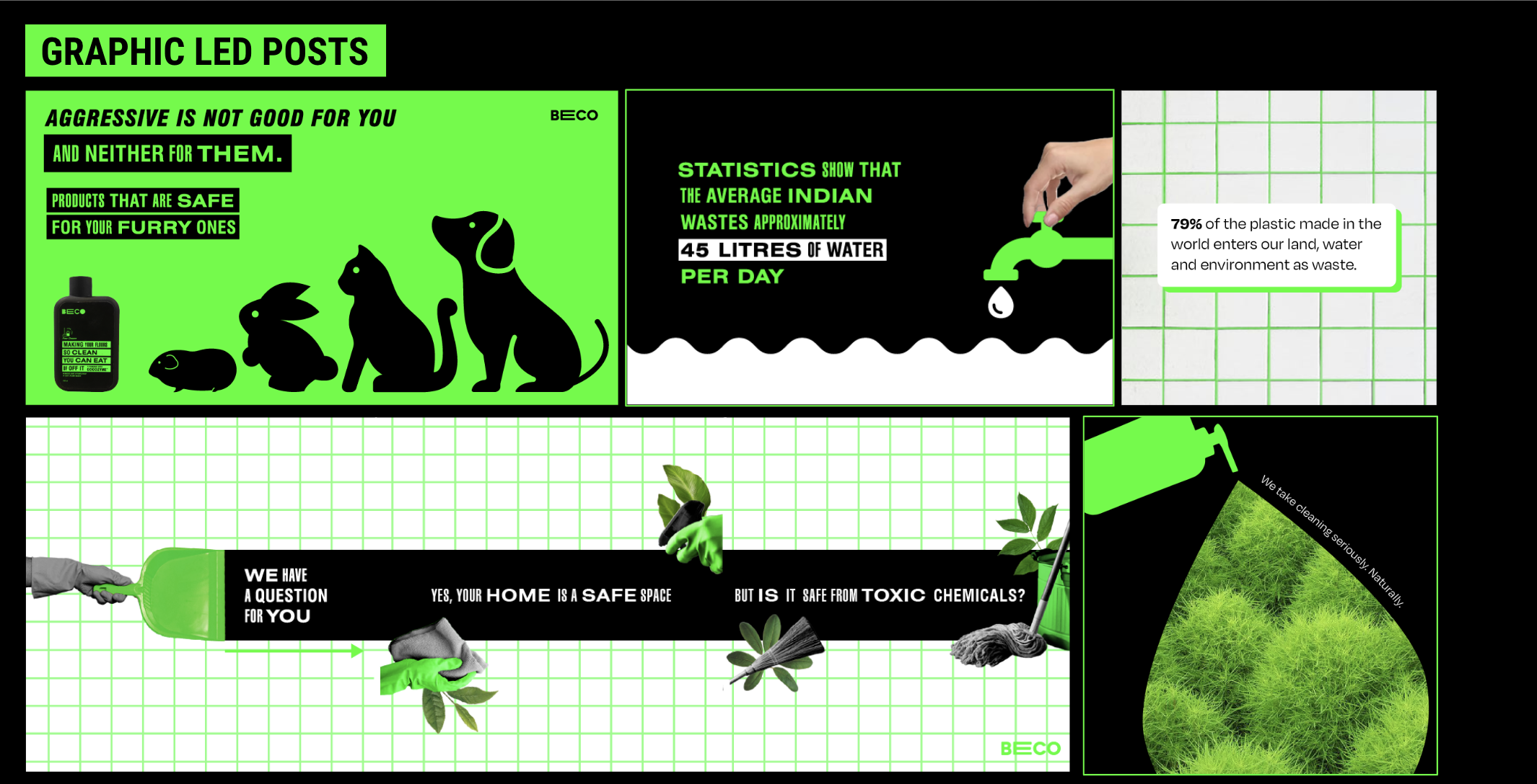
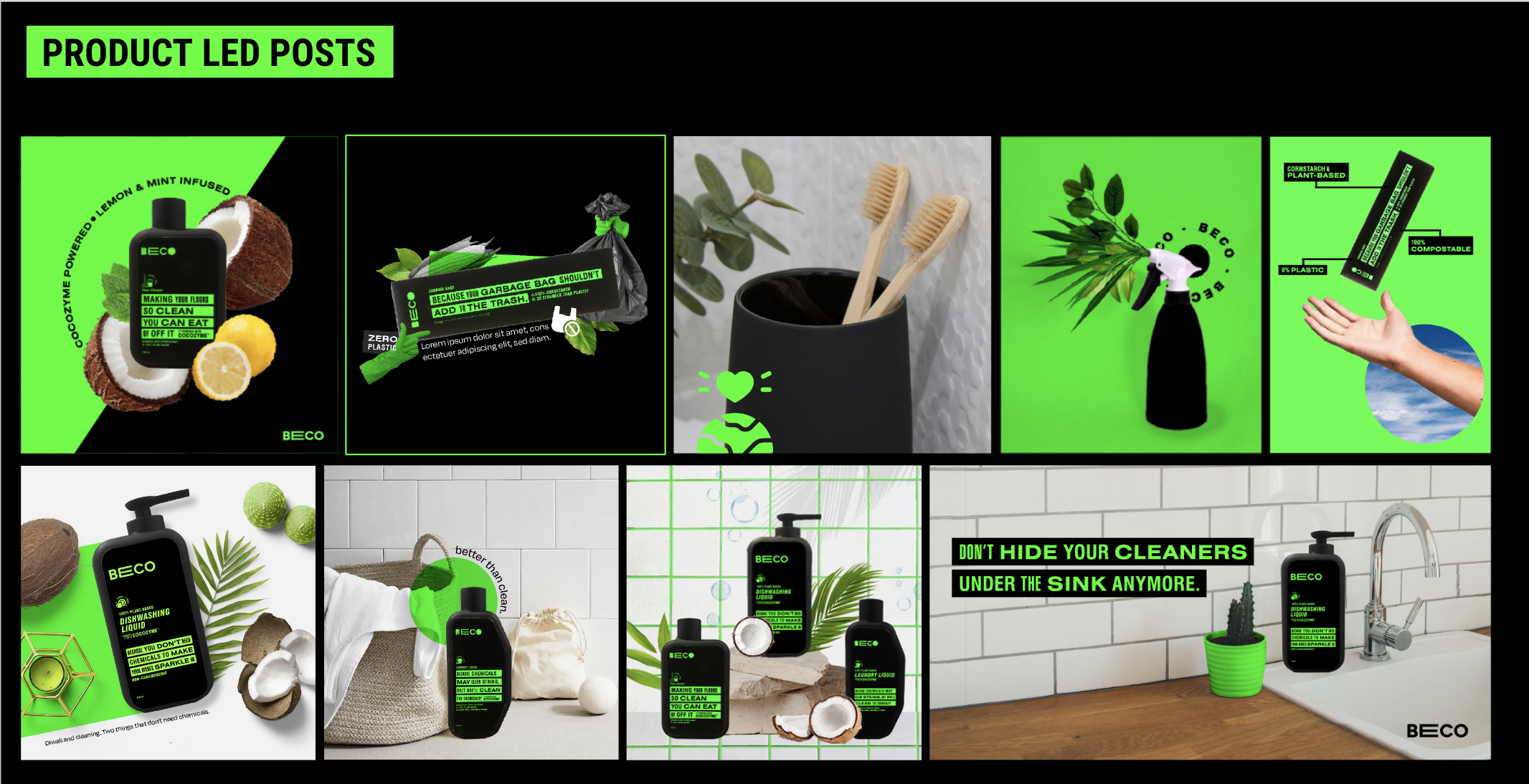
Breathing some wit into the home care space, to speak to the viewer. Instead of the category conventions of shines and halos, we chose to use a high contrast colour pallette with messaging that brings personality into an otherwise rather boring landscape.


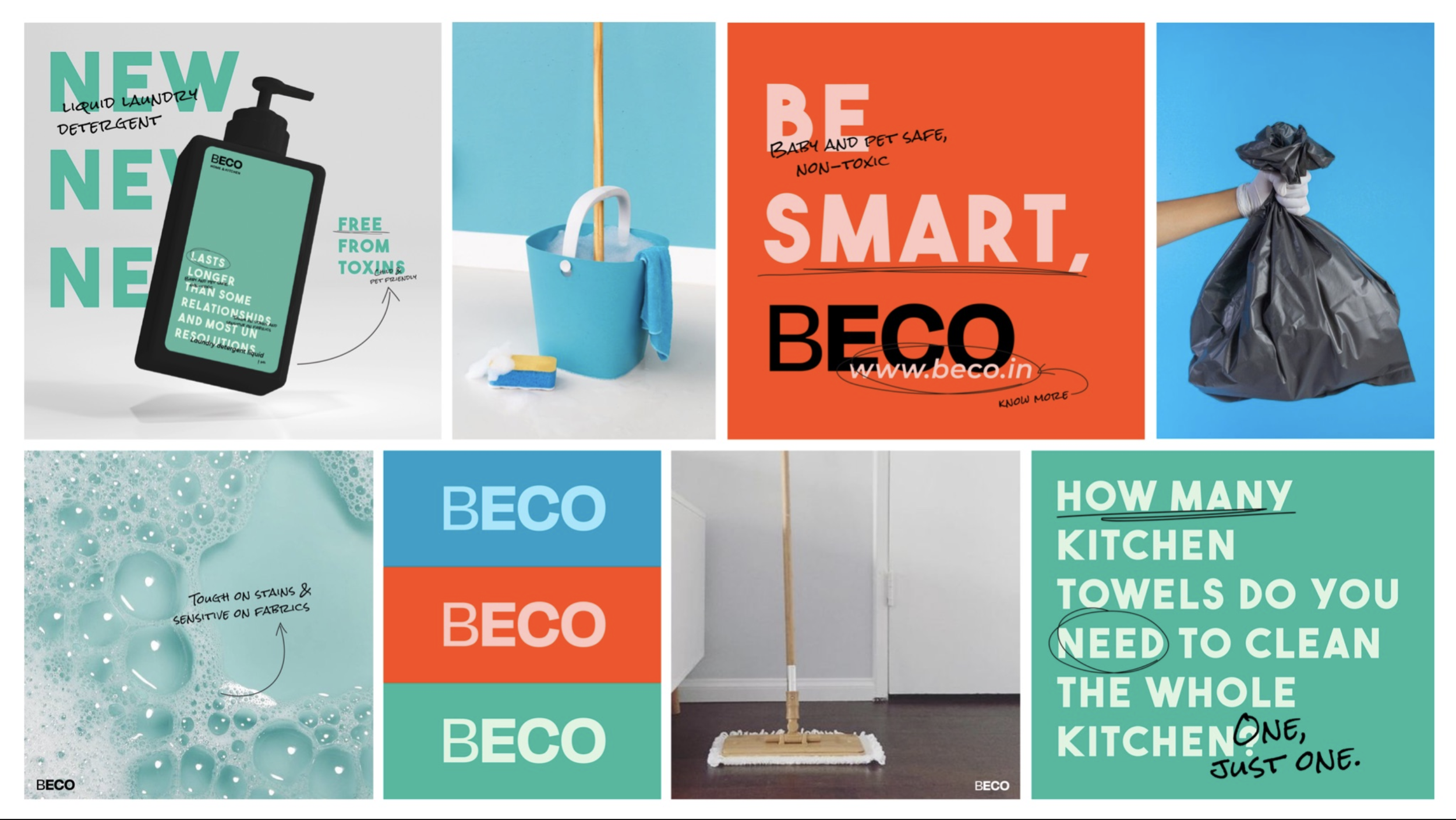
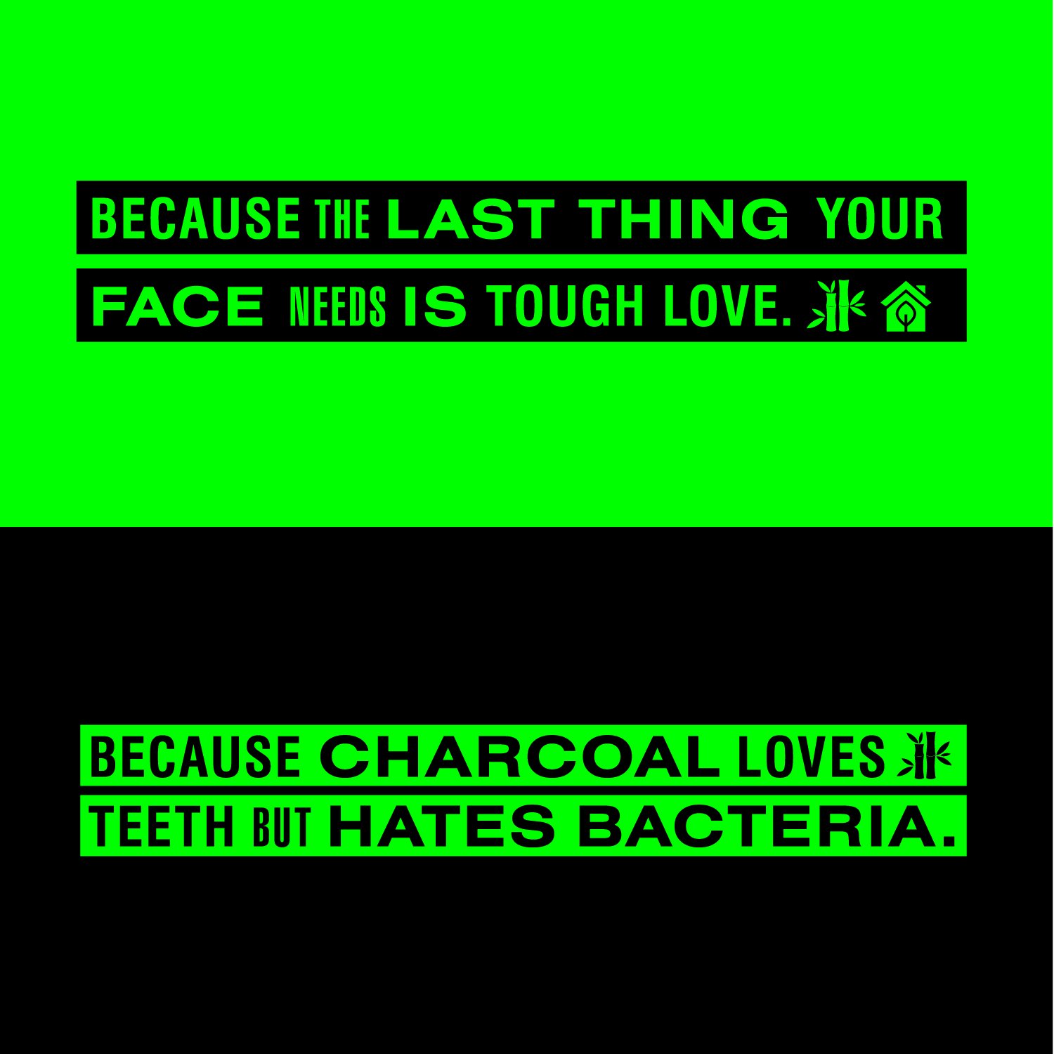
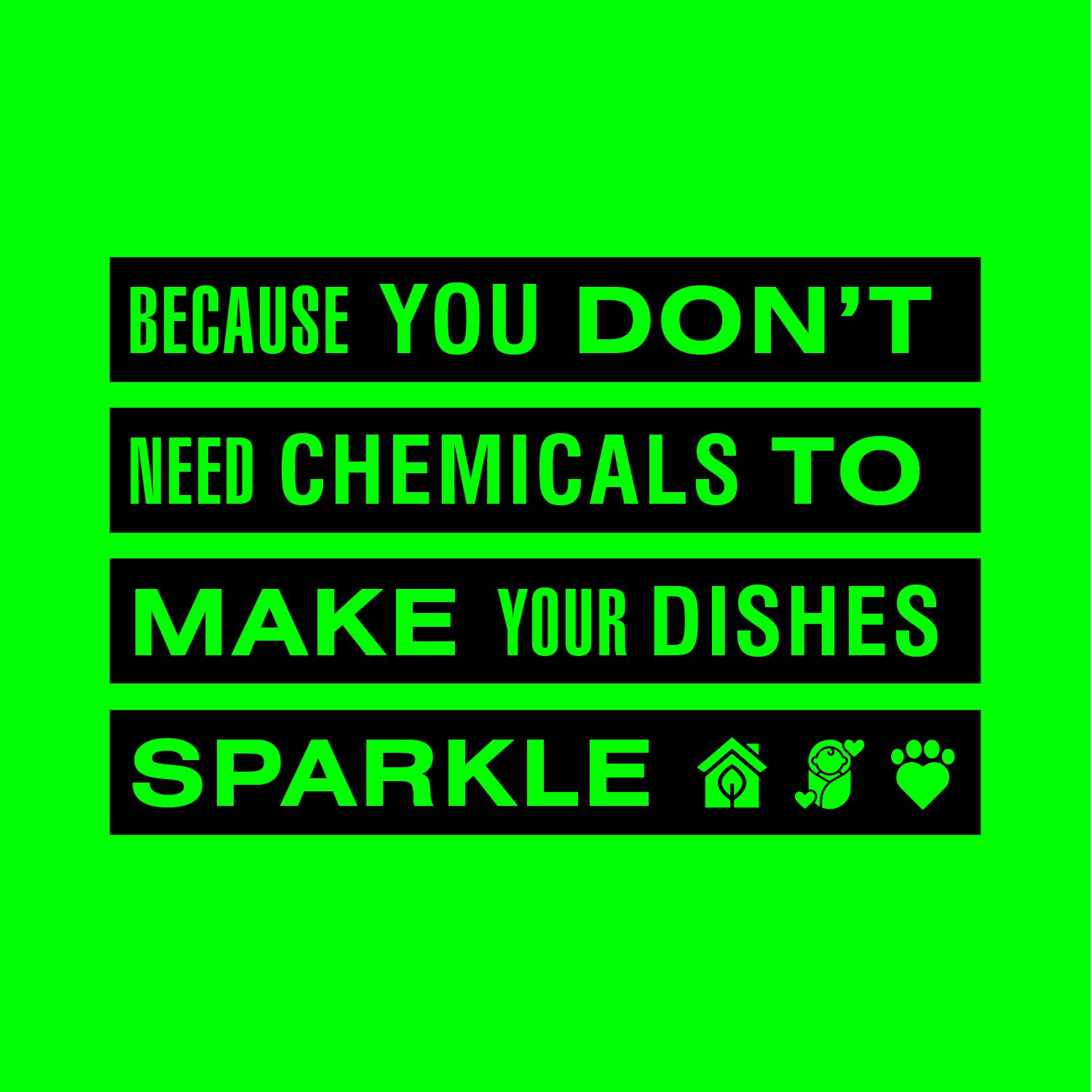
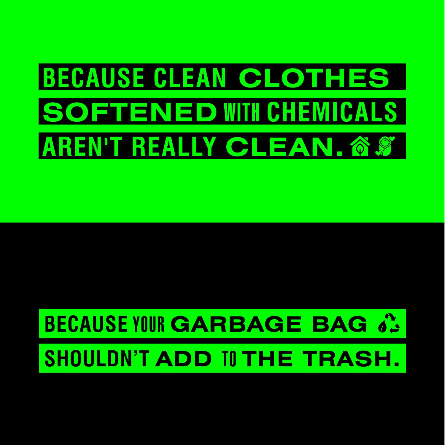
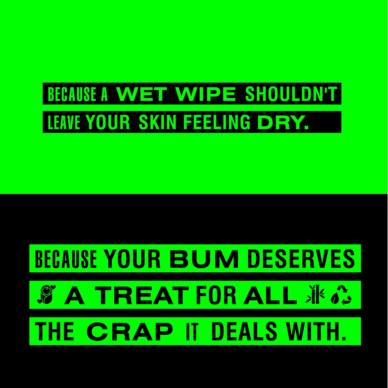
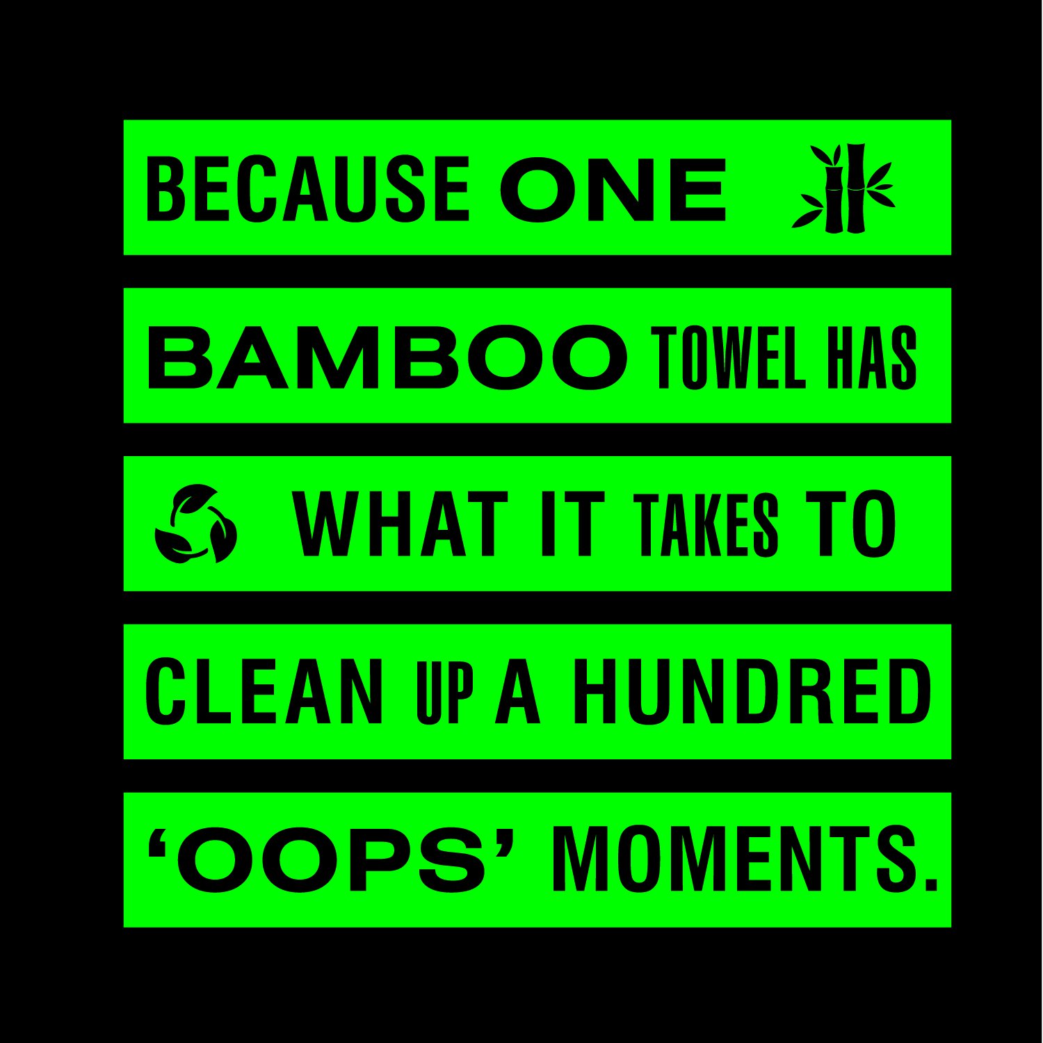
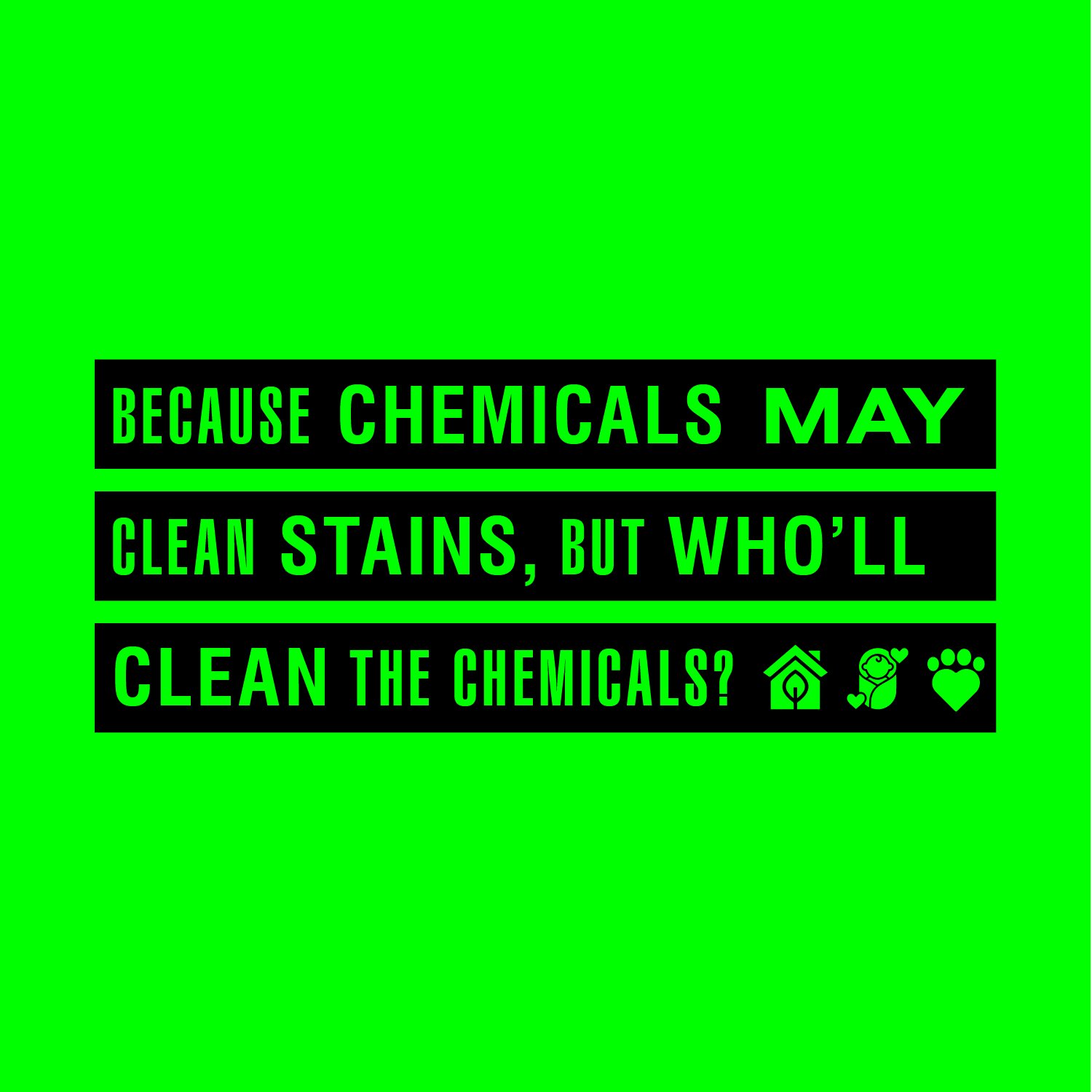
THE WRITING
We wanted to break the stereotype of ‘boring’ that is attached to cleaning, sustainability, and an eco-friendly lifestyle. Yes, climate change is a serious topic but it doesn’t have to sound dull. It can be colourful, interesting, and inspiring. Using wit as a tool of communication we have tried to make the otherwise mundane task of cleaning a lot more engaging and fun.

SOCIAL MEDIA & WEBSITE
Communication and visulal language that extends the disruptive colour palette and tone of voice.

We extended the edgy and bold visual style to create a dynamic website that lays emphasis on the brand philosophy without diluting the hasslefree shopping experience.
