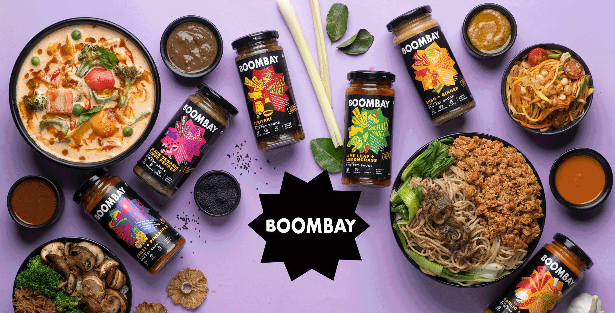
BOOMBAY
IDENTITY | BRANDING | packaging design | VISUAL & VERBAL LANGUAGE | communication pegs | KEY MESSAGING | WEBSITE DESIGN
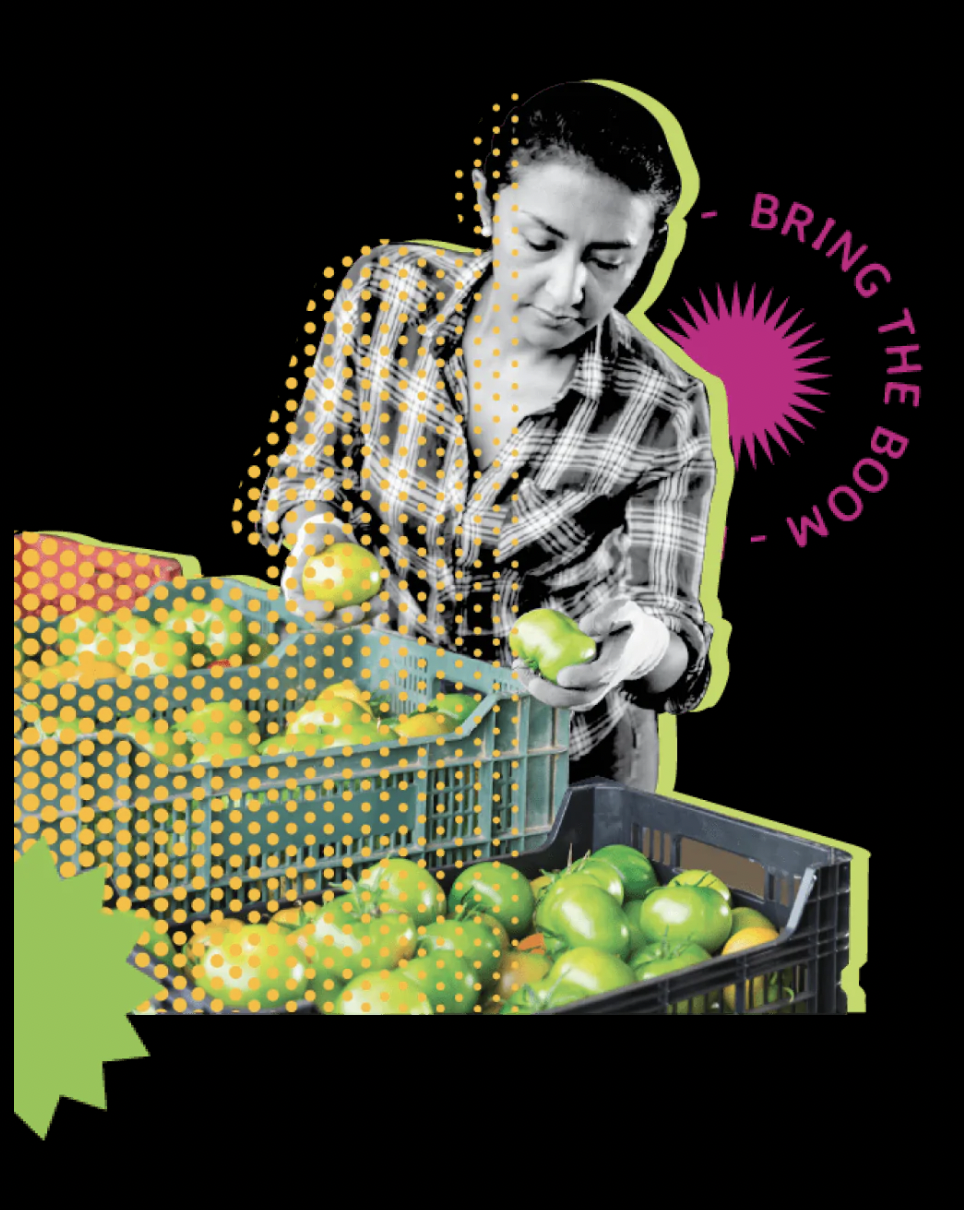
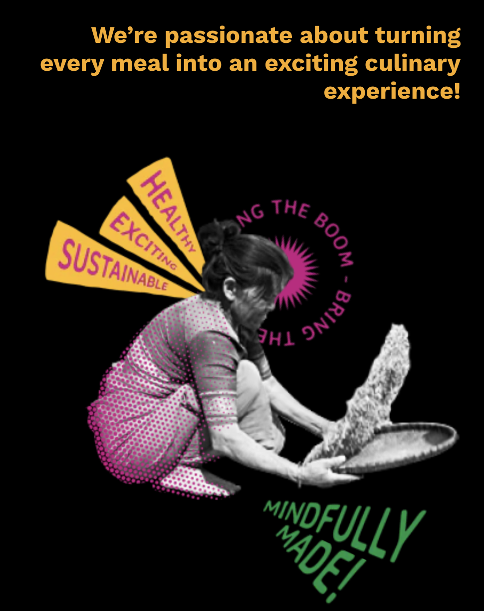
Boombay is a mindfully made condiments brand that encapsulates the melange of cultures and flavours that is inspired by the city Mumbai formerly known as Bombay. When we partnered with Niharika Goenka, her larger goals were clear: To create a brand that improved human and planetary health - and that begins by changing the our consumption habits.
BRAND FOUNDATION
The first order of the day was to articulate and agree on a brand foundation. This was done with a series of discussions and a final working meeting where we finalised three key questions that helped clearly define the brand. Why, What and How.

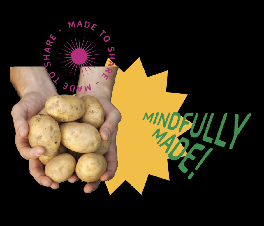
Leaning hard into the name and the thinking behind it, along with the kind of products that were underway, we were sure we wanted to incorporate the visual asset of the starburst, or the ‘Boom’ of Boombay.

It represented so many truths of the brand:
The intensity of flavours .
The idea of when two contrasting elements come together, there’s a spark.
The fact that when added to a dish, it could really elevate it to another level.
The inventiveness of recipes.
The sheer joy when a food memory comes rushing back.
And lastly, the creativity associated with the culinary arts.
Identifying the consumer
Before any design work, we first identified the kinds of consumers we wanted to appeal to at the very core of the brand. This is different from identifying the ‘Target Market’. Here we are looking at the kind of mindsets that would resonate with our brand values and our product promise.
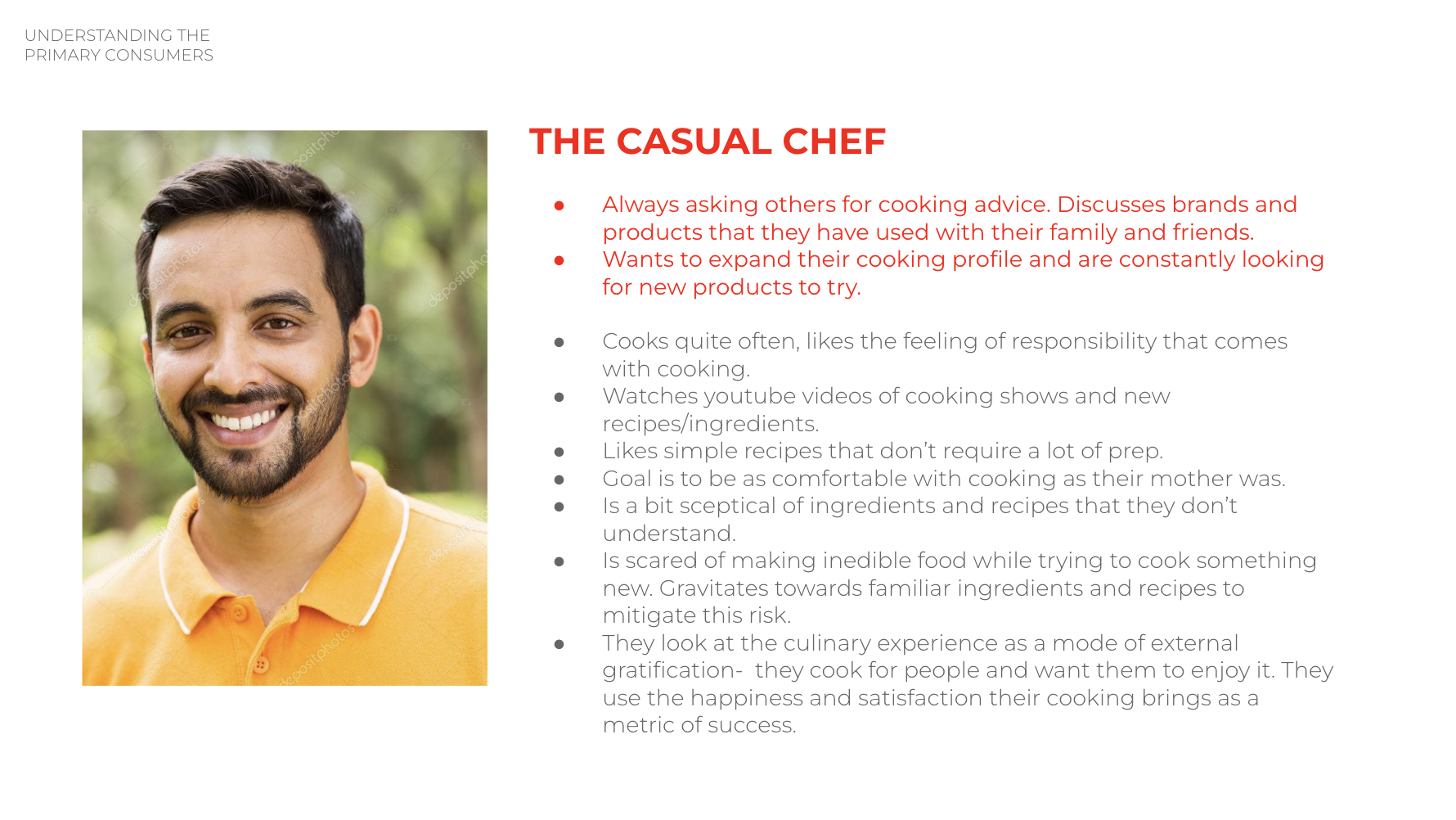
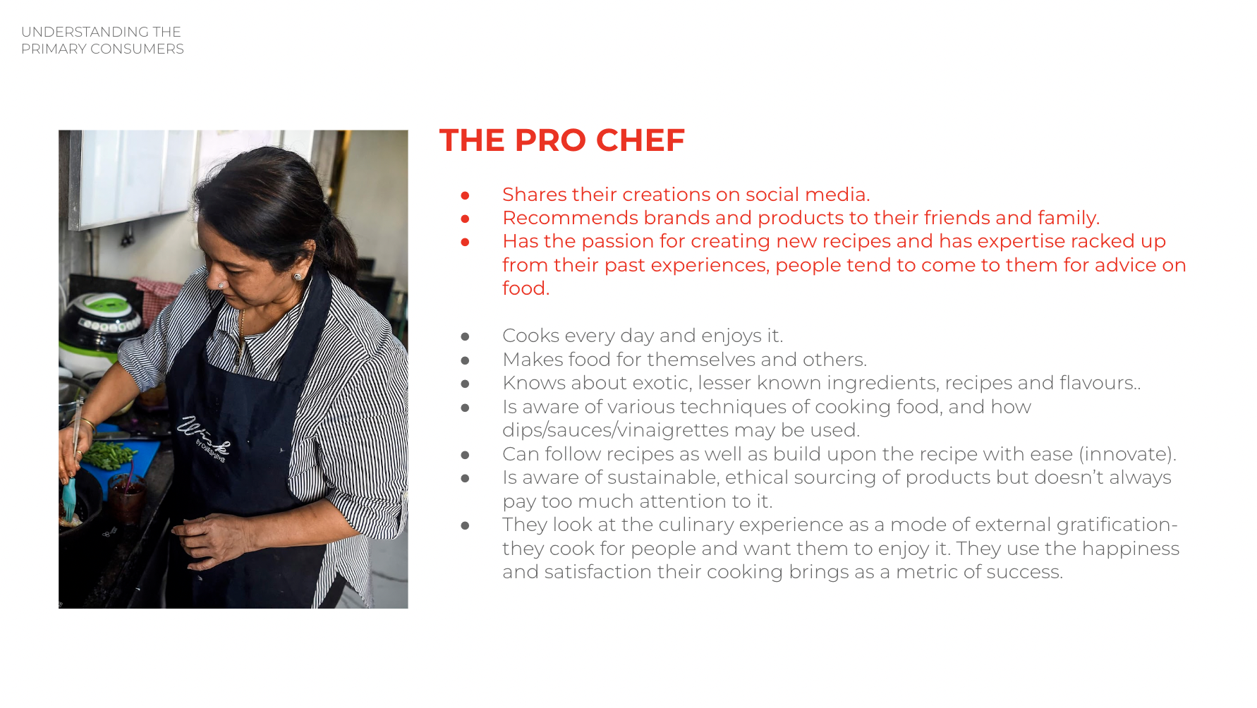
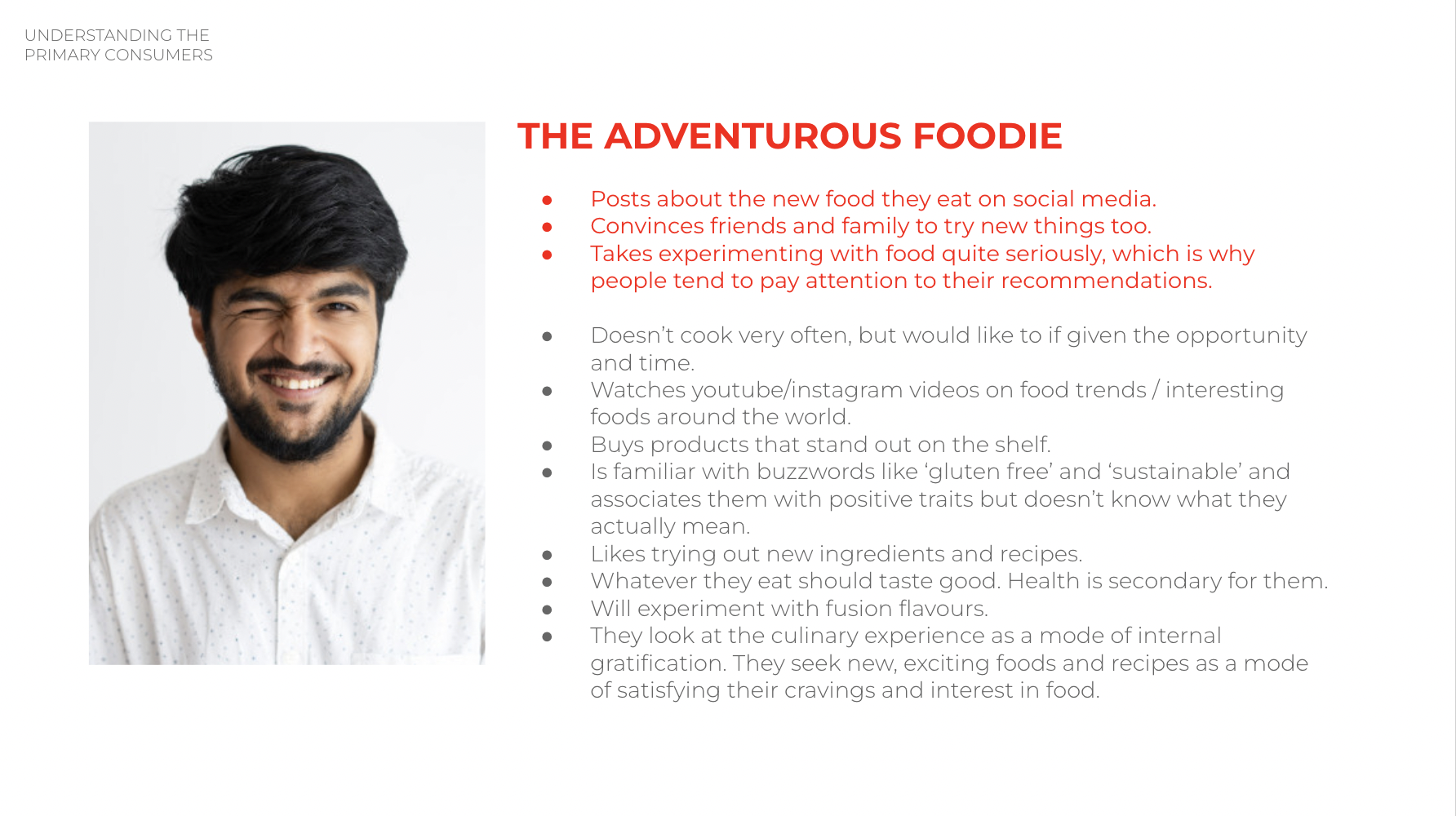
To do this, we first identify all the potential customer mindsets that exist through desk research, existing published papers and interviews, to then narrow it down to the 3-4 types we believe will be early adopters of our brand.
In this case, we concluded that our primary audience is a knowledge seeker - investigative and well-informed about sourcing and origin stories of ingredients and making. They have a higher baseline of education when it comes to food compared to the average consumer in the market, and take pride in their discovery of products, foods and recipes.
THE DESIGN INSPIRATION
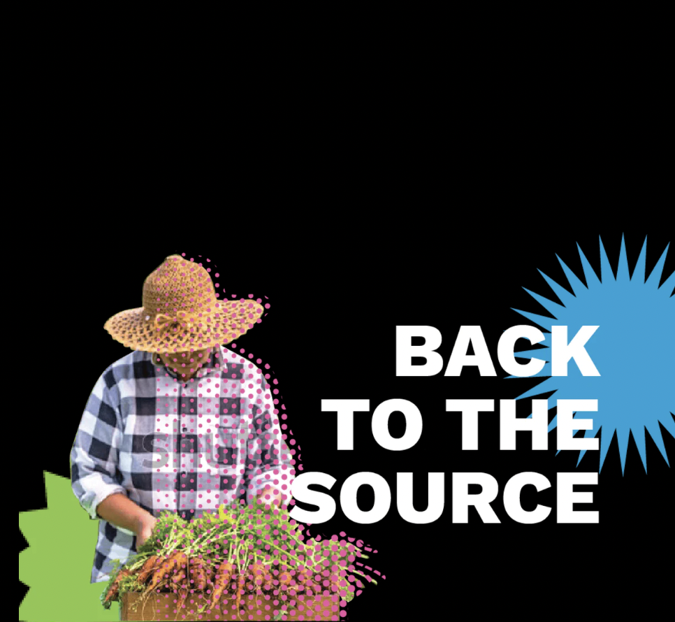
As we delved deeper and deeper into understanding the product development process over the course of numerous lengthy discussions with Niharika and team, we found we were talking to a bunch of foodie-geeks, speaking the language of research that we instantly connected with. Not just do these folks care about the humans who grow their ingredients, and where, but also what the carbon footprint of it was, the soil quality, the genetics and the farming practices used to produce it. We immersed ourselves in wrapping our heads around the number of parameters they consider whilst choosing which suppliers to partner with, their quality, their impact on the planet, the economics and the ethics of it all. We found ourselves working with a brand that had soul. A team that cared about the details. And we had to do justice to it. On a tiny jar.

The inspiration
The idea is inspired by the intricate shape of an explosion. An electric clash of elements that spread far and wide. Similarly with graphs, we see a congregation of a plethora of distinct details that come together to express a larger picture.
Through the device of visual graphs, we wanted to address the complexity of the brand by marrying a systematic and a creative approach. We craft integral data points into an explosive looking graph to highlight the elaborate essence of the brand without it being too overwhelming. We want people to feel that the more they look the more the see and the more they uncover.

This was what the very first version of the idea was. You can see it was a lot more loyal to the inspiration - the pie chart. But we still needed validation of how it was being received, and interpreted. To do this, the Boombay team asked a sample size of our audience who also happened to be visiting for product tastings. We collected feedback on this first draft of design, and experimented with potential ways to solve for some of the feedback that was undesirable. Below is the extent of the different things we experimented with: Namely colour abundance, information hierarchies, amount of information, visual elements, and emphasis on the ‘boom’ which was paramount to our brand language.

Design Explorations
Once we collaboratively selected a design, we then explored the permutations and combinations that could improve and amplify the design language for the brand based on feedback we received for the initial draft.
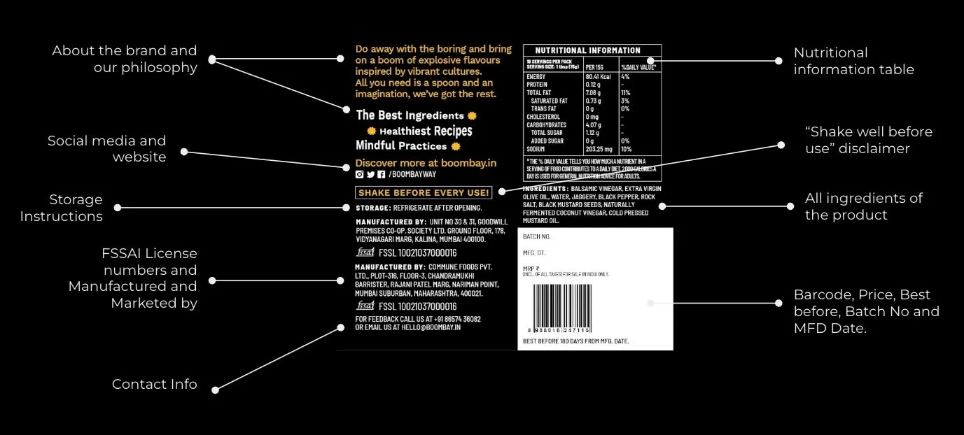
THE FINAL PACKAGING DESIGN
When building visual systems for brands that are on the growth path, we like to ensure the system is scalable, and can be extended to future products with ease. We prefer to enable brands by devising clear algorithms that help not just make sense of the design, but also allow quick decision making in the future for products that will be added to their portfolios.
In this case, we broke the label key visual into parts, that disseminated specific types of information. We defined what that information would be, worked with the Boombay team to create the visual representation of it, and arranged it in a way that helped convey more about the product that meets the eye.
Get a detailed look at the organisation of information and brand elements that make up the fronts and backs of pack.


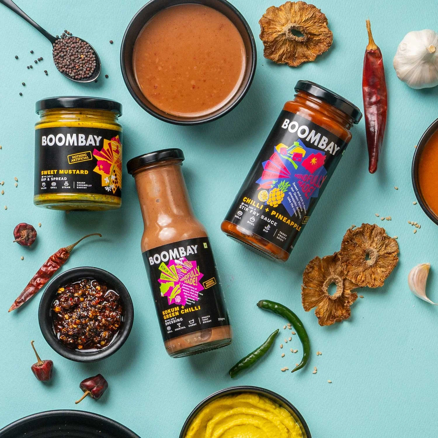
The Naming Convention
The nomenclature celebrates the ingredients and multi-purpose use which is core to the Boombay product line-up, which aims to spark creativity and prompt curiosity in consumers’ kitchens.
Et voilà. The result.


THE SHIPPING PACKAGING
Since the brand primarily used glass containers and was primarily an e-commerce business, there were concerns on shipping safety. We wanted to be as eco-friendly as possible and limit the use of material (not to mention keep costs in check). Thus began a series of experiments over months.
The constraints were many:
Varied container sizes.
Unpredictable handling by delivery partners.
Adverse weather conditions.
Operational efficiency (Speed of packing the shipment).
Scalability, scalability scalability.
Unboxing (mess-free) experience for the customer.
Lastly, the cost of packaging needed to be reasonable and plastic free.
And thus began numerous experiments over a period of months. We & the Boombay team worked relentlessly with our (very patient and cooperative) packaging partners who helped prove some of the ideas we had.
After countless failed experiments, finally we arrived at something modular that worked for the varying container sizes, heights, was robust enough to travel pan-India. To us, small while it may be, this was a win.
While admittedly it was hard to win on all fronts, the final shipping packaging reduced breakage to less than 1%, is scalable and used 0% plastic!
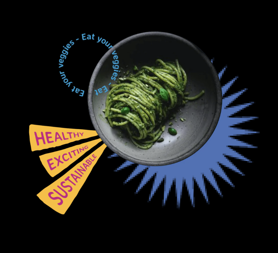
THE VISUAL LANGUAGE
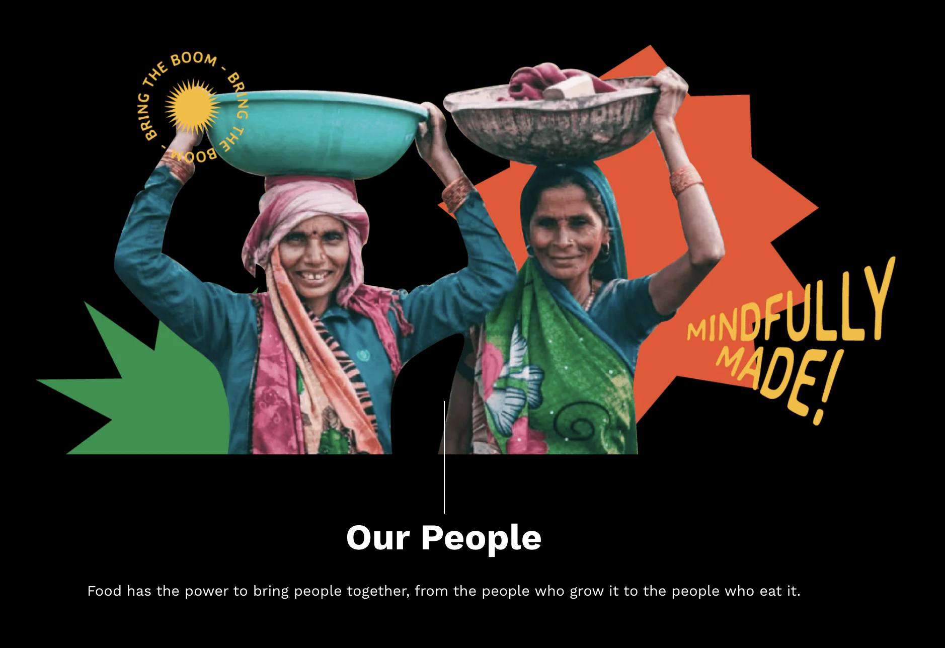
The Boombay brand language had evolved into a fun, vibrant, and information-rich mosaic that represented multiple aspects of its’ being. Given the origin of the name, there’s we embraced the patchwork nature of the city and unpredictability of the cultures that combine in Mumbai often leading to unexpected outcomes, represented by the ‘Boom’.

The culmination of brand assets and elements we created that form the visual grammar of the brand.
Given the nature of the business and the category, we incorporated these brand assets into the social media guidelines we created - allowing for UGC as well influencers, along with content pegs that are expected of a brand such as this one.

The Social Media grid look and feel, that covers varying content pegs including ingredient origins, product demos, user generated content and the making of the product to name a few.
WEBSITE LOOK AND FEEL
We used the website to take the brand language to a new level and evolve it. Not just did the website have to fulfil the function of prompting, it needed to make a compelling case for it, in just a few seconds. Our case was in the story of our process of sourcing, selection of our partners, and ingredients.
Being an information rich portal, we took the opportunity to connect with
our primary audience (who are curious about food) to explain exactly what’s so awesome about Boombays range of condiments. And so we didn’t gloss over the surface and trigger sales and only sales - we took the time to tell stories, to unravel the product and it’s glorious details.
We added details of animations and fun visuals and text here and there to make the experience as unexpected as we know our products will be for our customers.
Alongside are a few grabs of the visuals that made it to the website to create an atmosphere that was colourful, exciting and still informative.