DOT & KEY
A refreshingly unique beauty brand, Dot & Key has a range of products that address the markets unfulfilled needs, and have been formulated with utmost care to ensure that they are gentle to use. Promoters Anisha Agarwal & Suyash Saraf had a clear vision of the type of brand they wanted to build - one that is honest, looks into details that are missed and one that honours its word. This came to us as a welcome surprise, since the general category is filled with quite the opposite. The partnership was the truest of it's kind, where every decision, design or otherwise, was thoroughly debated, discussed and then finalised. The journey was a long and hard one, but satisfying to no end.
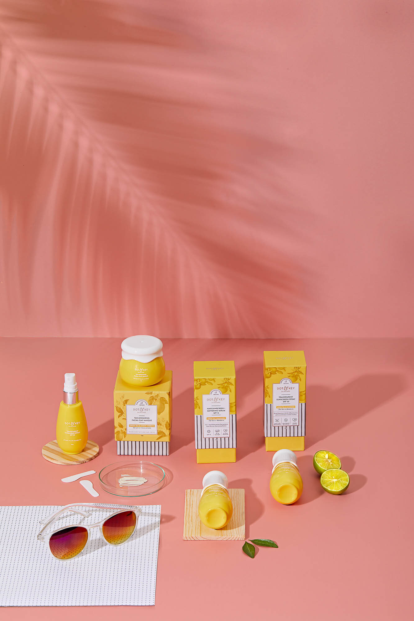
Studio Glyph worked with Anisha & Suyash to create the brand from ground up - beginning with what to call it, to its personality and visual language for both, print and digital media. In doing so, we created not just the secondary packaging of the products (cartons + inserts + brand language), but ensured that all customer touch points were consistent with each other so the brand experience stays intact.
THE IDENTITY & WORD MARK
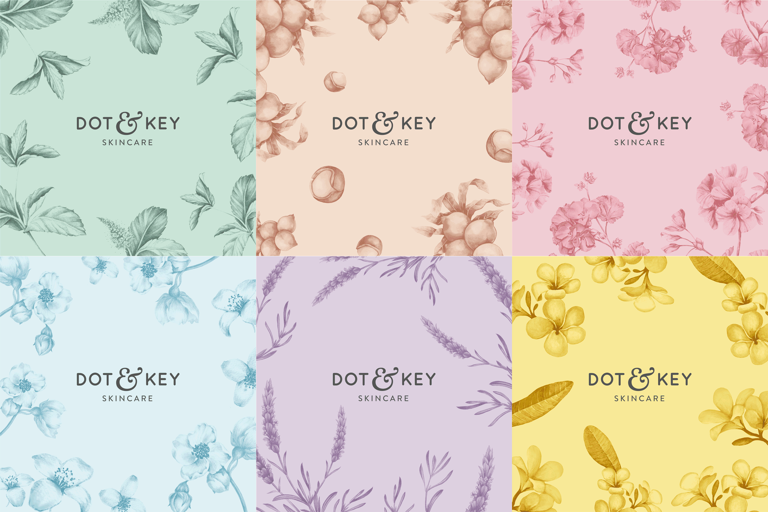
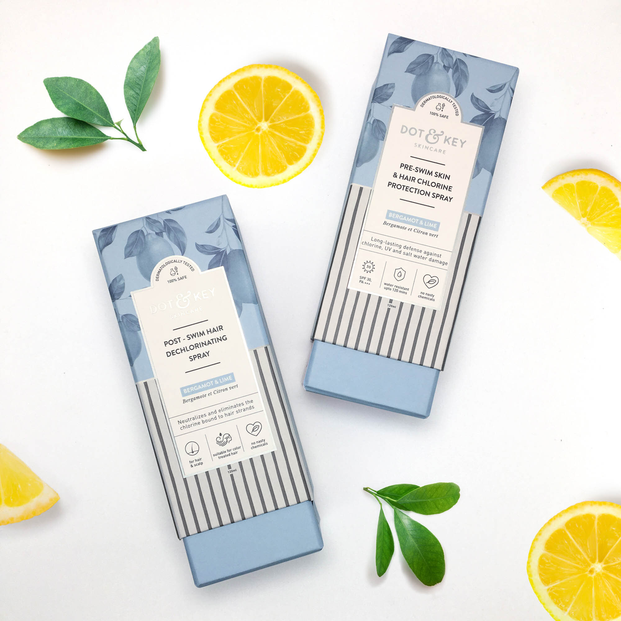
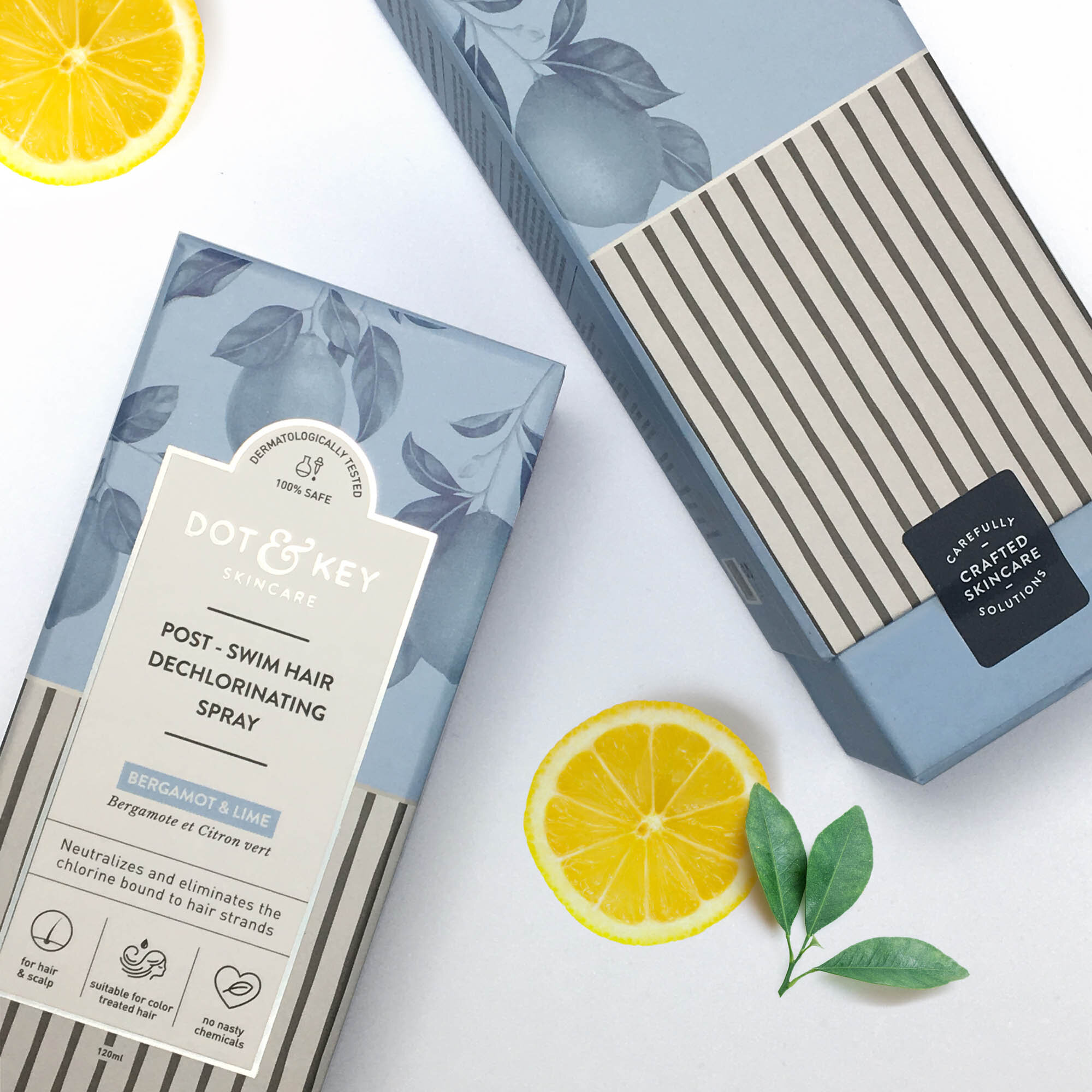
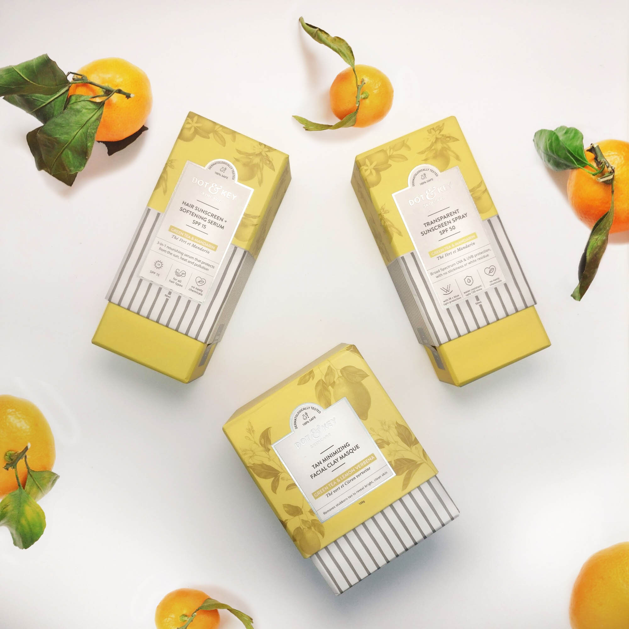
Simple, bold typography with a mix of serif and sans serif typefaces add familiarity along with modernness. When used in its primary application - the secondary packaging; along with the intricate and beautiful illustrations, it is offset and softened in its appeal.
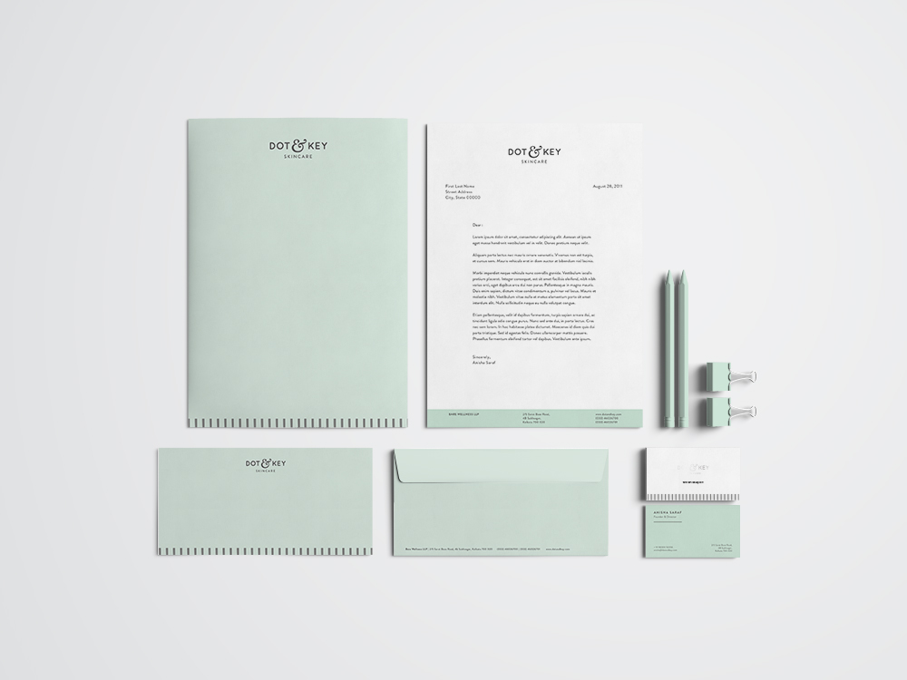
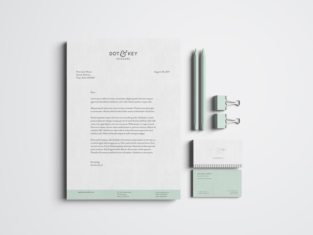
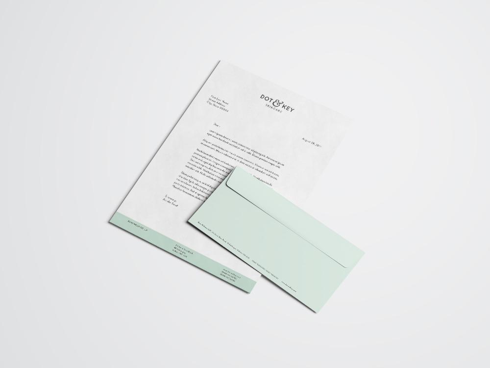
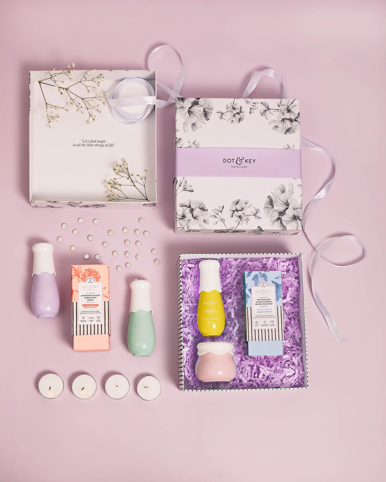
The logo is used in silver foil on the packaging, however digitally, and in cases where we could not foil, we opted for a soft but strong charcoal grey. For such a colourful range of products, one colour could do no justice. So we designed the rest of the corporate stationery to be in three signifying colours - a mint, a powder blue and a sunshine yellow.
THe secondary packaging & accompanying literature
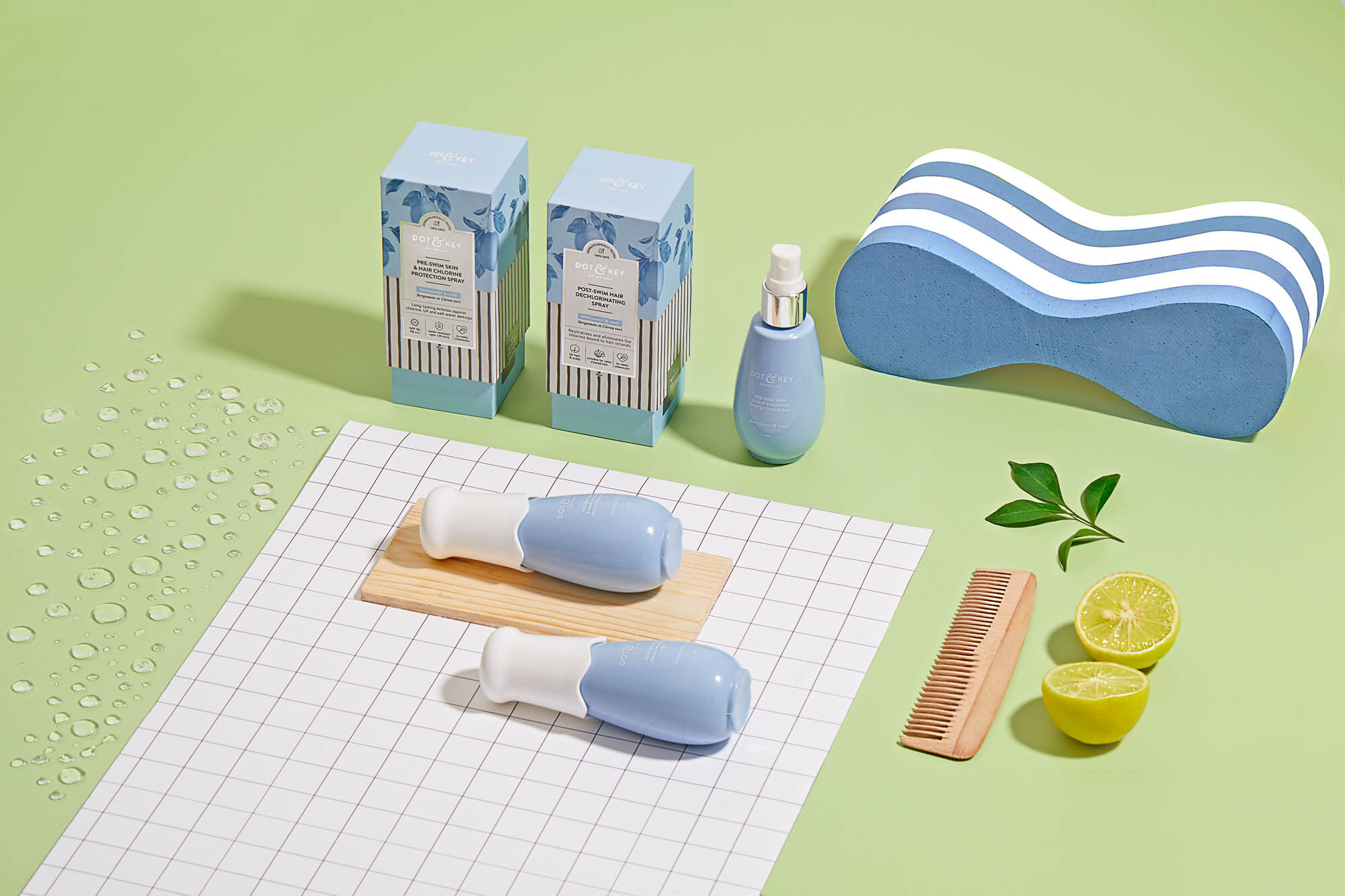
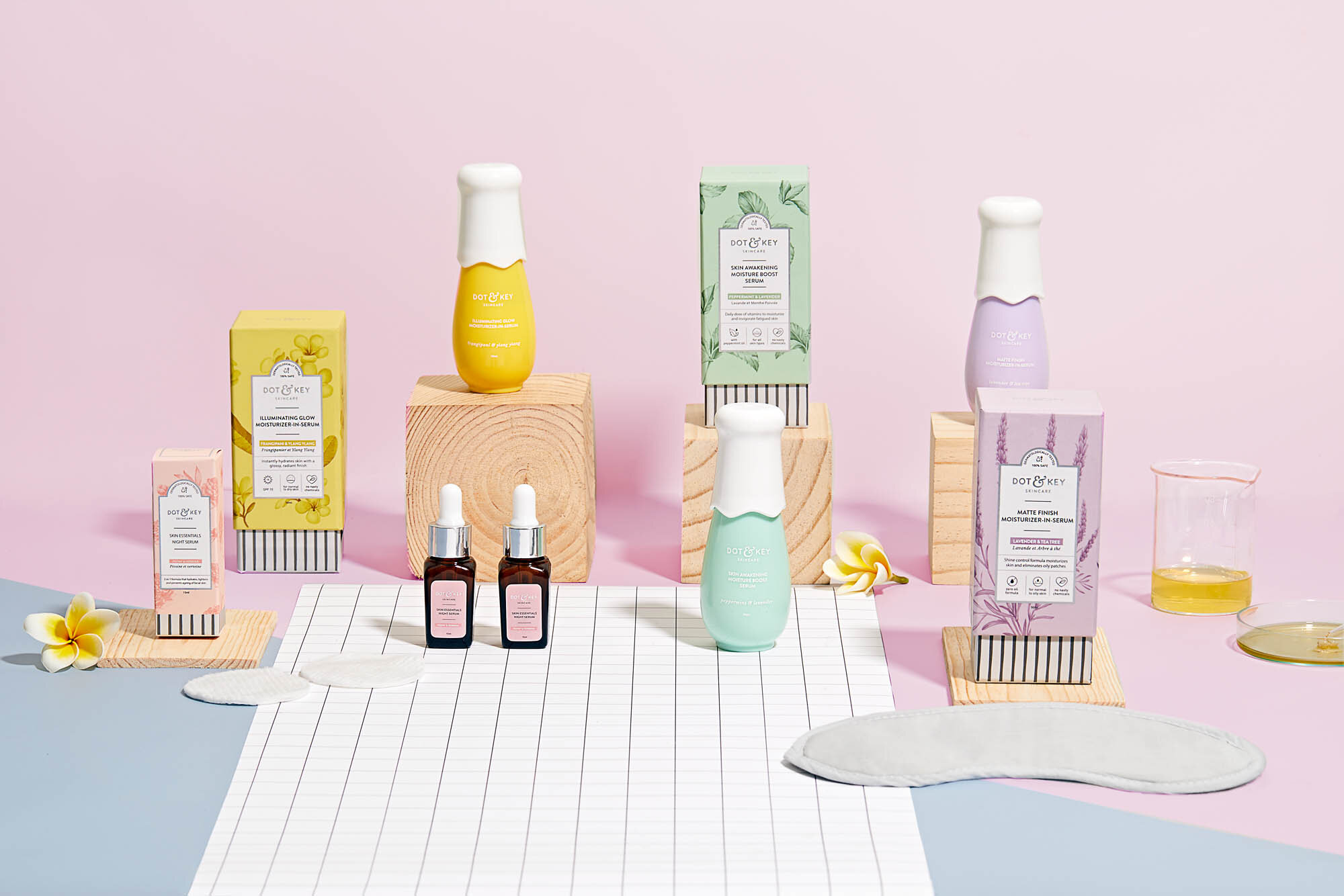
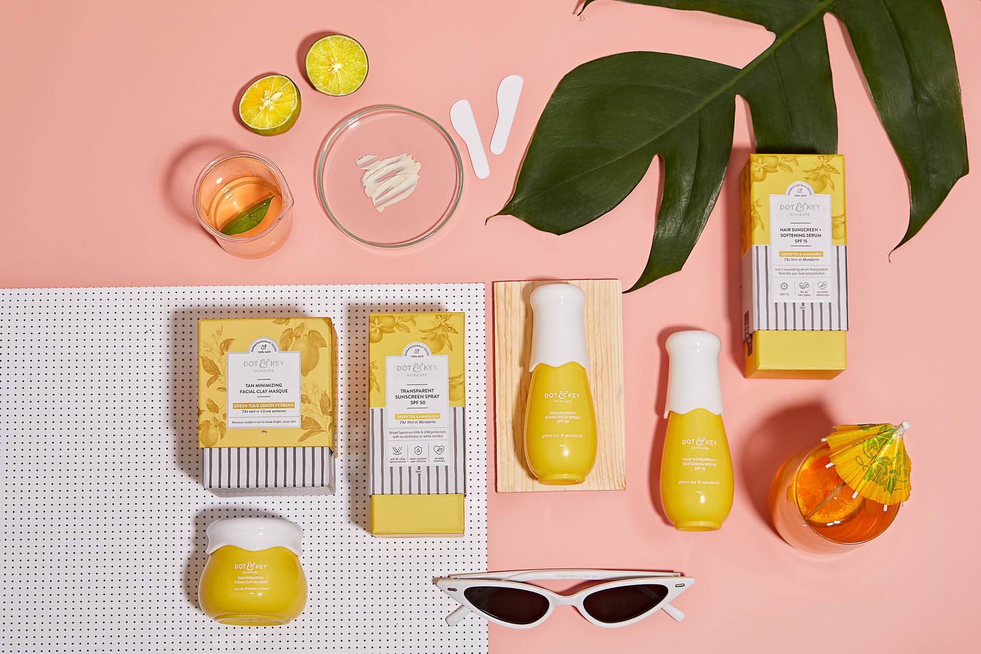
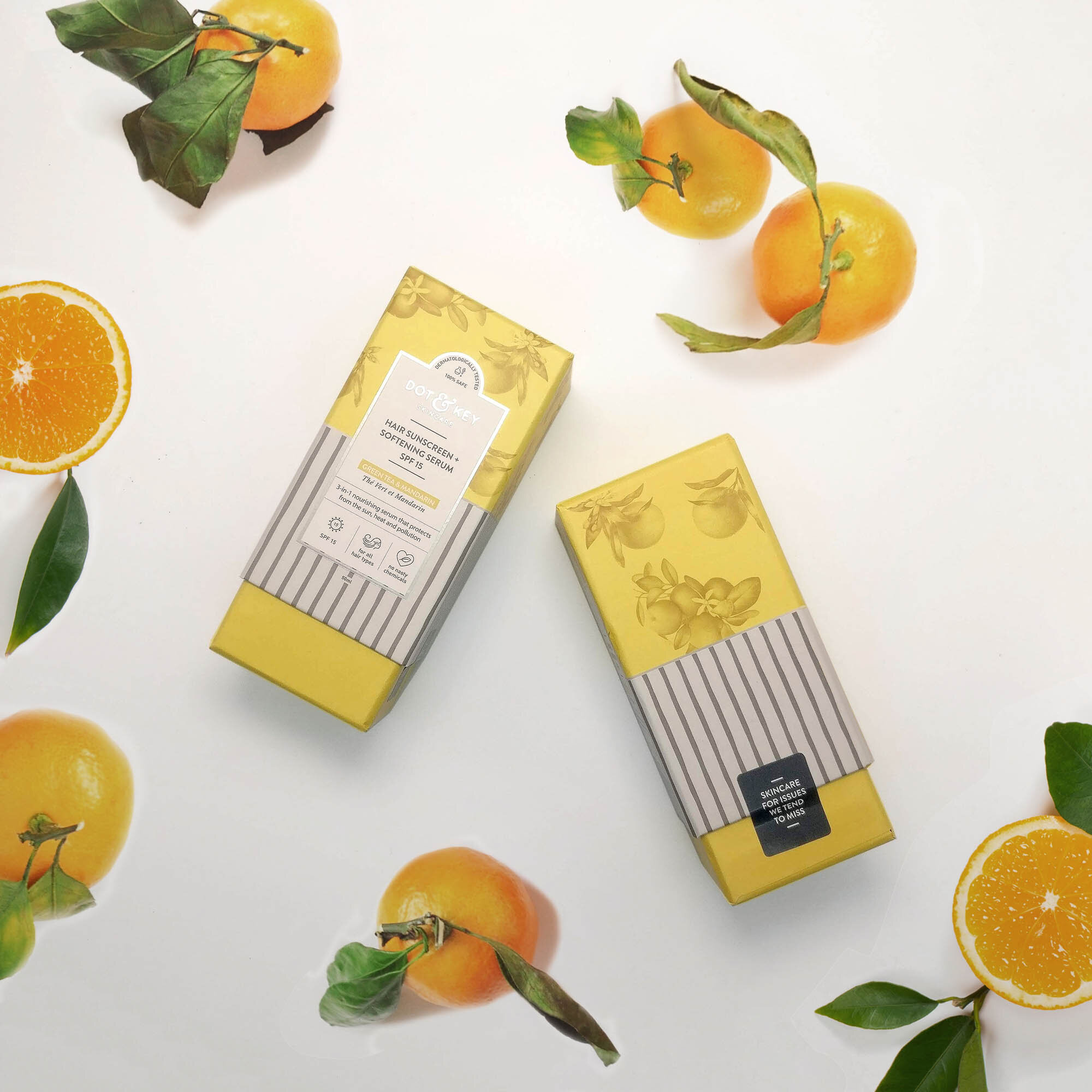
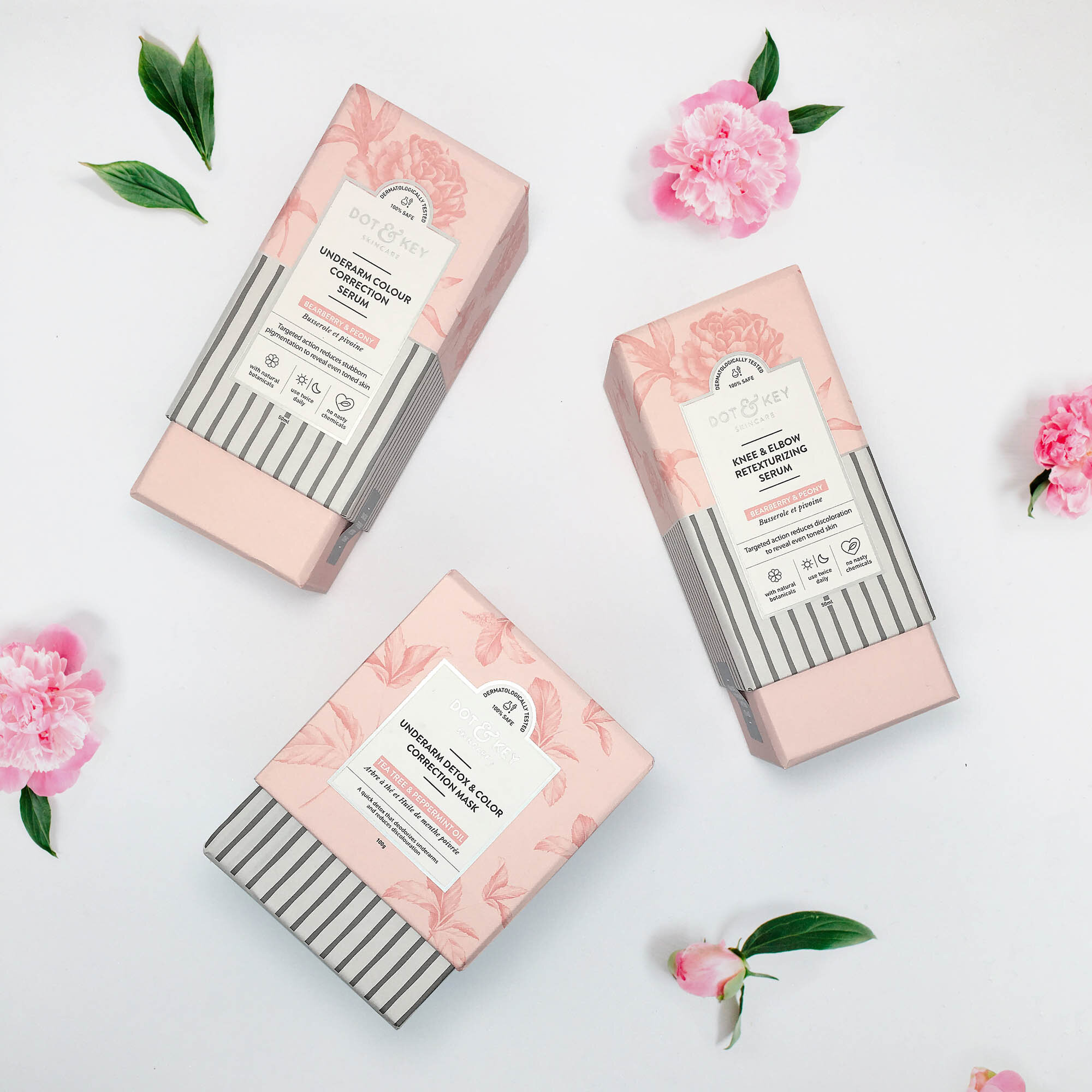
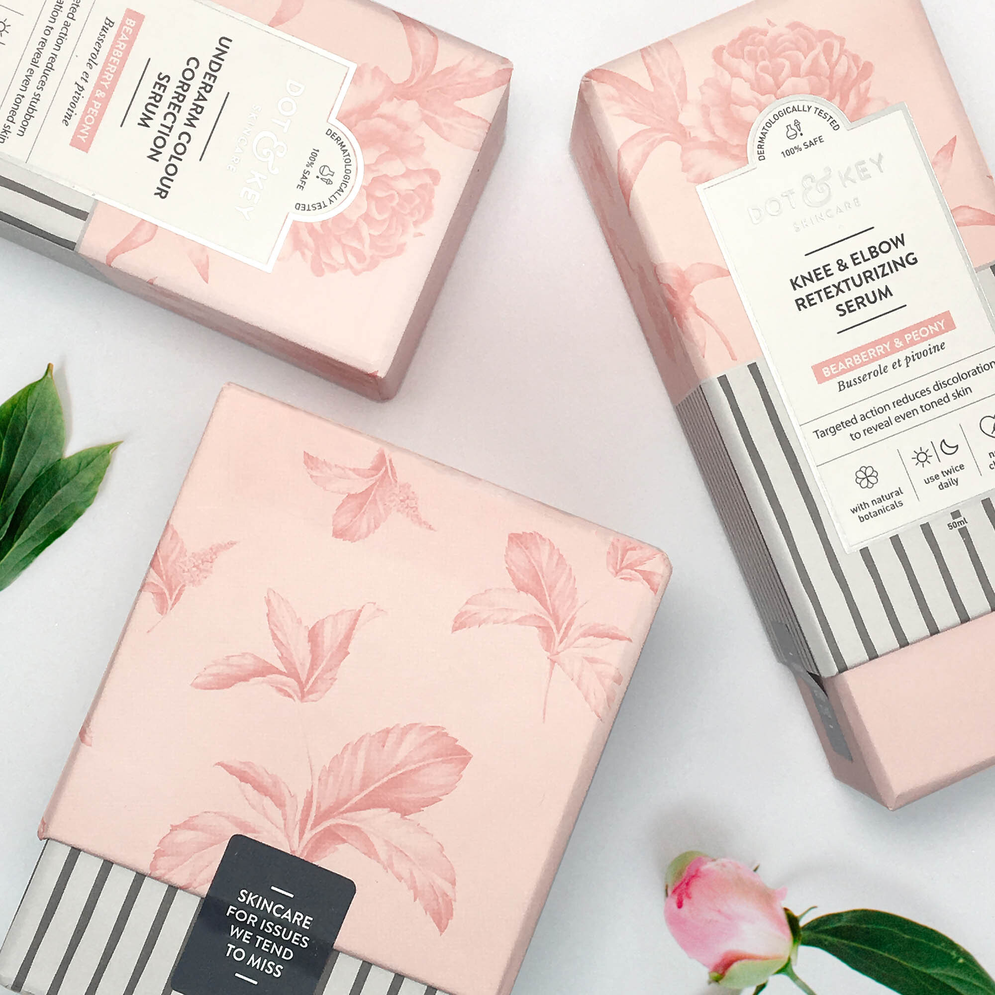
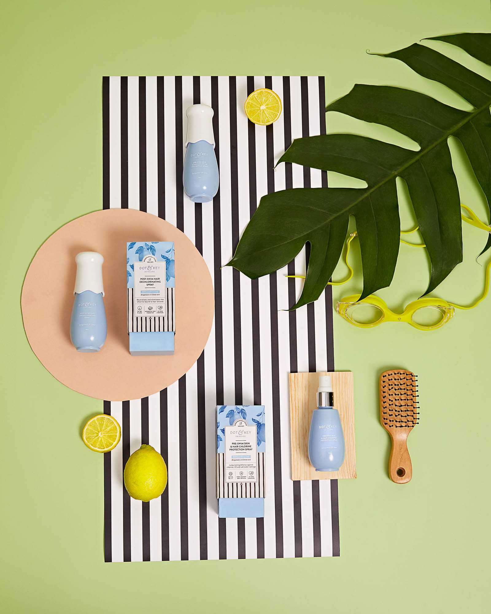
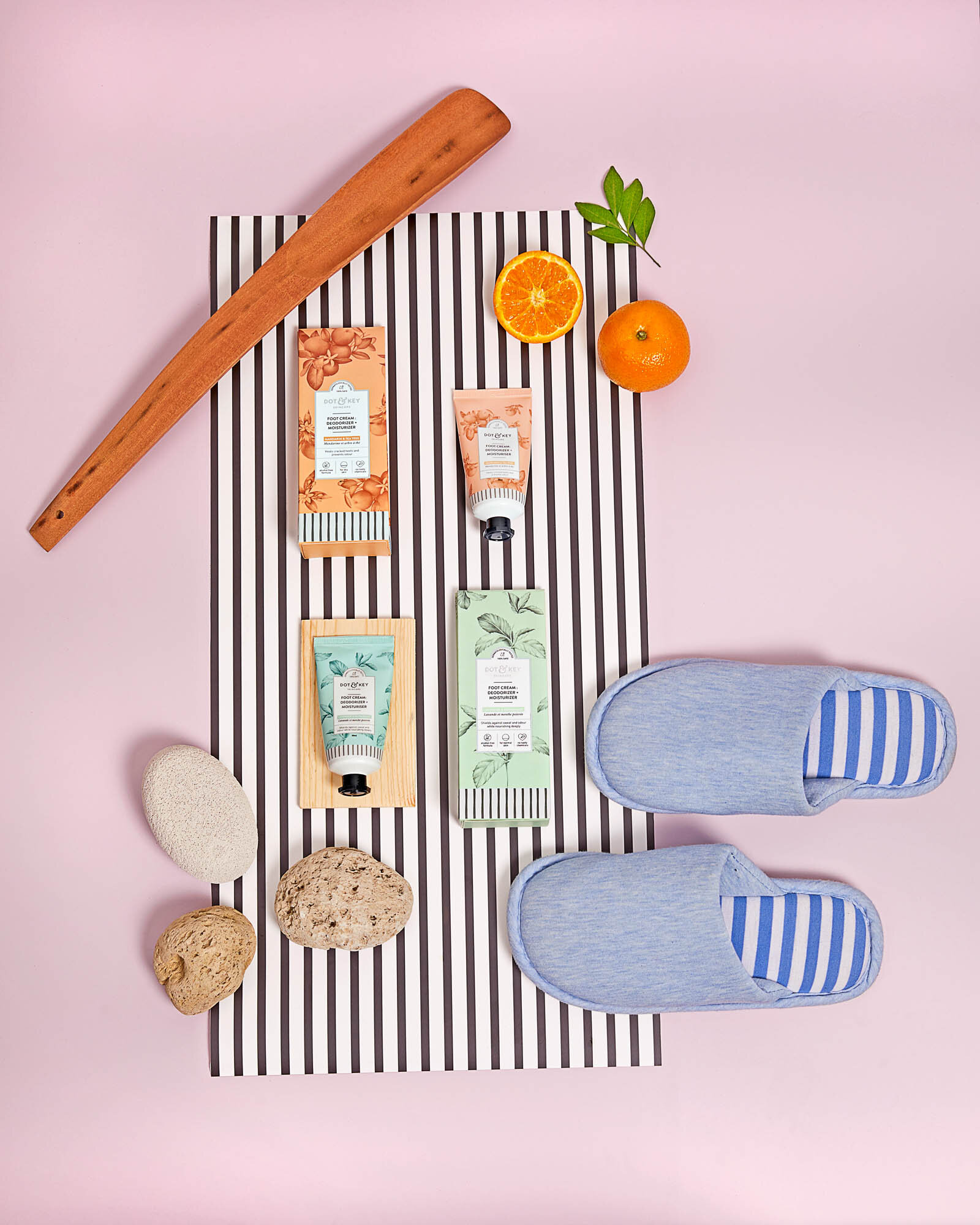
Rooted in the brand intent, the concepts for packaging started with the truth: The range of products. We delved into exactly how these products were made - the precision of science, a chunk of nature, and a whole lot of thought. That was what our secondary packaging (cartons) simply had to convey, both visually and experientially. After many design explorations, what resulted at the end was a combination of months of deliberation and detailed work.
Every box went with a little product information card (shown below) to explain the directions of usage, key ingredients and benefits.
The secondary packaging had a lot of key messaging that helped distinguish the brand. Instead of compromise the information with oversimplified language, we decided to use our core graphic design skills to generate a set of icons that would add the necessary information, without making it too wordy.
THE WEBSITE
And finally, with an e-commerce focussed market strategy, we had to ensure that all customer touch points were consistent, and reflected the brand sensibilities.

