GRAZE GOURMET
BRAND STRATEGY | PACKAGING DESIGN | BRAND LANGUAGE | WEBSITE DESIGN

Graze Gourmet approached us for the packaging and brand language for their range of high quality premium flavoured nuts. An area of emphasis for their product story was the origin and purity of their product, and that they were very much a healthy luxury brand. The initial thought when naming the brand came from the idea of a grazing board: a large tray loaded with small bites.
At the heart of Graze was an element of whimsy and worldliness: varied and diverse flavours from across the globe distilled into a single tin. The flavour story became important for the product as well as the overarching brand. And that’s where the journey for their visual identity began.
Before we could create a brand foundation and personality for Graze, it was important to understand what our competitors were doing. Analysing and understanding how they present themselves would help us know how we want to be perceived. We examined other brands in the nut, snacking, and gifting areas, not limiting ourselves only to direct competitors.
Both Indian and international brands fell within the spectrum of our consideration. We also made a note to look at brands outside the category that tell a story through their branding, packaging, and communication, to see if there was something to learn from them and perhaps incorporate that into our approach.
SURVEYING THE CATEGORY
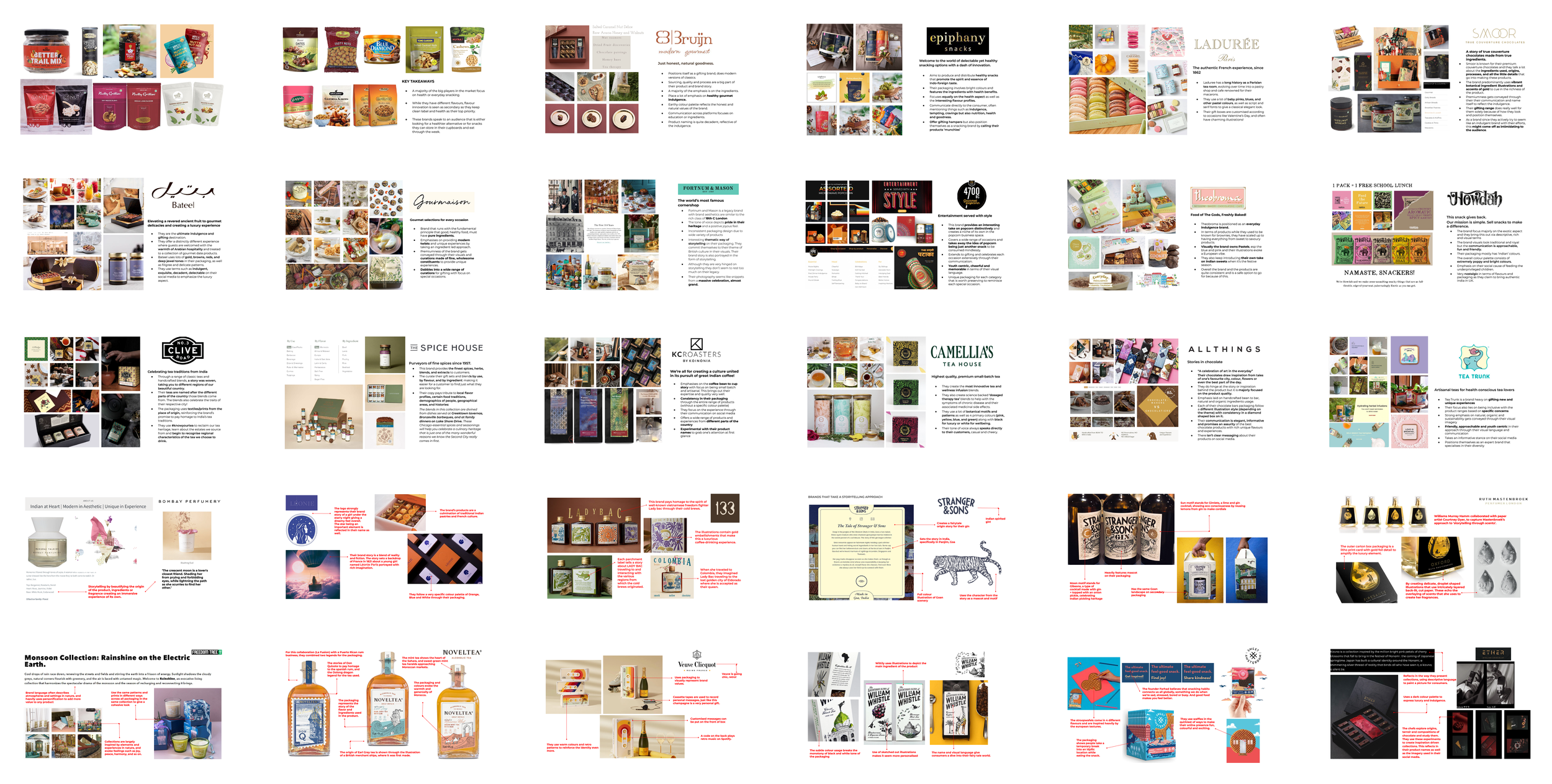
We made detailed observations on brands, their design, their communication, what they claim, how they began, why they are successful or popular and what price band they operate in.
UNDERSTANDING THE CONSUMERS
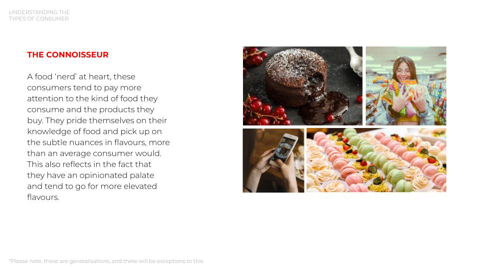
The brand catered to a number of different customer cohorts ranging from the connoisseur to the host, to even the less predictable experimental buyer. We kept all of their motivations and apprehensions in mind before diving into the design development.
THE DESIGN EVOLUTION
Graze Gourmet aimed to evoke the unexpected in consumers through their innovative recipes and ingredient mixes. A middle eastern ingredient combined with an Indian chilly, or an Italian herb combined with an African emulsion, throwing up flavour combinations that were familiar but unimagined.
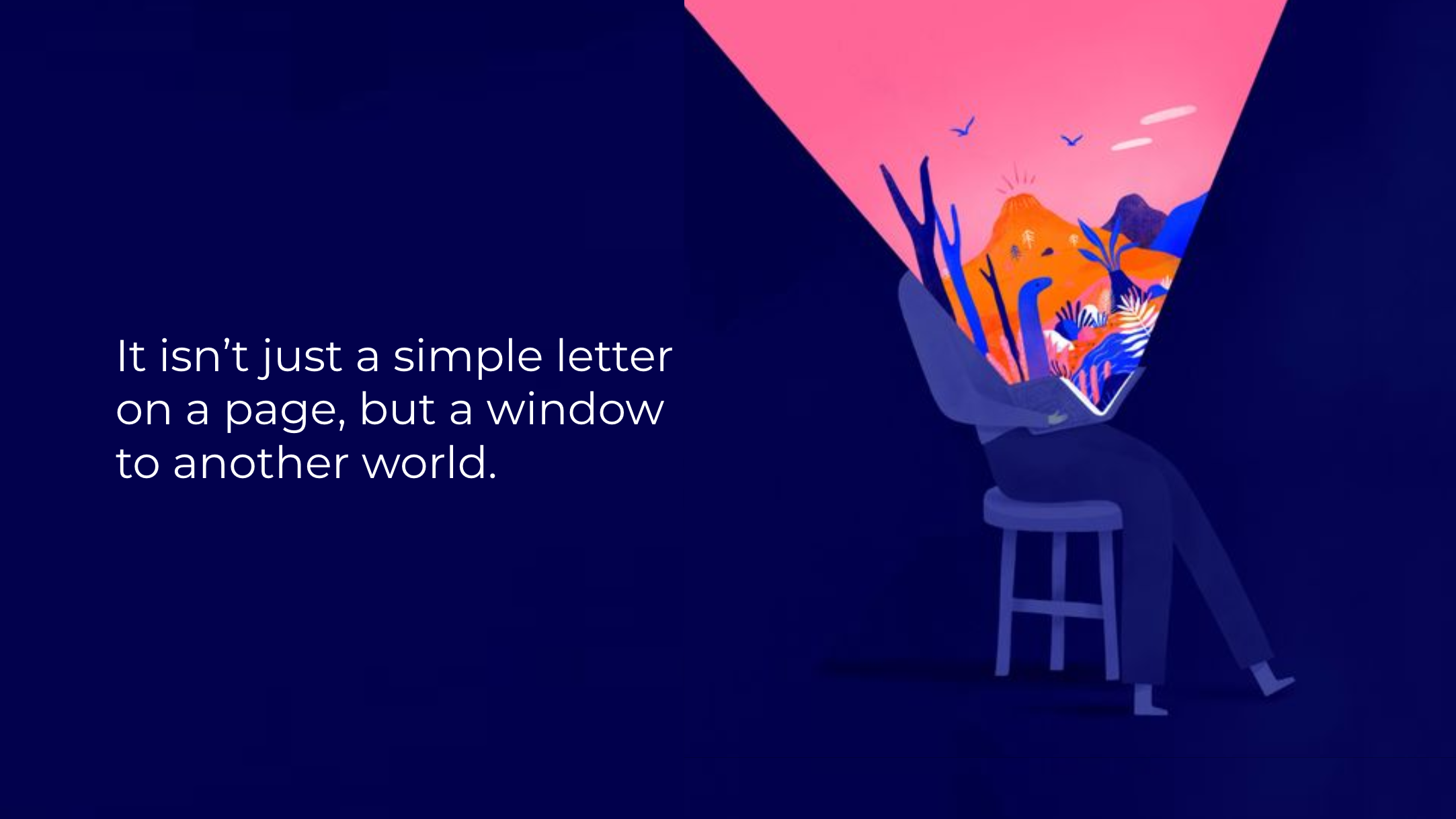
We explored the idea of fairy tales or fables, where the reader is taken on a journey shaped by their past associations and how they see the world. We examined traditional story telling typography, and found the drop capital to be an interesting representation of the adventure to come in the text. Below is a short set of images that explain our ideation and how it evolved.
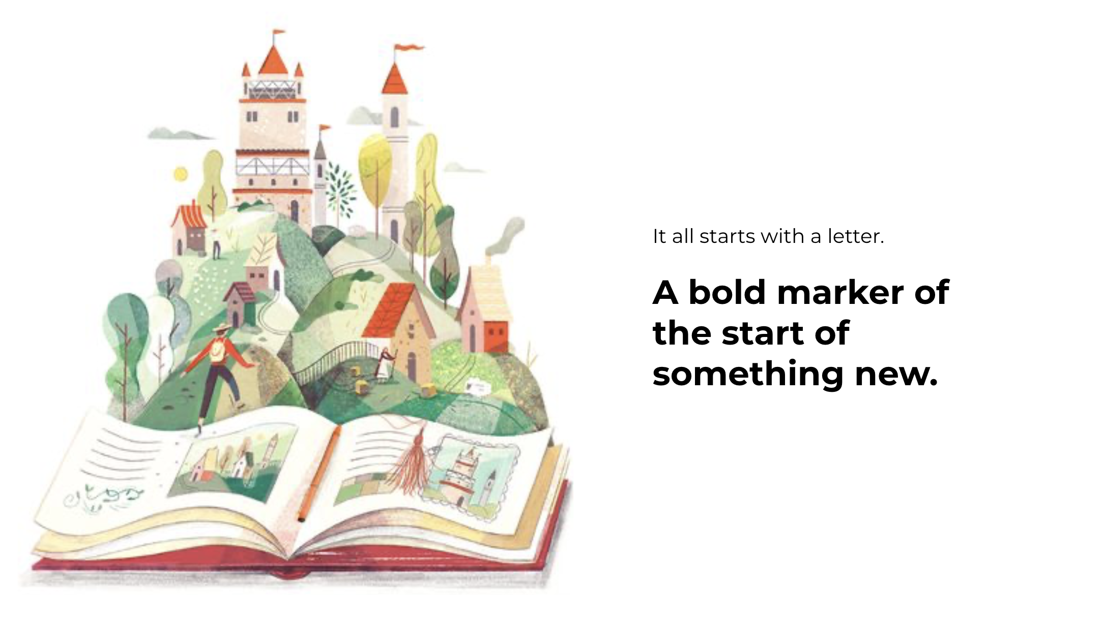
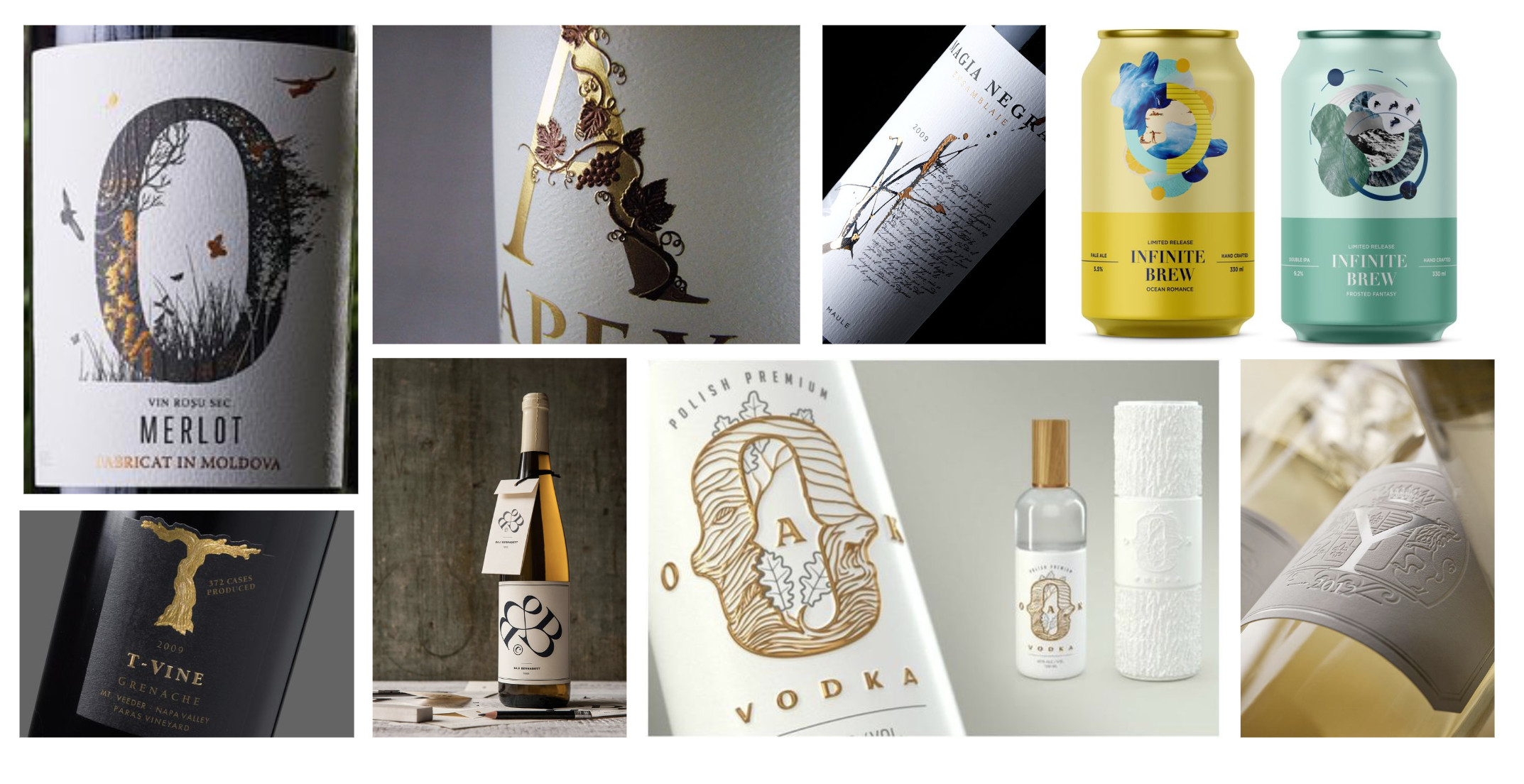
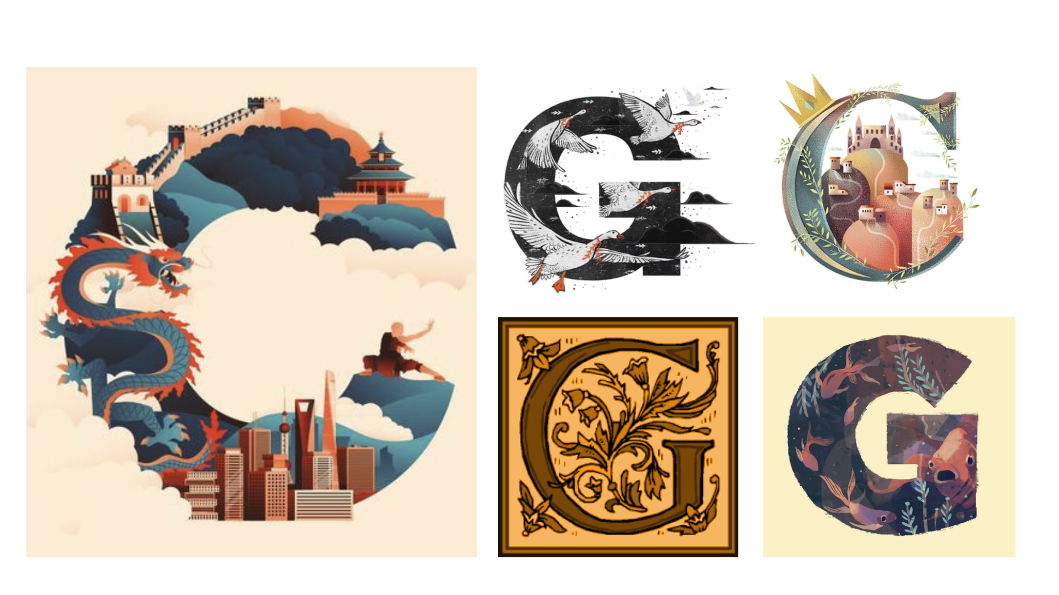
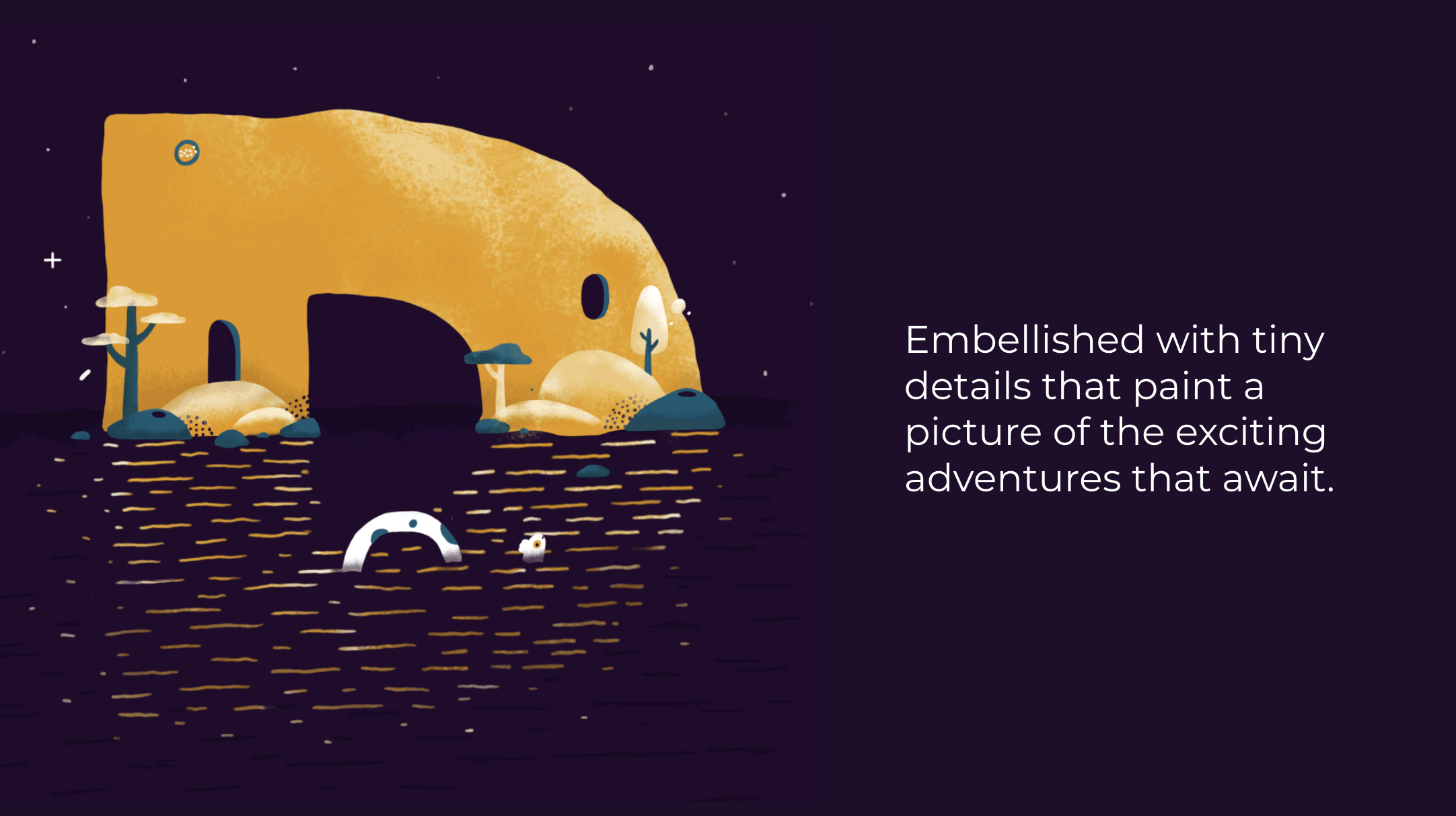
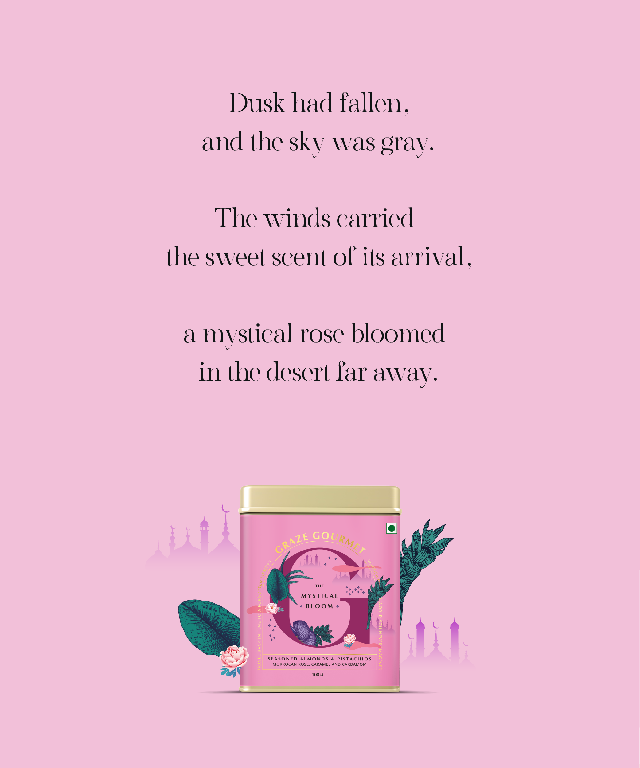
We developed stories based on the flavour profiles of their products, and used the drop caps to depict elements of the tale and help the consumer anticipate a taste theme, as is critical in packaging to do. Balancing the fantasy, the reality of expectation was part of the challenge. Being a modern brand for modern, conscious consumers, we chose to represent the drop capital in a contemporary style. Alongside are just some of the experiments we conducted.

THE BRANDING & PACKAGING
The various logo lockups.
Alongside are representations of the elements of the labels, and the different lockups of the branding.


We wanted to have different lockups for the logo to allow for flexibility, especially because this brand would engage with gifting. Above is the version that is in used as on the gift box.


The entire range

Above: brand side of pack.

The packaging illustration has a seamless feel with the illustration, with a lot more of the elements on the two ends along with the mandatory information.

Above: story side of pack
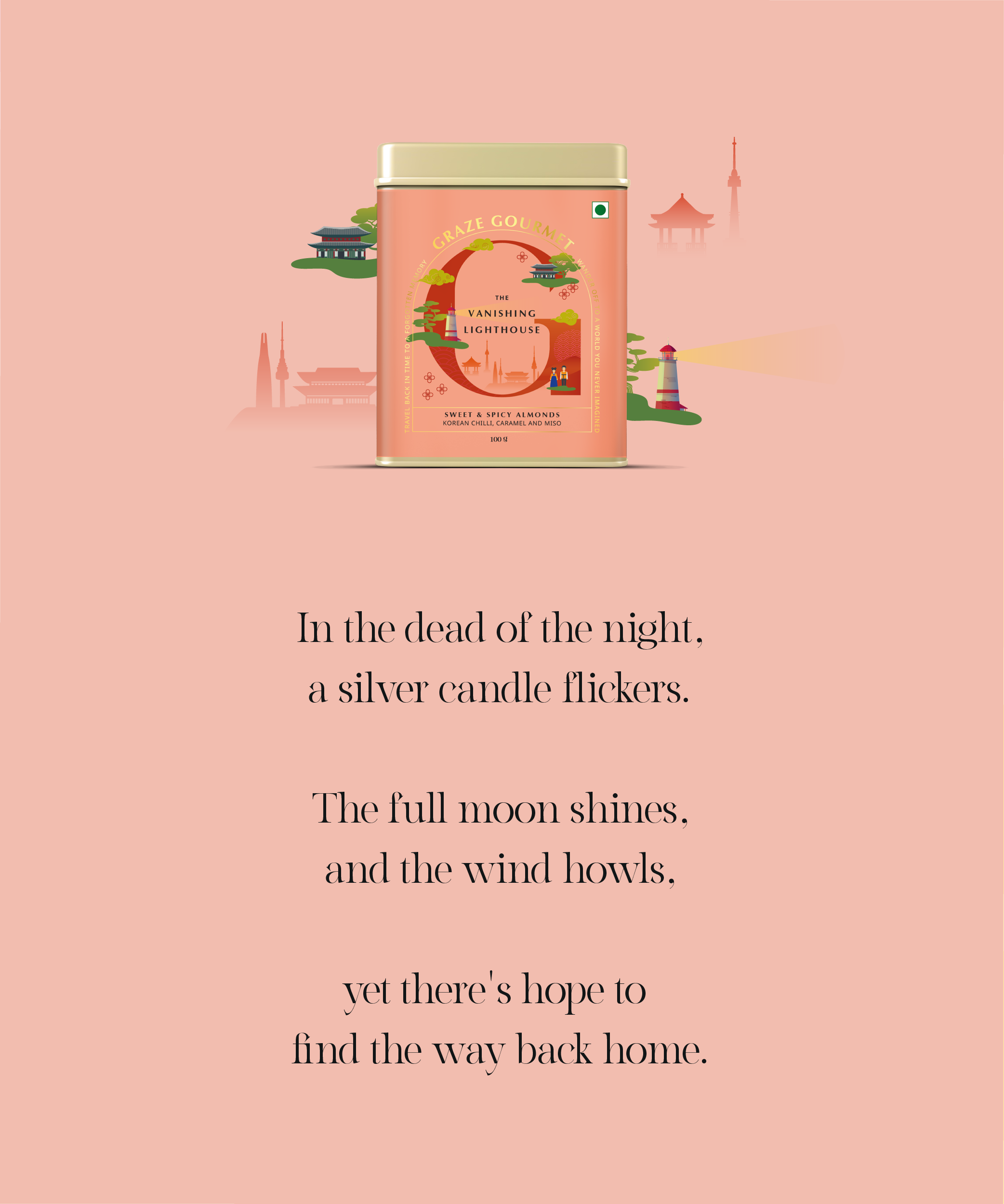
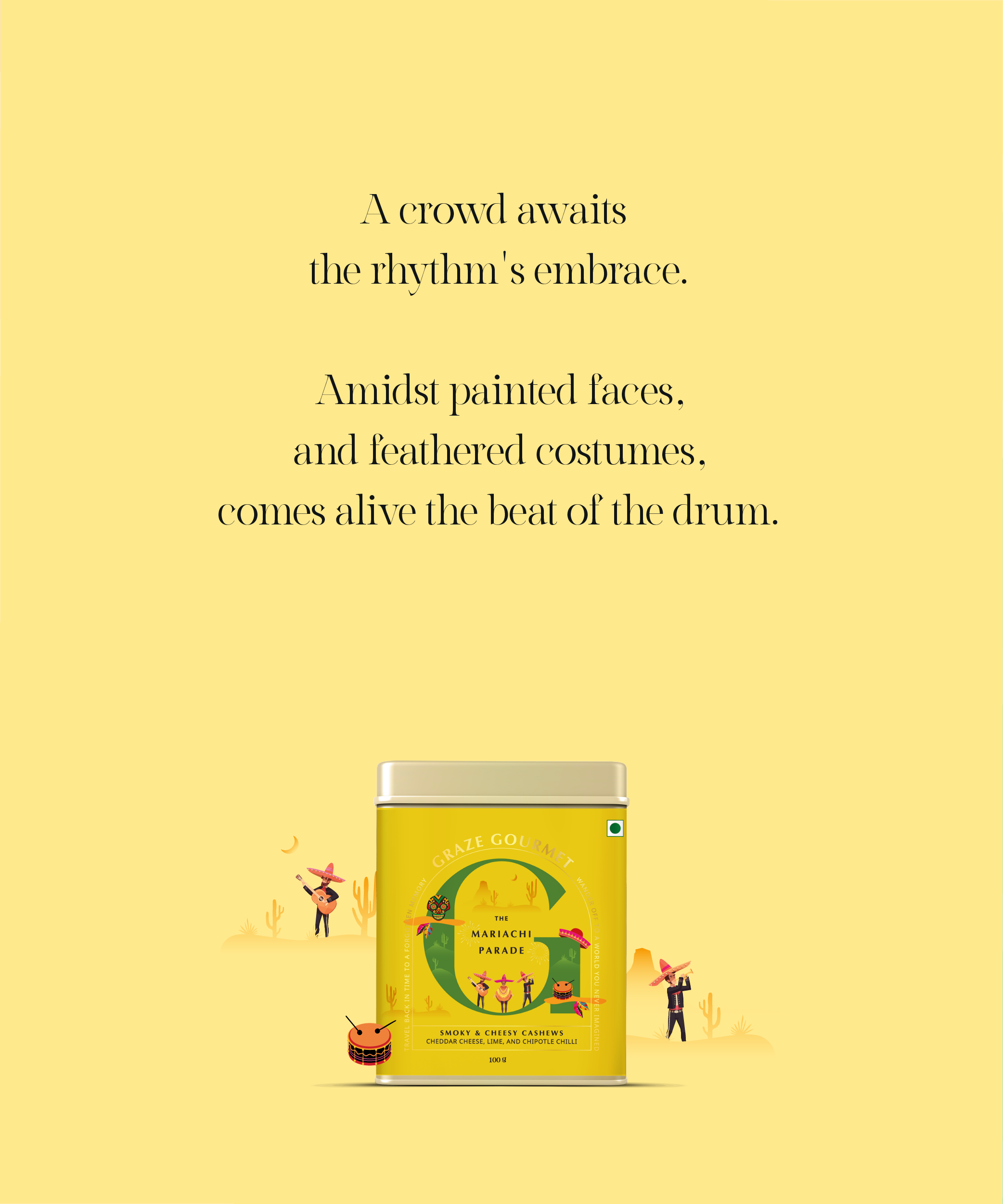
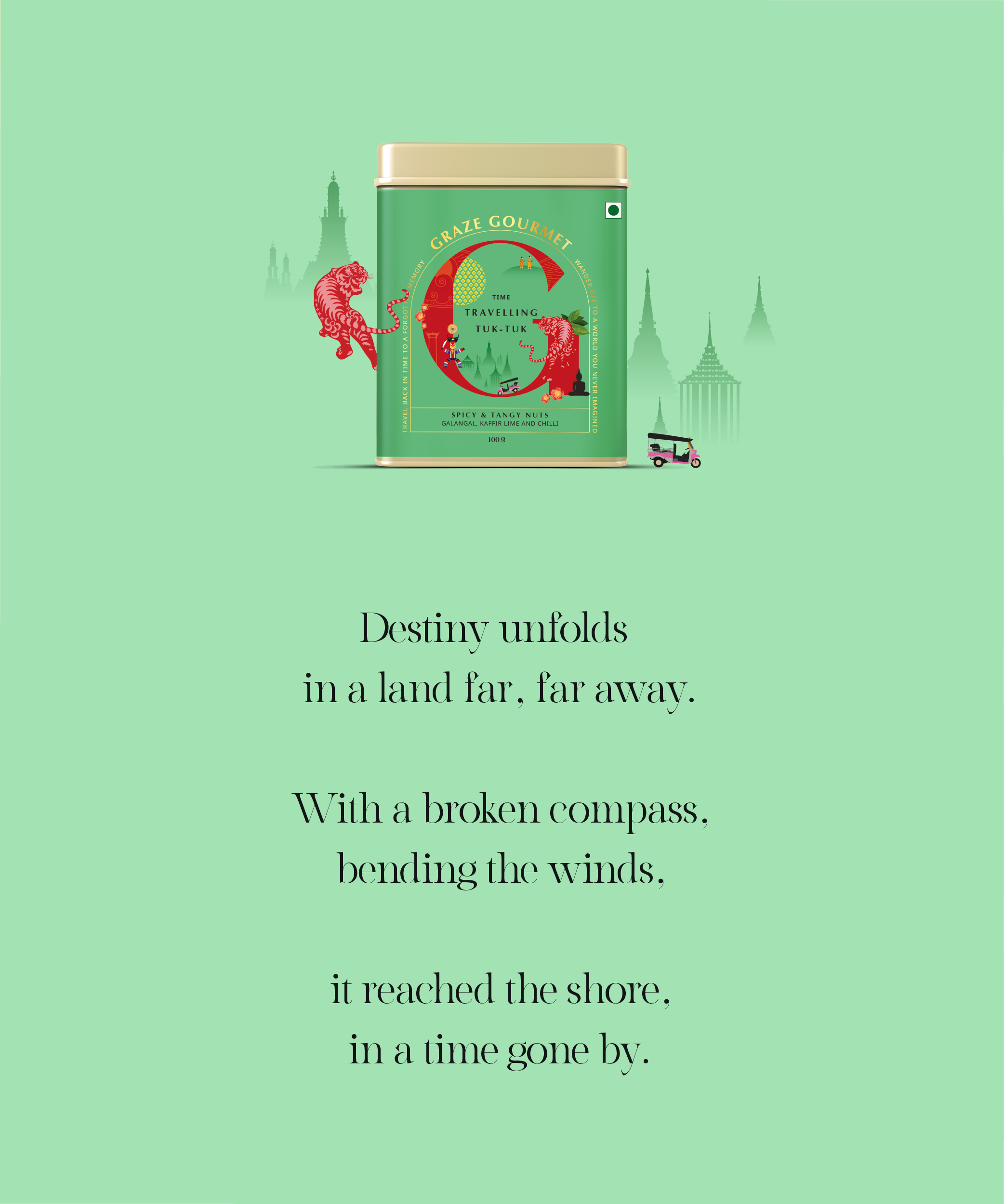
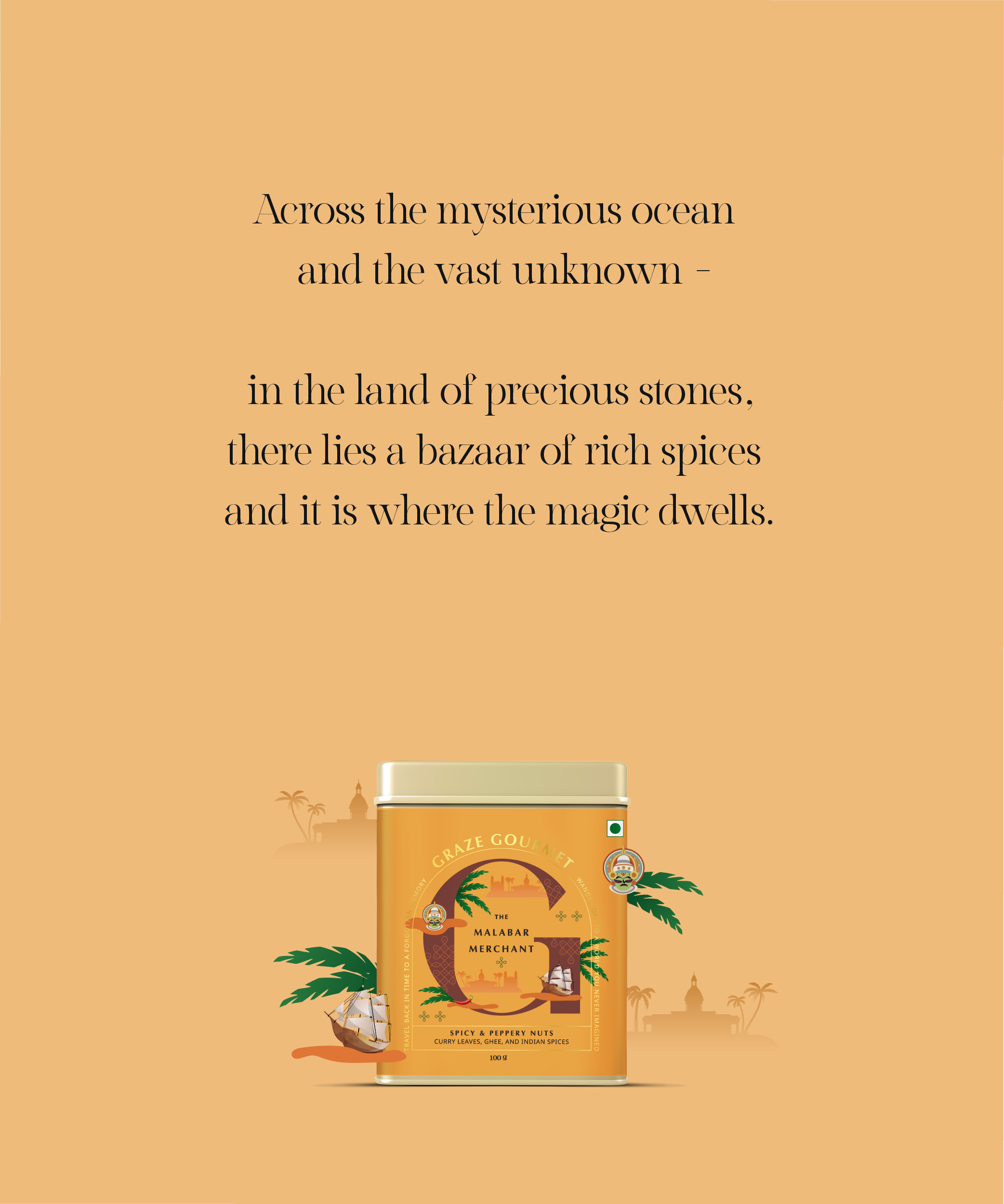
THE WRITING
The writing on the side of the pack had an excerpt, intended to intrigue the reader - to perhaps finish the story, or make their own beginning. Each flavour had it’s own story that carried a whiff of the ingredient origins, with a touch of fantasy.
SOCIAL MEDIA & WEBSITE
The brand communication is varied where it’s a combination of photography, illustration and graphic cut outs. The goal is to make sure that there is a variety in content but still ties up as a cohesive brand with one voice.

An e-commerce business, the website became the first critical touchpoint for sales. We created an experience that brought alive the wonder of imagination, whilst giving their unique product range the spotlight to enable quick sales.