KIRO BEAUTY
NAMING | BRANDING | PACKAGING DESIGN | BRAND STRATEGY | BRAND LANGUAGE | WEBSITE DESIGN
The premise was simple - there was a fabulous opportunity waiting to be seized, and with their cumulative backgrounds, Svah Cosmetics believed they could change the industry standard in colour cosmetics. The important thing is that when we met them, hearing their intentions and expertise, we believed them. The founding team had a robust background in e-commerce, technology, healthcare - specific to women, business, and combined, their powers were everything needed to start up a brand that would redefine how the market perceived this sector. When we got involved, the product line was in the beginnings of its development. We didn’t have a name, and we needed to start from laying the very foundation of the brand.
This project is perhaps one of the best examples in our experience of how design studios and businesses need to work together.
With collaboration, comes clarity. And with clarity of input, comes effective output.
We consulted, debated, brainstormed endlessly, made some hard calls, challenged each other, passionately put forth compelling evidence to swing a decision - and we can all safely say that every decision made, was made with everyone on the same page.


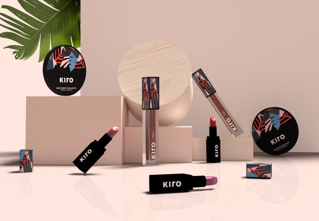
Pictured above: The word mark for kiro, the edgy brand pattern that’s inspired by nature, and on the right is an image of the bullet lipsticks. The idea was for the brand pattern to be graphic and bold, and dynamic such that with every new collection the colour palette could change. Above is the launch colour palette.
The market was brimming with brands of all shapes and sizes.
It was daunting to realise just how much there was to learn. We pondered how to differentiate ourselves in a category that was already overcrowded with so many compelling brands. Thankfully, when in doubt, research gets you out. And that’s exactly where we began.
SURVEYING THE CATEGORY
With e-commerce soon becoming the future of retail, geographical affinities for customers will soon cease to exist, and that will open up the whole world of brands to compete with. It became doubly important to lay a solid foundation that could withstand the porous political boundaries that ‘free worldwide shipping’ would bring along with it. And like most projects, we always begin with immersing ourselves in the category. We like to know who pre-dates us, what they’re saying, and what they look like. We also like to read about their product - influencer reviews, paid promotions or features, customer rants online, everything. We looked far and wide, beyond borders and closer home too.

We made detailed observations on brands, their design, their communication, what they claim, how they began, why they are successful or popular, and what price band they operate in. The market was rapidly changing. Over the course of time it took to finish this immersion piece (roughly 15-25 days), at least 3 new brands had launched worldwide, 1 of which was an international brand that had made an entry into India, and at least 2 were Indian.
UNDERSTANDING THE CONSUMER
We had the good fortune of market research with interviews from groups in tier 1 & 2 towns from the west of India to the north that team Kiro had to arm us with. Being an almost all-girls team, together we detailed and defined the kinds of consumers we wanted to appeal to. We went one step further to narrow down our primary audience - the 27 year old, working girl. We got into her lifestyle, her tastes, her ambitions and dreams.

We listened carefully to hours of tape, talked to as many makeup consumers we came across - friends, family, heck, even strangers. Some members of the Kiro team had prior experience working in the category, and so we arrived at the following key fears that dominated our potential user base.

Her problems:
I am scared of what using makeup everyday will do to my skin.
Natural products seem ineffective.
I don’t feel glamorous using herbal makeup.
GIVING THE BRAND DIMENSION
We had now identified our consumer, understood her problems, and wanted to come up with a range of makeup that was truly problem-solving. We decided it was best to stay focussed on our product truths and own our authenticity. We looked very closely at every aspect of the brand - how the products were conceived, the teams values and parameters while considering formulation, the thought process that went into it, the rounds and rounds of eliminating formulas and ingredients, the personality of the founding team, the actual product itself, all of it.
We could not find a brand
that was all three:
Good for you, Mindful yet effective and Indulgent.
The team decided to build this brand themselves. And these became three pillars on which Kiro was built.

Often brands get lost in the intangibles of their brand universe. More often, they stay stuck in between pages of some beautifully designed and punchily articulated brand book. Here, the brand was determined to make it a reality. We constantly kept validating everything with our actual formulations. At Kiro, we set out to change our customers perception of beauty, her expectations from beauty and thereby her relationship with beauty.

Deriving the Kiro
core ideology
MAKEUP THAT’S
GOOD FOR YOU:
HIGH IMPACT
HIGH PERFORMANCE
HIGH COLOUR
MAKES A DIFFERENCE TO YOUR LIFE
LIVES UP TO PROMISES
MAKEUP THAT’S
MINDFUL
PRODUCT INFUSIONS
CONSCIOUS BEAUTY
CLEAN & NON - TOXIC
CRUELTY FREE
HEALING BEAUTY
ERGONOMIC PACKAGING
NO OVER CLAIMING
TRANSPARENCY
MAKEUP THAT’S
INDULGENT
FEEL INDULGENT
LOOK GOOD
PAMPERING
NURTURING
LUXURIOUS TEXTURE
& APPLICATION
THE DESIGN EVOLUTION
In the early stages of evaluating brands in the category, we were overwhelmed by the sheer number of brands that existed. We knew from the start that e-commerce would be our primary mode of sale, at least initially. And so as a part of our research, we were looking very closely at other e-com first brands as well as at popular e-tailers for beauty. Typical shopping patterns for beauty had changed considerably - customers were buying brands without touching or trying the product, unlike what it used to be in conventional retail. The pressure on visuals became stronger.
The new challenge:
How to stand out in the sea of thumbnails of products online. The environment of e-tail was full of distractions, and so our task became harder.
We observed that most primary packaging was minimalistic. There could be many reasons for this, but we decided to leverage that fact. Additionally, the Kiro team had been doing their research on types of printing, costs of the materials and technology in order to identify what would be the most feasible for us. We decided to try and keep costs as low as possible, so we could invest more in formulations, ingredients, and product efficacy. Being a start-up, it would have been unwise to invest in new moulds. So we explored what we could do with existing moulds, and worked on customising them.
We started with exploring the physical design language that we believed worked best for the product & brand, and represented the brand values in 3 dimensions.
In parallel, we were also coming up with names for the brand, that met the parameters of what we wanted it to stand for: Our three pillars.

The chosen form language
Bold, solid and yet simplistic, this selected form language aptly represented the kind of product Kiro would be making: Reliable, Clean and Luxurious.
The Kiro team got cracking on identifying packaging that was similar in form-language. Since custom moulds made little sense, we decided to aggressively explore a visual style that could make the product stand out. It needed to be eye-catching, without being tacky. It needed to look premium, without it being expensive. And this was the hardest challenge. After selection of a basic container style, the team increased the product weight, evaluated how the product opened, shut, felt while using it, made tweaks to the finishes and only then was this exercise concluded.

Then began our journey exploring the design for the primary packaging.
Below you see, the final selected concept thought. A rich combination of elements representing nature, art and science.


Along the course of the way, we found success with the availability and registration of the name ‘Kiro’. So while we put our products into production, the design team moved on to creating the rest of the brand assets, defining the communication and secondary packaging.

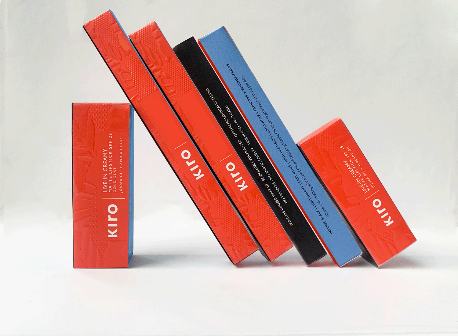
Above, the entire set of cartons with the signature graphic taking form of a texture. Since all products have not launched, some names have been concealed at the moment. Check back for more in the coming months.
Like the product, we collectively decided to use the colours of the launch palette prudently on the secondary carton. This was so the impact of the print on the primary product was high. Instead we used print techniques to create a tactile version of the print, with a high gloss. The contrast between the glossy outer carton and the matte, heavy primary product was more pronounced.
The bold but measured use of colour became central to Kiro.
Each face of the carton was designed deliberately to be a different colour, so while stacking the products, it could create different colour blocks and make for an attractive visual. While the launch was planned to be primarily online, eventually this would prove to be an asset for when physical retail came into being for the brand.
Above: The colour-blocked cartons for some of the products. Since all products have not launched, some names have been concealed at the moment. Check back for more in the coming months.
The distribution of educational information across the faces is represented below.

THE WEBSITE
Before we actually began to design the website, we took a detailed look around at the things that we, as users, appreciated in websites that existed. Made our observations and discussed them at length internally. The website had to represent the brand’s values of being customer-centric and innovative.
If it didn’t impress us, it would impress no one.

Empathy was an important part of our process. At every step of the way, each one of us kept our consumer in mind, and put ourselves in their shoes. We were a part of the target group too. So if something did not meet our standards, address our own issues, we knew it would not be good enough to put out into the world either.
INFLUENCER GIFTING
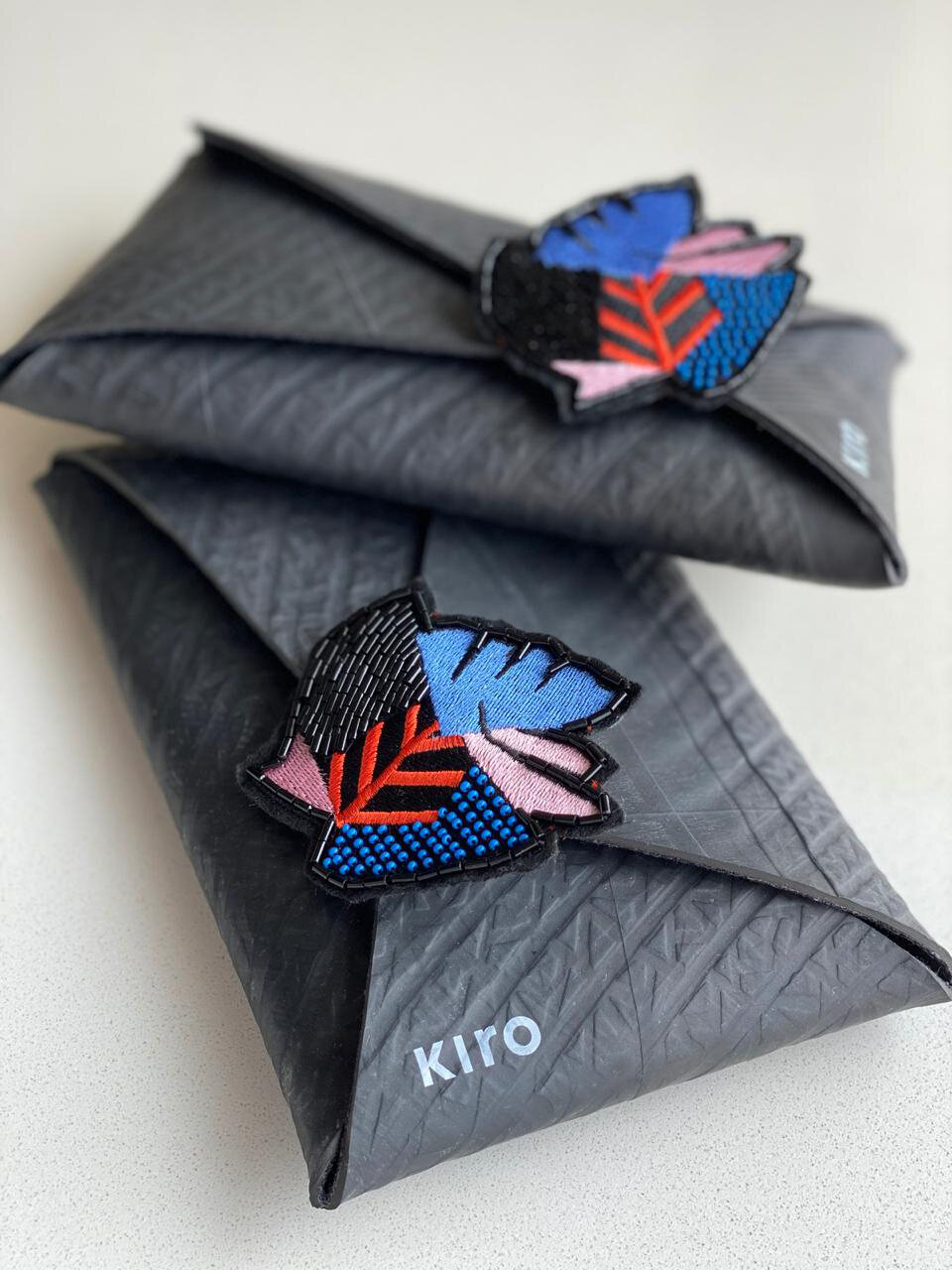
The final influencer gifting pouch.

Packed and ready to be despatched.
As a part of our launch activities, we wanted to share our products with some influencers and thought leaders that could help introduce the brand to consumers. While the usual routine is to package products with lots of literature into boxes which are often thrown away, we wanted to reduce wastage and leave people with a significant impression of the brand. After doing some hunting, we chanced upon the idea of creating an upcycled tyre pouch - while this met our brand requirements of being mindful and effective, it fell a little short of being indulgent and glamorous. We put our heads together and thought to create a beautifully detailed embellished lapel pin, that was reminiscent of our predominant signature print - something we knew we would love to use ourselves, and would add a touch of glitz to the up-cycled tyre pouch.
EXTENDING THE BRAND UNIVERSE
While the branding, packaging and launch was out of the way, we were presented with a new problem. How does the brand live on social media? While all the brand assets were clearly defined, we found that social media needed something more dynamic, something that leapt off the brand core, but took it to a new, more dynamic space. We evaluated the kind of messages, the kind of content that was typical to the space, and added a touch of the Kiro brand of sass to it.
