Not Rocket Science
IDENTITY | packaging design | VISUAL & VERBAL LANGUAGE | communication pegs | website design
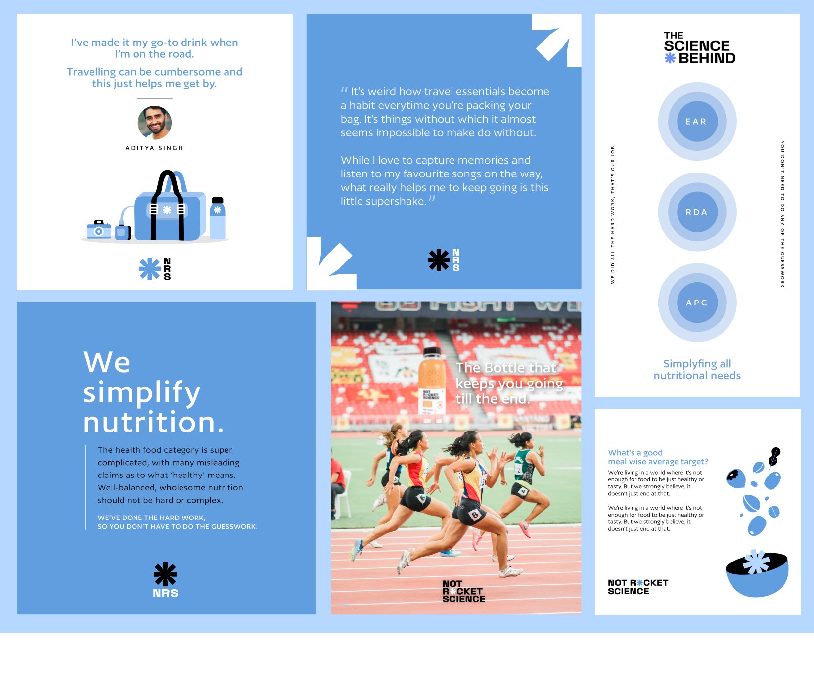
The health food category is complicated. Crowded with misleading claims of what “healthy” means, a cocktail of fads that make the space confusing for consumers to navigate through, all leading to an industry that ends up doing more damage than good. Well-balanced, wholesome. nutrition should not have to be hard or complex. Not Rocket Science was built on the notion that nutrition can be well-balanced, clean and convenient. But most importantly, that it can be simple.
The Not Rocket Science logo looks at bringing the asterisk, a symbol generally used to indicate the existence of tucked away information, to the front and centre as a point of emphasis.
All the details laid out on the table, so you don’t have to dig around the fine print for it.
SURVEYING THE CATEGORY
Before we could create a brand foundation, it was important to understand what our competitors were doing. Analysing and understanding how they present themselves would help us know how we want to be perceived. We examined other brands in the healthy beverage and food areas, not limiting ourselves only to direct competitors.
Both Indian and international brands fell within the spectrum of our consideration. We also made a note to look at brands outside the category that tell a story through their branding, packaging, and communication, to see if there was something to learn from them and perhaps incorporate that into our approach.

We made detailed observations on brands, their design, their communication, what they claim, how they began, why they are successful or popular and what price band they operate in. Based on our findings, we worked on creating the brand personality and the Golden Circle (the what, how and why) for the brand. This helped us garner a better understanding of what the brand core is.

DEVELOPING THE IDENTITY AND EXTENDING IT THROUGH PACKAGING


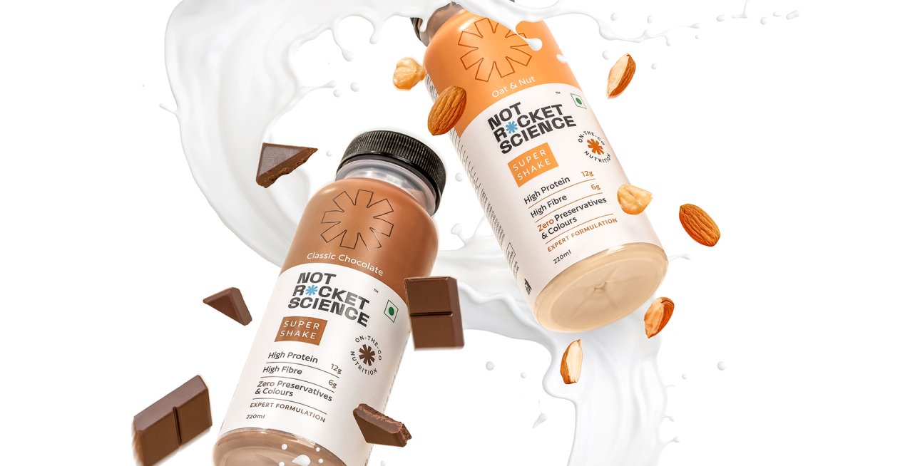
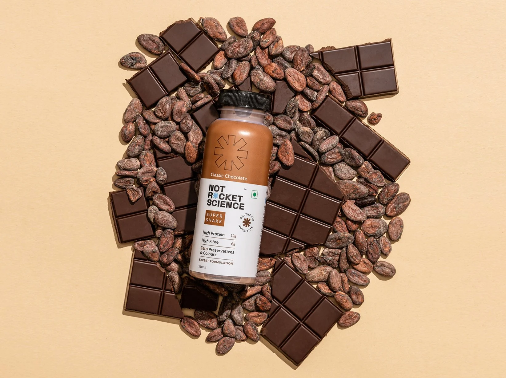
We wanted the packaging to look clean, systematic and simple. A band across the top of the bottle along with the brand asterisk denotes the flavour range of the super shakes. It was important for us to go this direction in order to make sure the product looks unique compared to everything else on the shelf.
The brand colour being blue was brought forth through the box within which the products were to be delivered.


BRAND COMMUNICATION AND WEBSITE

ICONOGRAPHY


VERBAL LANGUAGE
While being experts on nutrition, it was important to never come across as know it alls, but at the same time we also didn’t want to sound goofy and frivolous. The brand language aims to always sound authentic and never arrogant.

WEBSITE design
Being a digital first brand, we made sure that the clean and modern communication translated well onto the website.

