THE GOOD BUG
IDENTITY | BRANDING | packaging design | VISUAL & VERBAL LANGUAGE | communication pegs | DIGITAL LOOK AND FEEL

We’re conventionally made to believe that bacteria as a species only and only can bring about a negative connotation. Strangely enough, millions of bacteria co-exist with us within our body. They help in more ways than we can even possibly even imagine. From helping in digestion to balancing a better mood, these good bugs have made our body their home and do these things in return and more for us. The good folks at the good bug believe that nurturing your microbiome is the way to a healthy being.

There’s a universe inside of us. A complex biodiversity working together to make sure our body functions the way it does. These little bugs while naked to the eye, exist in millions and are a big part of us. They work like clockwork, in almost a magical manner. There’s a balanced co-existence between us and the microbiome which is only essential.With the good bug, we aim to celebrate the world that lives within us.


We wanted to create a system where the microbes would exist within a petridish of sorts and rendered it in different ways before settling on what worked best.
LEANING IN TOWARDS SIMPLICITY AND WONDER


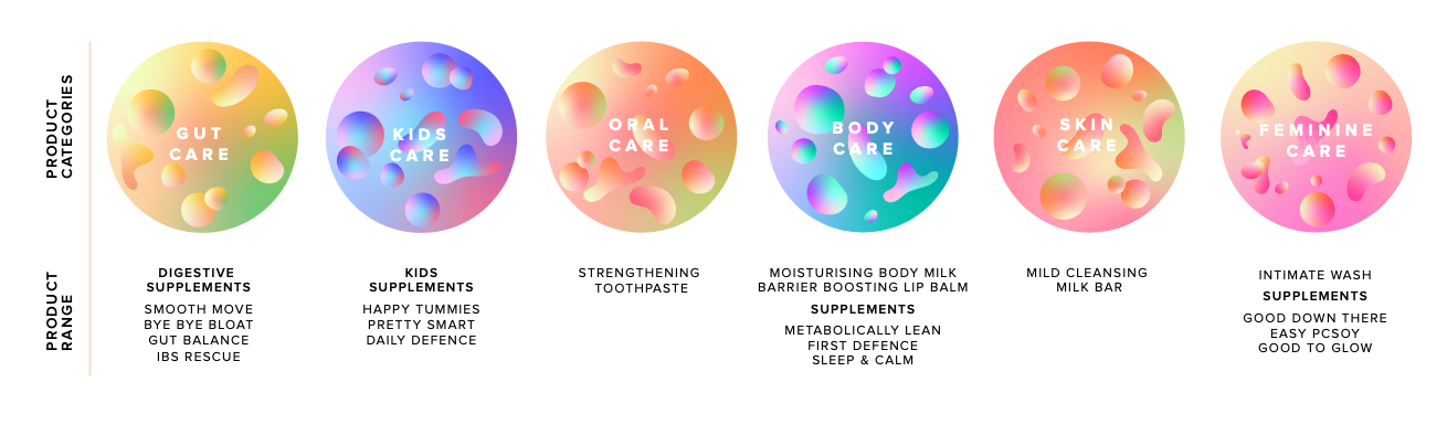
Microbes despite being tiny are visually complex. We wanted to pictorially represent them as simple blobs of slightly varying shape. This would make them look a bit more approachable and help extend across the visual language.
A circle with a different arrangement and colour palette put together to represent the different categories which the brand works towards.


BUILDING THE VISUAL LANGUAGE
The petridish was taken as a starting point and extended in a multitude of ways to bring the world of these microbiomes to life.

There’s a magic of sorts in the way these organisms help us function. The gradient and a mix of these colours helped us do so. Using the petridish to interact with people, products and the world itself was the first step we took forth in building the visual communication for the brand.


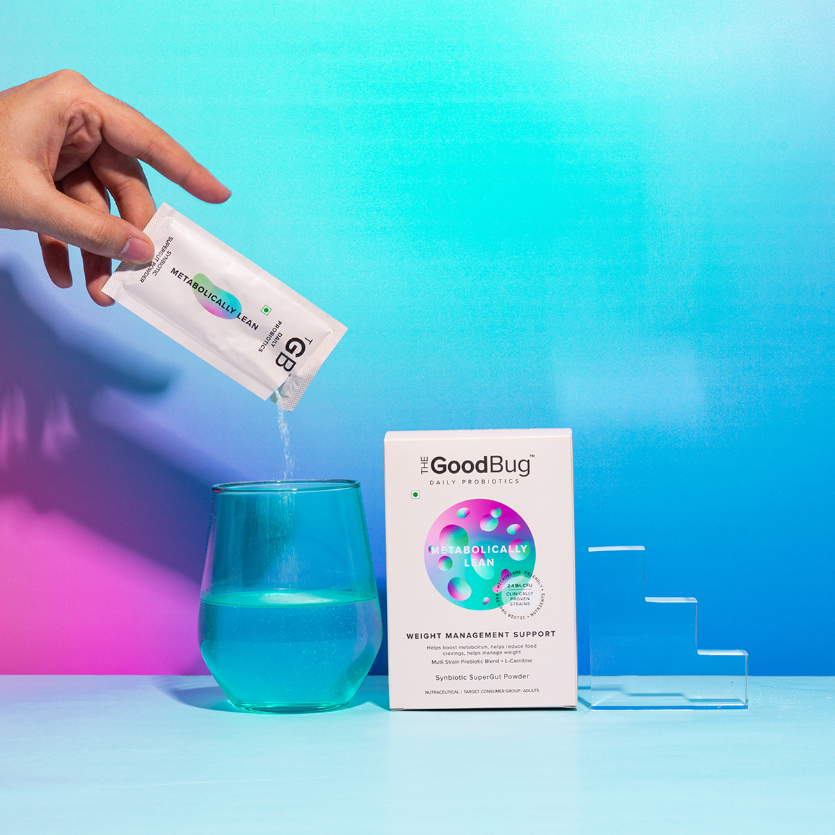
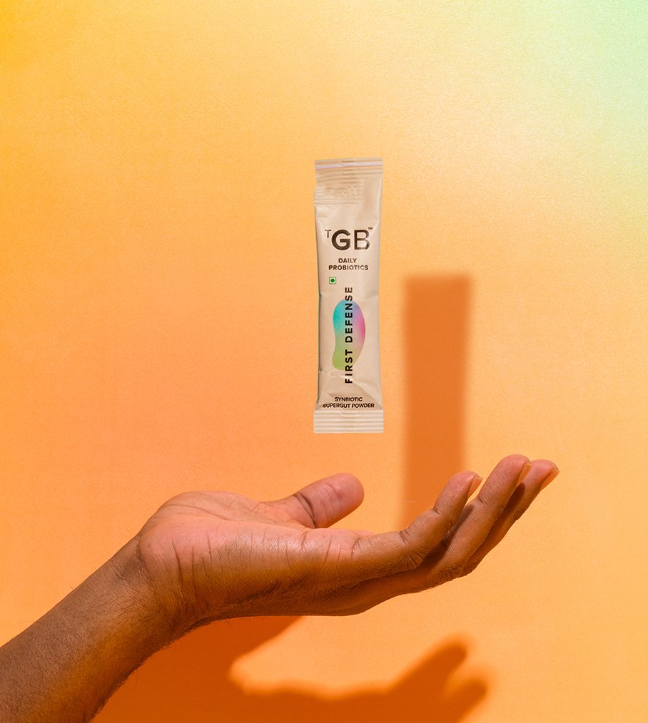
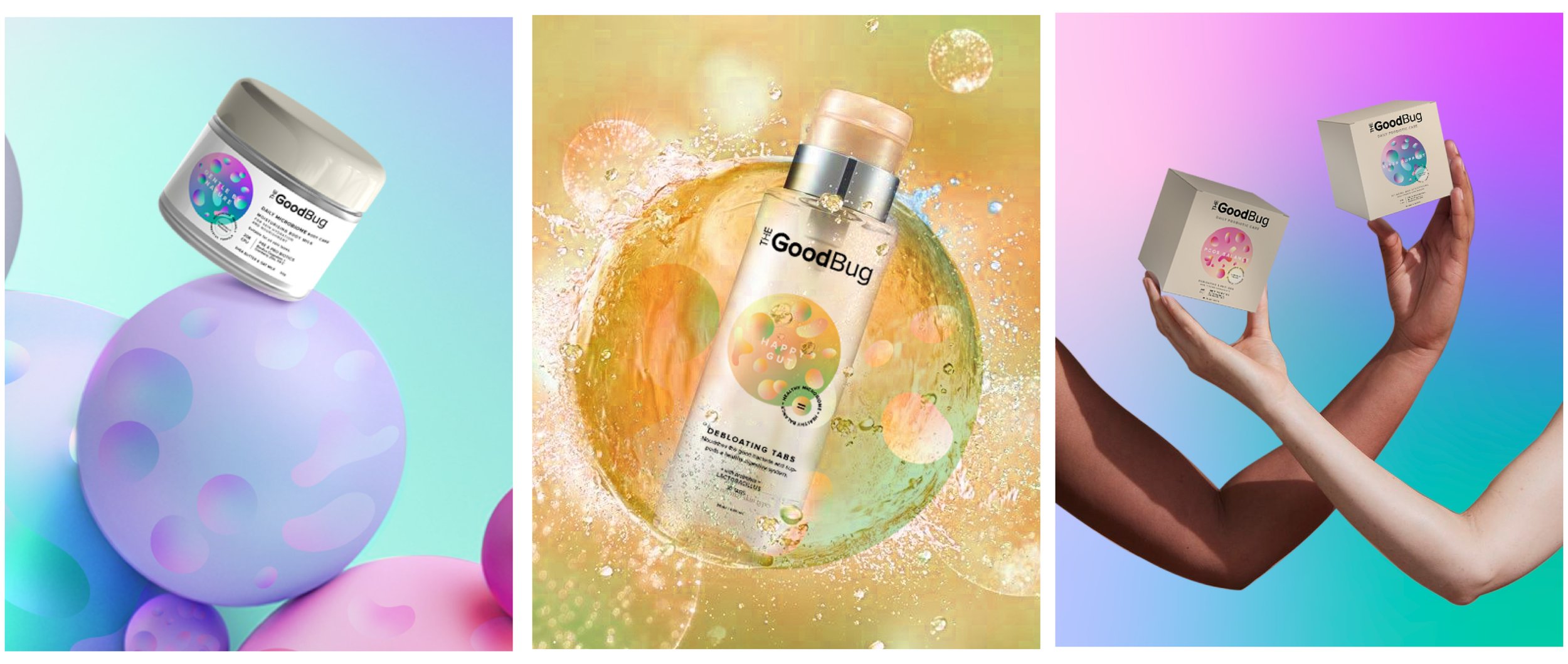
PACKAGING DESIGN
The packaging was meant to be simple, modern, clean and memorable. Since the brand would exist across different verticals from haircare to skincare to gut care; we wanted to build an architecture which could be easily extended and still look consistent.

We intended on naming the different categories in a functional manner however the individual products were named in a creative and approachable name which would highlight the intended use.


VERBAL LANGUAGE
Microbiome Care is still making it’s way and there might not be enough awareness on it. While the brand took an expert stance, it never intends on seeming complicated to understand. We made sure the way we communicate ourselves is- inquisitive, witty, forthcoming and humane.

WEBSITE LOOK AND FEEL
Being a digital first brand, we made sure that the wonder and curiosity of the microbiome world translated well on the website too. Through interactions, product photography and most importantly having a humane element wherever possible.

