CUREVEDA
When Bhavna Sharma, co-founder of Cureveda, had first approached us, she had launched not so long ago with a wide range of therapeutic products. Her products were problem-solving and completely herbal, and vegetarian. They came from Baidyanath pedigree, so had access to some of the best research and ingredient sources possible. So ‘What’s the problem?’ we asked.
As most companies do, Cureveda grew from an idea, to a brilliant, progressive and modern start-up in the nutraceutical space. With exceptionally astute co-founders at the helm, we were confident that the brand would maintain product standards, and continuously challenge the status quo. However, we soon discovered that Cureveda was about to launch newer products, that didn’t quite fit their pre-existing product line. Which means it required a revisit of their product architecture - and perhaps even design.
Studio Glyph began by understanding the Cureveda past product - the journey they travelled to get to where they had. And we looked on into their imminent future to gauge what they had planned. Bhavna Sharma was bursting at the seams with new product and business ideas. We had to find a way to future-proof their brand, and ensure their competitive edge was well-represented through their brand language.
SURVEYING THE CATEGORY
Like most projects, we always begin with immersing ourselves in the category. We like to know who exists, what they’re saying, and what they look like. We also like read about their product - influencer reviews, paid promotions or features, customer rants online, everything. We look far and wide, beyond borders. After all, with e-commerce the future of retail, geographical affinities for customers will soon cease to exist.

EVALUATING THE EXISTING BRAND LANGUAGE
Whilst we began to dig deep into the product range(s) that we were to design for, we first decided to evaluate the existing brand visual language in order to decide what to keep and what to let go of. After all, the brand had invested time, energy and money to establish themselves - we were looking for ways to retain familiarity and leverage this.

THE BRAND LANGUAGE
What you see below is a super quick truncated version of the amount of moodboards we explore before we zero in on a direction that the brand language can take. All of it heavily dependent on what the product ranges promised, what the brand stands for, it’s values, and of course who our consumer is and what would communicate most effectively with him/her. What evolved from here, was a visual system for the brand, and enough scope to distinguish one vertical from another, yet keeping it from the same parent company.
Once we agreed on an approach, we then proceeded to explore directions for the product vertical that was launching the soonest - The beauty range.

Exploring the visual directions
DESIGN EVOLUTION


The Pattern
Precise geometry but arranged organically, to symbolise the technology and discernment that’s required to take hard calls when it comes to balancing the best formulations and the highest degree of efficacy.
And this is Cureveda’s specialty.
The selected packs. Version 01.
After this, we tweak, refine, adjust, modify,
realign, shift, discuss, on repeat, until we are fully satisfied…

FIGURING OUT THE COLOUR EXTENSIONS
Once we had arrived at a label design for the front, we needed to ensure that the colour logic worked for the beauty range of products that Cureveda had planned. We used warm tones for womens products, cool tones for men and a mix for gender neutral. The foil colours changed across the sub-sets, along with slightly differing colours for the elements versus the backgrounds.
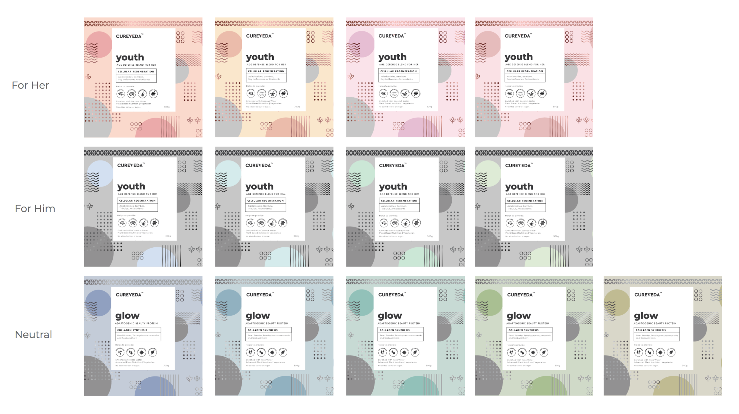
THE FINAL PACKS

“It would not be a complete exaggeration to say we spent as much time on the back, as we did on the front. ”


THE GENERAL WELLNESS RANGE
For the ‘General Wellness’ range, the third vertical in the gamut of innovative products that Cureveda had envisioned, we introduced new system of visual elements, along with some familiar ones from the beauty category above. You can see a clear and distinct brand language emerge.
Below is an image of the first and recently launched product of the range: Sparkle.


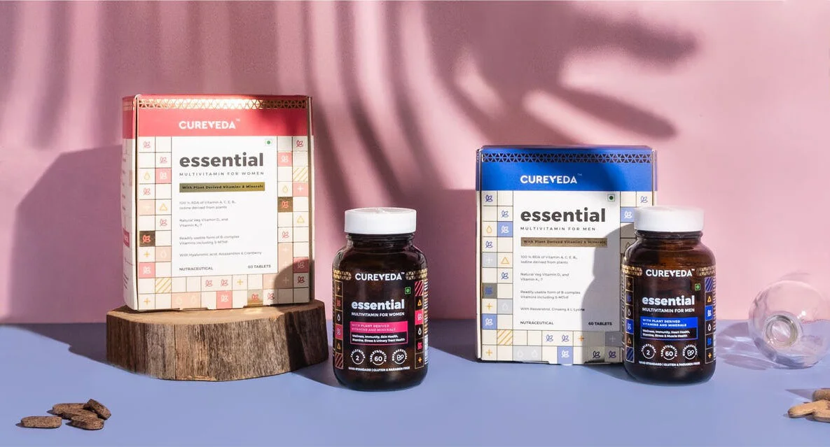
Image courtesy Cureveda