Itti eco-friendly cleaners
Naming | brand strategy | packaging design | brand language | communication pegs | website design

Life has its fair share of mundane moments. The chore of cleaning definitely makes its place on the list. But when Artevet Hygiene came to us with their product which happened to be a little tablet, which when mixed with water turned into a solution for cleaning any area, it really poked us to think that cleaning need not be looked through the same old lens. In fact, it could be something you look forward to, find joy in and enjoy. And life is about enjoying the little things, be it a thing as little as this tablet. And that’s why with itti, we decided it’s time to add a little zing to our clean-ing.
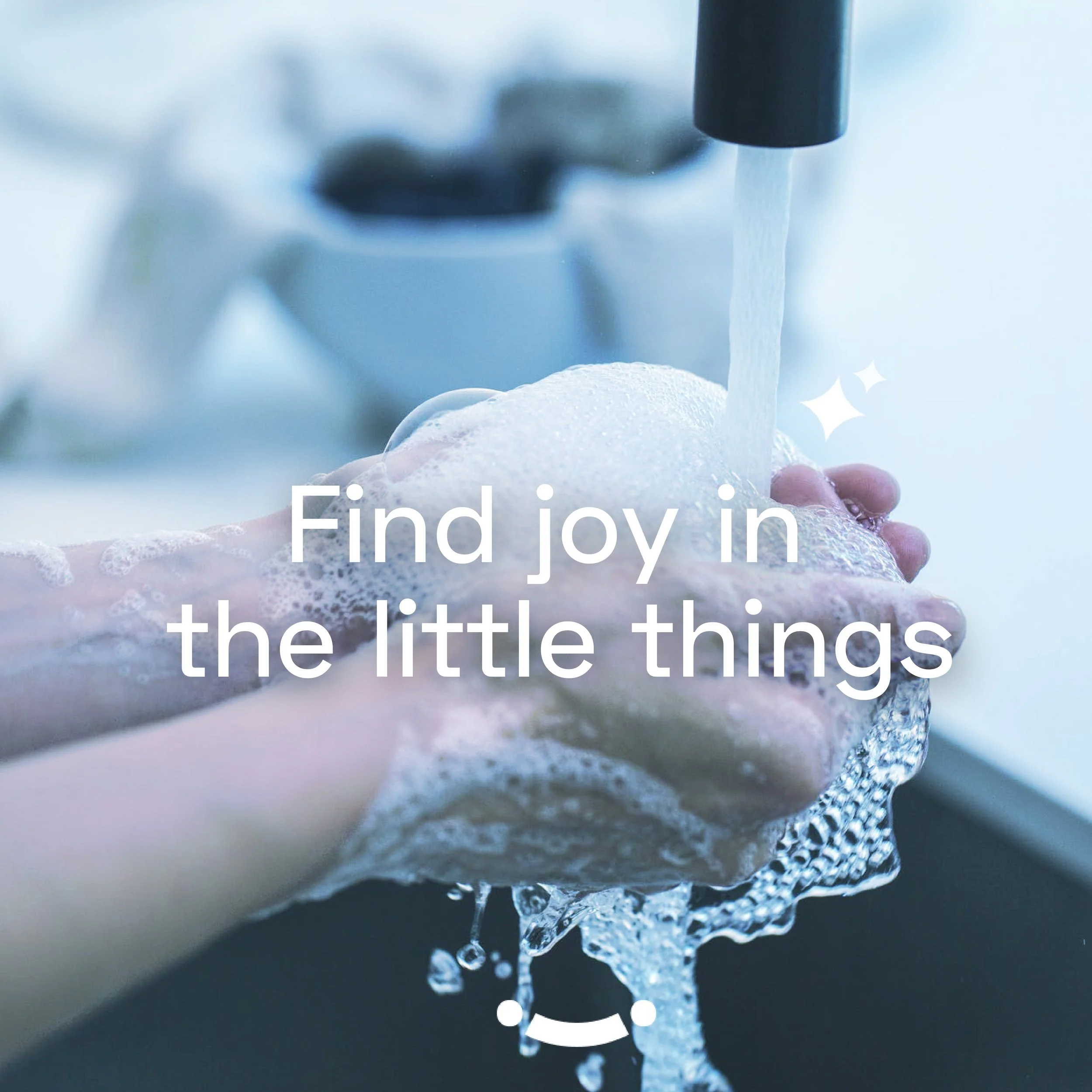
At it’s core, itti is all about finding joy. It could be through something as itti bitti as the tablets too! And cleaning as an activity, might not be considered something enjoyable but there’s a lot of fun to be found in anything and everything.

We took a look in our own homes and…
Saw that cleaning products were almost quite mundane. They always looked functional and gave out a feeling that cleaning is something you’re doing for the sake of it being done. This made us realise how we could differently position ourselves by adding a bit more zing to the brand.
SURVEYING THE CATEGORY
There weren’t other brands who were go for this approach. A predominant share in the market was occupied by other big players from the FMCG category. And it really was important for itti to distinguish themselves from the others in terms of the way it presents itself and communicates.
We made sure to create a brand which while looks super fun, it doesn’t lose out on enforcing the function. The product also was unique in terms of using a little tablet which also made it a lot more eco friendly, space friendly and pocket friendly.

EXPLORING THE VISUAL LOOK
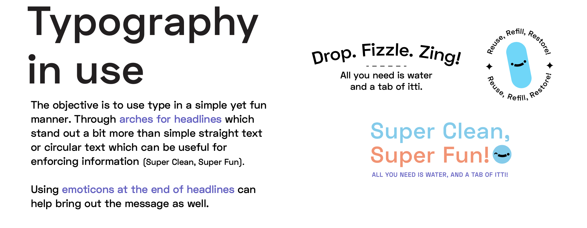
We explored far and wide before landing with the final designs. The level of quirk, how sleek and smart the brand should look, the colors it uses, the typography with which it can express itself. It was a lot of tweaking and turning before we could strike the right balance.
Finally we managed to get a balance between fun, quirk, function and messaging.

Pictured above: The brand mark was meant to be simple with a slight quirk. The second ‘i’ in the logotype is used as a starting point for the visual language.

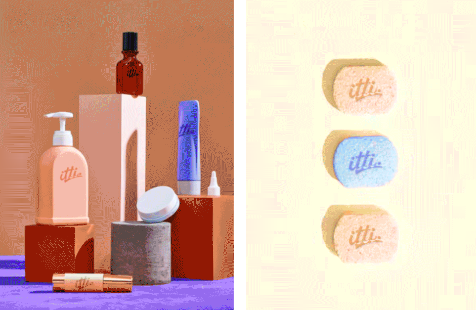
Pictured above: the itti spray bottle and pouch pack collection across all 4 categories.


Drop Fizzle Zing
:)
That's the itti way!
:)
Drop Fizzle Zing :) That's the itti way! :)


‘Packing it’ a certain way.
We wanted the packaging to look striking, friendly, colourful and fun. Every category has a little emoji to go along with it which also is carried on the spray bottles of the respective colours.
It was important for us to go this direction in order to make sure the product looks unique compared to everything else on the shelf.
The brand colour being purple was brought forth through the box within which the products were to be delivered.


The idea was to work with a visual language around the smileys. Having them on the pack being cropped in a bunch of ways. This just helped the brand reinforce their visual language.
Even the manner in which products were named was sleek yet fun- Bathroom Bliss, Floor Fresh, Glass Glow.
The intention was always to keep things simple, because that’s what itti was all about. You just need a tab mixed in water and you’re ready to clean.

The product shoot for the brand


The brand communication was intended to be on the playful side of things too! We worked with typography and illustration by making them simple by adding all the life we possibly could through the smallest of things, keeping the itti bitti essence at heart.


THE WEBSITE
Since the brand’s most crucial touchpoint was it’s website, we spent a lot of time debating, discussing, brainstorming what it should be like. The website needed to bring forth the fun that cleaning can be, emphasise the good that the brand is doing and overall capture the essence of to enjoy something as mundane as cleaning

