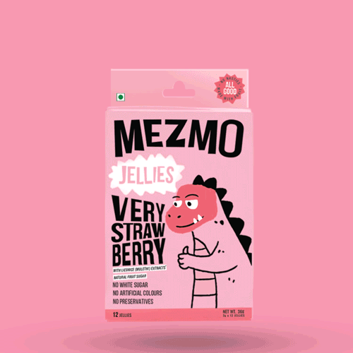
MEZMO CANDY
NAMING | BRANDING | BRAND STRATEGY | BRAND LANGUAGE | PACKAGING DESIGN | WEBSITE DESIGN
Despite how sweet candy is, it’s notorious for not being the healthiest snack. Mezmo came to us with a very important mission; changing the image of candy forever. Their team devised confectionaries which did not compromise on the yummies but made sure they’re free from all the nasties such as artificial colours, added sugars or any other evil additives. Which got us thinking, if candy can be healthy then anything in the world can be possible. There’s no defined way of doing things and more than likely, there is no right or wrong.

Embracing Imperfections
That’s what got us to the identity. One that embraced imperfections, went beyond and challenged the norm and did something out of the ordinary.

THE BIG BRAND IDEA
WE’RE AN INNATELY CURIOUS BUNCH
Remember the last time you looked at a cloud and thought, ‘Is it a rabbit in the sky, or a train taking a turn towards the infinity. We let things be whatever we wanted them to be and built a world where anything was possible, where swords were fluffy and lava was purple. One where there were no wrong answers, and everything was embraced to be whatever you wanted it to be.
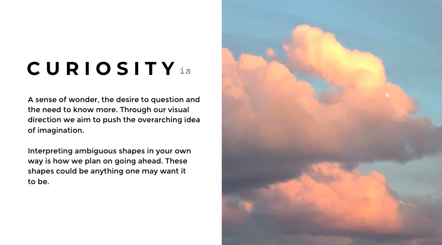

Let it be, what your imagination wants it to be.
“Is that a lion?” he said. “No! Looks like a monkey to me.” said she. They both took a moment and said together, “Could it be an elephant?”
We used the shape of a blob as a visual device. A blob which could be interpreted as anyone and could be anything. We made sure to place the blob in the same position and in the same, then draw over it and see what all could it possibly turn into.
THE DESIGN EVOLUTION
We knew for a fact that the Mezmo products will cater to the kids, the packaging and the brand language needed to be such which appeals to them. We made sure its playful and embodies fun. But at the same time, we didn’t want to alienate an older generation. Candy which decided to do something different from the herd was quite a rebel, so we made sure to add a bit of spunk to the brand, give it a little edge and made sure it’s such that it hits the sweet spot for both age groups.

We scribbled, sketched and explored!
A bunch of different shapes, objects, animals, magical creatures. All in order to find the perfect fit for the packaging design.


The final influencer gifting pouch.
We decided to create our own set of letters, something which would be own-able for Mezmo as a brand. What started out as a logotype soon extended into a typeface with its own set of quirks.
THE WEBSITE
Before we actually began to design the website, we took a detailed look around at the things that we, as users, appreciated in websites that existed. Made our observations and discussed them at length internally. The website had to represent the brand’s values. If it didn’t impress us, it would impress no one.


We wanted to make sure the e-commerce experience was a lot more fun with this website. We filled it with animations, illustrations and our signature typography.
