NOTO - THE ICE CREAM THAT LOVES YOU BACK
Let’s admit it, we all love ice cream. But in this health conscious information world, calories don’t just mean desert but are looked upon like ‘deserters’. Studio Glyph partnered with Varun and Ashni Sheth to create a brand from ground up that challenged exactly that - how can ice cream be low on calories, and yet uncompromising on flavour and textural experience?
Beginning with the brand name, to its personality and visual language for both, print and digital media, Studio Glyph worked in close collaboration with the Noto duo to develop a brand language and packaging that pushed the boundaries of perception within consumers minds.
THE IDENTITY & WORD MARK
Simple, bold typography in a sans serif typeface. When used in its primary application - the packaging; along with the illustrations, it is offset and softened in its appeal. The logo is used in our brand colours, black & white on the packaging. For such a colourful range of products, keeping the logo in black help retain the attention to the brand name.


It’s always a good idea to have more than one way to express the identity, for cases where you have space limitations (especially in packaging). The arched version of the logo made good use of the visible surface area of the tiny 120 ml cup that carried not just the name, but a whole host of other important information that needed to be said.
THe packaging
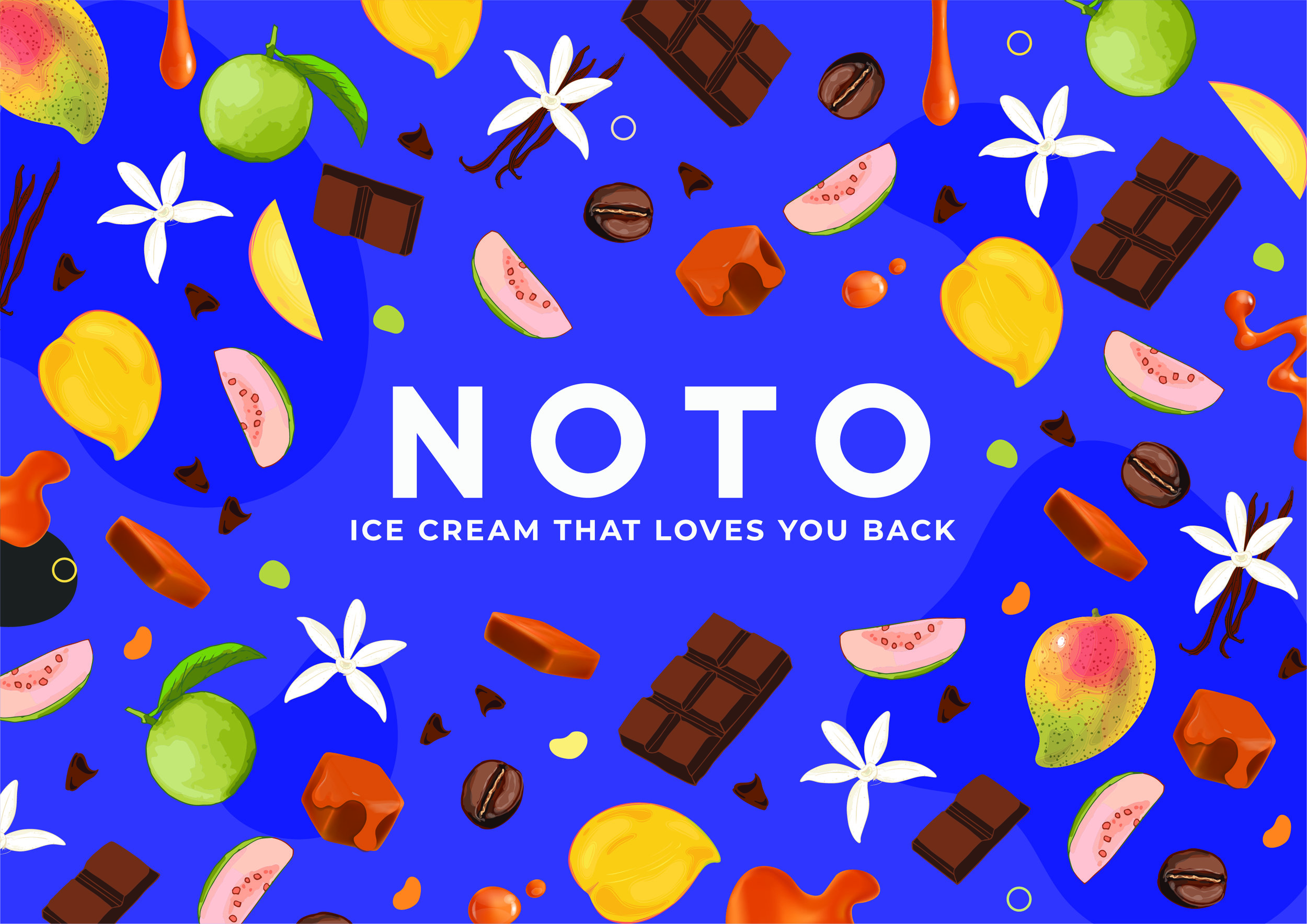
Rooted in the brand intent, the concepts for packaging started with the truth: The range of products. We delved into exactly how these products were made - the precision of science, a chunk of natural ingredients, and a whole lot of thought. We surveyed about 100 peoples expectations of what they wanted from their healthy snack, and what we discovered wasn’t surprising. That taste comes first. And that was what our packaging simply had to convey. After many design explorations, the result was a combination of months of deliberation and detailed work. Our packaging accommodated our consumers foremost desire when they have a craving for dessert - High on flavour. The health benefit is an added bonus.


We created icons for each key USP of the product that go on the back of the pack for easy consumption in a busy retail scenario.