Nova Nova
NAMING | BRAND STRATEGY | PACKAGING DESIGN | DIGITAL ASSETS | BRAND LANGUAGE
The good folks at Waffle House have been serving waffles and a lot more since the last few years. Not only do they bring the world of food to you, but also experiment, re-invent and create something ever so special. They had had come a long way in terms of their product offering from where they started and wanted to bring about a new identity which stayed true to who they are.
Now Nova (Nova being Latin for new), focused on innovation and discovery. Be it discovering old favourites in new avatars or discovering entirely new inventions. Newness was at the heart of it all. And that’s where the journey for their visual identity began.

The Nova Nova brand mark has a ligature connecting the letters ‘N’ and ‘V’, recreating a pathway; a road for adventure and discovery.
We also wanted to write the two words albeit the same in a different manner, as there is newness in everything the brand has to offer.

We intended for the logo to be simple, timeless yet memorable. Something which can work across a range of products, yet spark a sense of curiosity.

While there weren’t many brands who happened to have the same kind of variety in their range which Nova Nova had, there were more than a handful who served similar purposes across categories such as gifting, indulgence, healthy food and so on.
We observed how the other brands placed themselves and how we could position the brand to stay away from the clutter. The discovery we made here was the fact that a majority of the brands focused on the product itself and not so much on the personality.
SURVEYING THE CATEGORY

We made detailed observations on brands, their design, their communication, what they claim, how they began, why they are successful or popular and what price band they operate in.
UNDERSTANDING THE CONSUMERS
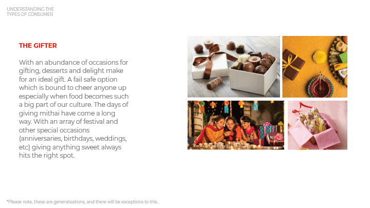
The brand catered to a number of different customer sects ranging from the gifter to the experimental buyer to the impulsive one. We kept all of their needs and preferences in mind before diving into the design stage.

Based on the customer types, we worked on creating the brand personality and the Golden Circle (the what, how and why) for the brand. This helped us garner a better understanding of what the brand core is.
THE DESIGN EVOLUTION

The curiosity to discover the unexplored and journeys through the new laid the foundations of our design process. To transport people to a wonderland that evokes curiosity and and offers a sense of adventure through food is what stood at the brand’s core.
Then began our journey exploring the design for the identity.
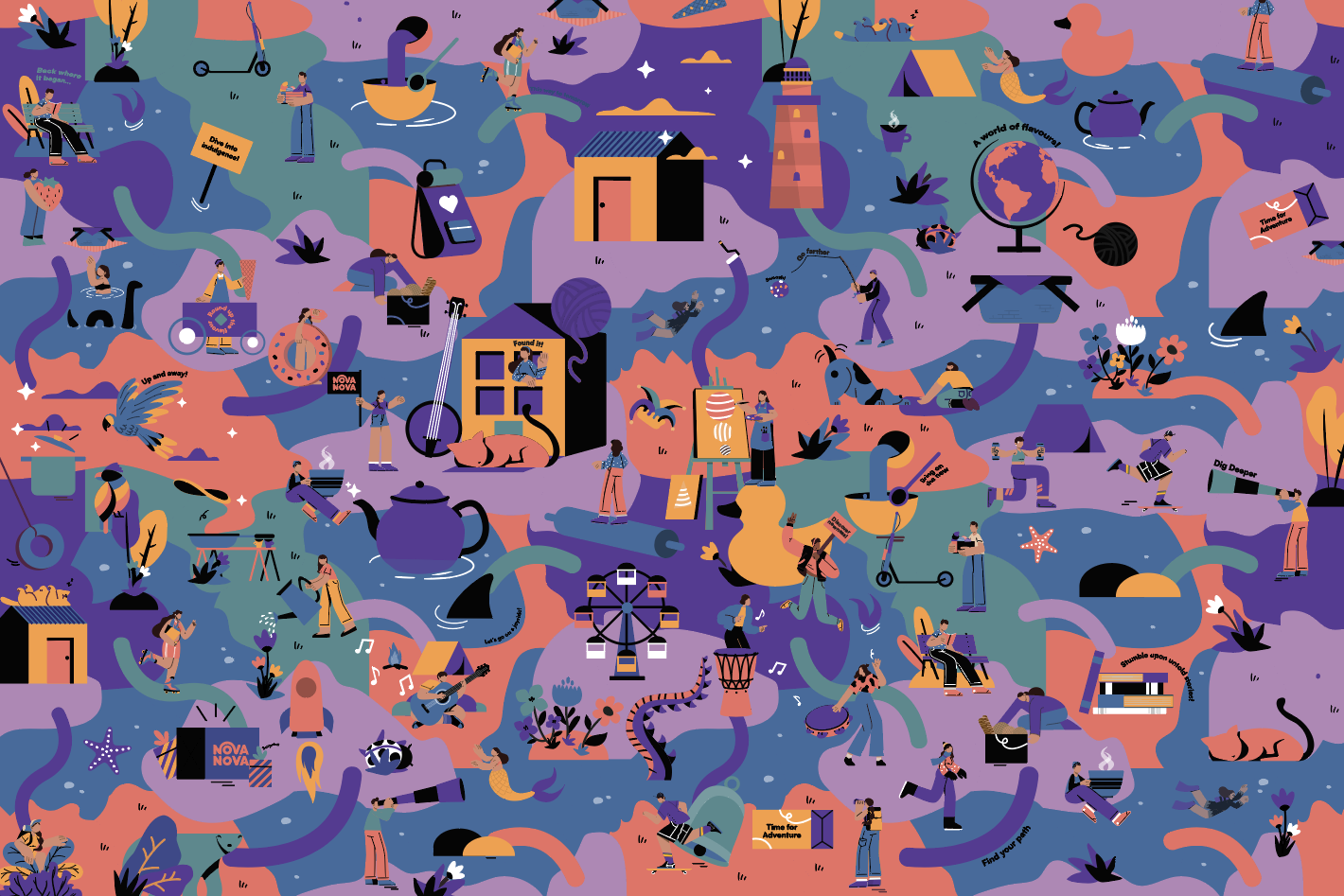
We created a seamless master illustration- a landscape with a warped perspective. One with unicorns and rocket ships, with life sized rubber duckies and never seen before food innovations. This created a base for the packaging and communication language for the brand. Where the illustration elements were arranged together to create a unique sense of newness for the brand.

The product packaging is done in a manner where despite the massive portfolio we’ve kept things simple. Depending on the product category the illustration switches and a hint of flavour is given through the colour palette.


The master illustration had all the given elements which had been dispersed into various packaging along with communication. The blob is made in a dynamic manner and depending on the size of the word, the size of the blob is altered.

The brand communication is varied where it’s a combination of photography, illustration and graphic cut outs. The goal is to make sure that there is a variety in content but still things tied together.


Above: The iconography is done such that the illustration and the typography merge. The key message from the iconography is highlighted through the text.

The communication style has a varied manner of execution where all different categories are covered but still a consistency is maintained throughout.

The packaging illustration has a seamless feel with the illustration, with a lot more of the elements on the two ends along with the mandatory information.

And finally, we shared the new look with the world!