ORIMII SKINCARE
IDENTITY | BRANDING | packaging design | VISUAL & VERBAL LANGUAGE | communication pegs | DIGITAL LOOK AND FEEL | WEBSITE DESIGN & KEY MESSAGING
India’s first pregnancy-focussed skincare brand, that’s also feel-good, Orimii’s founder Sneha Agarwal had a very clear vision when she started to develop her product line. From the get go, our core consumer was ‘expecting mothers’, already grappling with dramatic changes in their body and state of mind, we asked the question: why then should self-care be yet-another-danger to be wary of?

THE NAME
Inspired by Ogimi, a village in Japan that is known for longevity. Inspired by this village and what it stands for, we arrive at an idea about calmness – one that comes from knowing that things will be okay in the end, and you’re in for a long and happy life.

From the get go, our core consumer was ‘expecting mothers’, already grappling with dramatic changes in their body and state of mind, we asked the question: why then should self-care be yet-another-danger to be wary of?
THE LOGO
Our logo comes from the thought of being comforting, simple and approachable to our consumers. The rounded curves of each letter bring out a gentle softness that tie back to the honest, empathetic nurturing nature of the brand, while the overall simplicity of the logo emphasises that we as a brand are functional, simple and safe.

THE CUSTOMER
Our customers are well-read, well-researched, and well on their way to growing their families. Between recommendations from friends and advice passed down through the generations, there’s a lot of information and differing views to sift through. And that’s a problem we’re looking to solve.
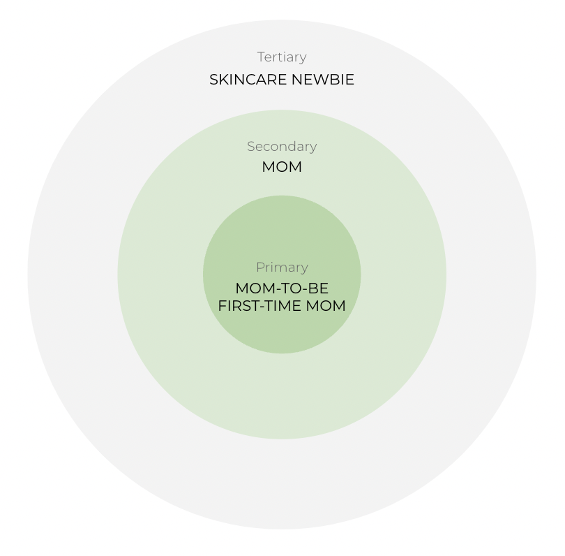

We recognised that there is far too much information out there, and that leads to anxiety, especially for cautious moms-to-be. Could Orimii be that one go-to self care brand that raises no red flags, that assuages fear and allows expecting mothers to relax and look after themselves at a time when they need it most?

Backed by a talented team with a deep understanding of skincare, we’re committed to providing solutions that have been through a rigorous testing process - ensuring that it is safe to use on everyone’s skin. Our products are developed through a critical approach to ingredient science and comprehensive and emerging research on the function and processes of the skin. Making our methods more transparent ensures that our audience has all the information they need to make informed choices that benefit the ones they love.
The result is a special set of curated products based on our customer’s needs, not category trends.
It’s simple, Orimii is safe.
THE PACKAGING DESIGN
Simplify and demystify were two words we had on top of our minds when we were approaching the design language for the packaging of Orimii. The brand was based on the key insight that expecting mothers are so inundated with information and advice from all directions, this should be their one source of calm, where they don’t have to second guess safety, and it doesn’t trigger anxiety for them.

We suggested roundness to all custom containers, and simplicity of information that didn’t require deep study. While the process of motherhood is complicated as it is, we wanted to keep things as simple as possible. We distilled the information down to the bare necessities, and allowed lots of space along with a touch of softness to the product form itself with the curved edges.
We additionally created a few key elements & icons that reinforced the brand idea and promise to the Orimii customers.

Range of products (primary containers)


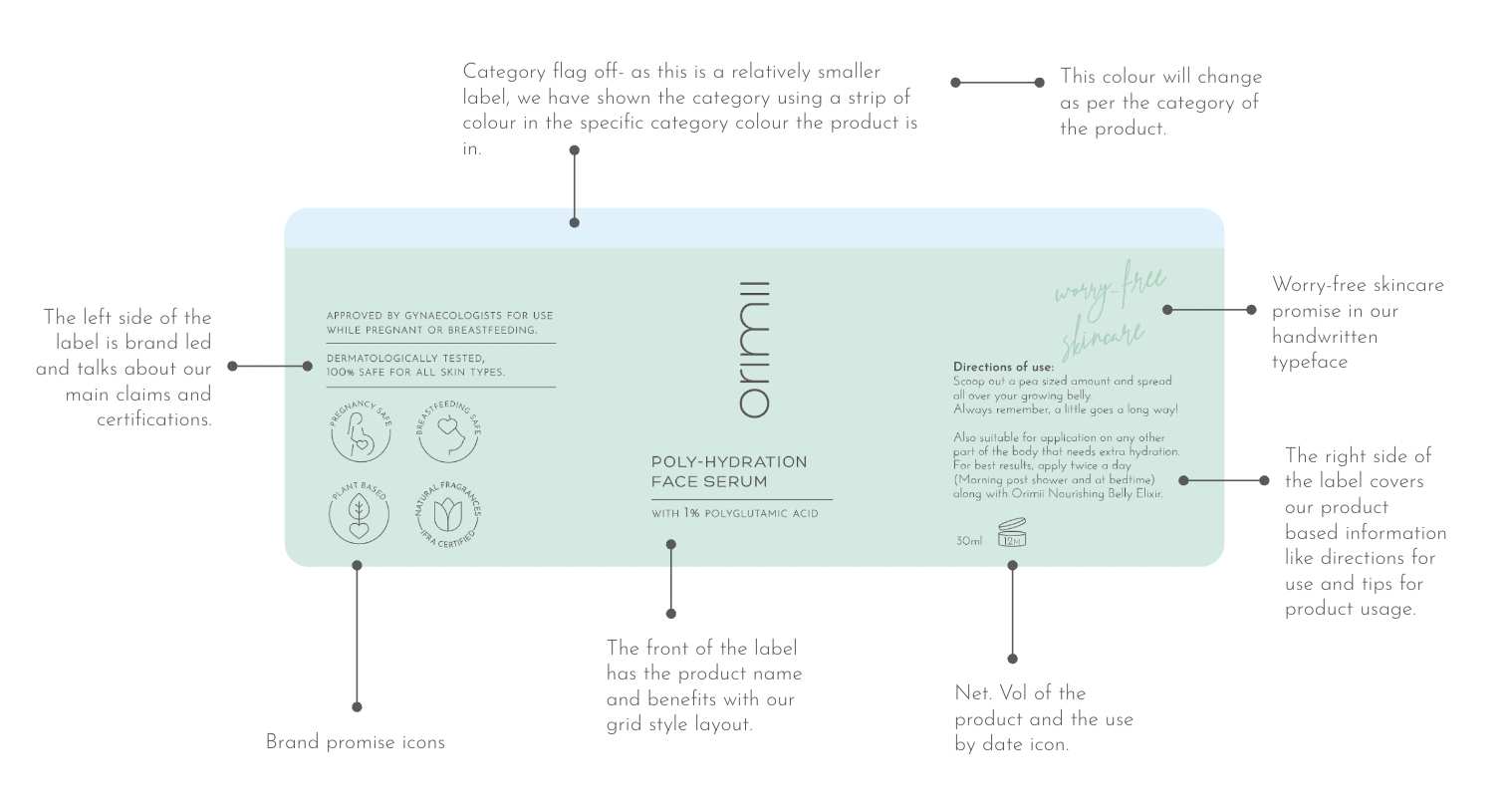
THE PACKAGING MECHANICS
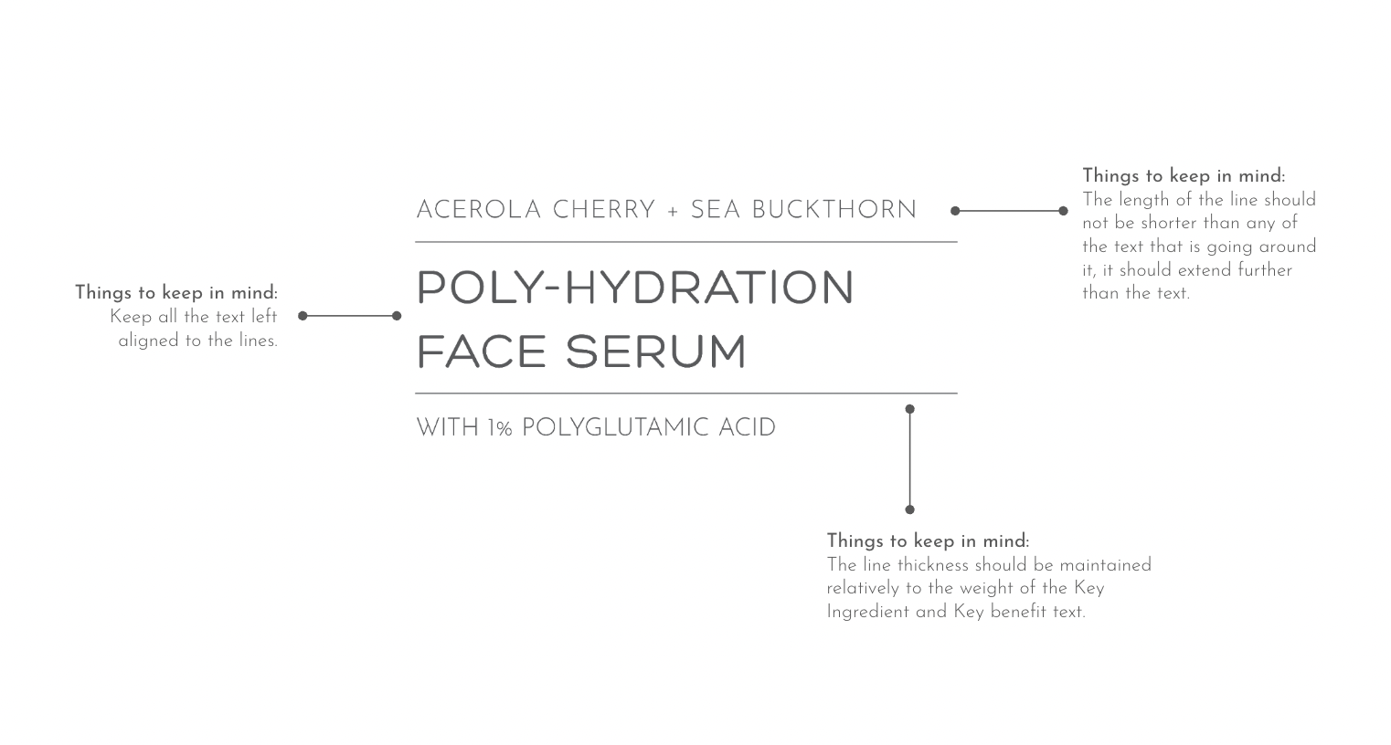
It’s well known that consistency is necessary to create memorable and trustworthy brands. Whenever we develop new brands, we create the systems for product nomenclature, that stay consistent across all products, present and future. Along with that we outline carefully how every surface of the packaging and product will be used, adhering to regulations and still giving out the necessary information that a customer would need to know and would be searching for.
Additionally, it aids future product development, and retains all the essential brand assets across varying sizes.

THE COMMUNICATION
When we brand, we’re designing for scale - and for consistency, we create stringent guidelines and notes for both, the visual and textual impact of the brand. When it came to Orimii, we evaluated the different aspects of the brand idea we could lean into that differentiated us, along with key pieces of communication that were expected for the category and product.
