OTT SKYNCARE
THE BRAND IDEA | BRAND STRATEGY | PACKAGING DESIGN | BRAND LANGUAGE | VISUAL LANGUAGE AND EXTENSION | WEBSITE DESIGN | BRAND GUIDELINES
It all started with the founder and skincare aficionado, Sachi A. Mittal’s, struggle during the pandemic of finding affordable high-quality skincare in the Indian market. Combined with her passion for skincare and her dedication to establishing a valuable, long-term brand, OTT was born. An Indian-made brand, on par with any international brand.


We’re going over-the-top with our ambition, ingredients, and formulations so our consumers get the best, no matter the size of their pocket. And creating top-notch experiences to ensure that we deliver high-quality, luxury skincare of international standards at a price that doesn’t break the bank.
UNDERSTANDING THE LANDSCAPE
As is part of our usual process, we did an intensive study on the brands that exist in the category, specifically ones that share similar values, or perceived in the same space. We found that the beauty industry is saturated with countless brands, making tall promises and delivering little results. This is why consumers are left with skepticism and mistrust. As consumers continue to become better informed than before, their expectations have evolved too.

The lack of innovation in skin care cosmetics was a big contributing factor. The changing lifestyle habits, coupled with the high spending power of the average consumer will aid the growth of the market in the coming years. Tired of being misled and spending on products that are no good, they want more than just good, they want the best that money can buy.
WHERE OTT COMES IN TO CHALLENGE THE CATEGORY
We believe that consumers deserve effective and high-quality skincare, and we’re here to serve just that. We aim to democratise luxury skincare so that everyone can access it.
We push the boundaries with cutting-edge research to source the best quality of ingredients and formulations for highly efficacious products of international standards. All this so we can deliver the same high-quality, luxury skincare, but make it accessible to all.
UNDERSTANDING THE CONSUMER
OTT is for those consumers who are relentless in their pursuit of perfection. The ones who don’t let conventional boundaries dictate their purchases.
Pragmatic buyers who’ll spend hours on research to make sure they’re on top of their skincare game.
Like us, they aren’t satisfied with just good, always on the hunt for better. For high-quality luxury skincare that goes beyond empty promises.

THE BRAND IDEA
We’re breaking all industry restraints when it comes to our products. We’re going over-the-top with luxury, with quality, and the sheer experience, because for deep-rooted skin health, there’s no room for compromise. We know that floral extracts are precious, and also the most expensive. And that’s what we’re gunning for, because if that’s the best, then we’ve got to have it. We believe that the maximum potential of these extracts have not been harnessed yet. Which is why we use scientific innovation and potent concentrates to unlock the powers of these rich botanicals to create skin potions that give you the best results.

FLORAL ALCHEMY

Since the beginning of time, beauty has always been compared to flowers. From rosebuds to full blooms, to the exquisite array of colors and sheer abundance, not just do they lift spirits, they are synonymous with wellness, good health, and that flush of happiness. Moreover, flowers contain elixirs that are no less than skin potions.
Inspired by the idea of floral alchemy, we set out to strike the perfect balance between science and nature. We apply the powers of this precious flora to create skincare that embodies the lavishness of abundant gardens and deep-rooted wellbeing that manifests on the surface.
So when we say ‘as pretty as a posy’ we mean it quite literally.
THE DESIGN EXPLORATION
There were numerous ways to interpret the idea of ‘Over The Top’ & ‘Floral Alchemy’. Below were a few initial design explorations we made before we settled on the design language that the brand today carries.
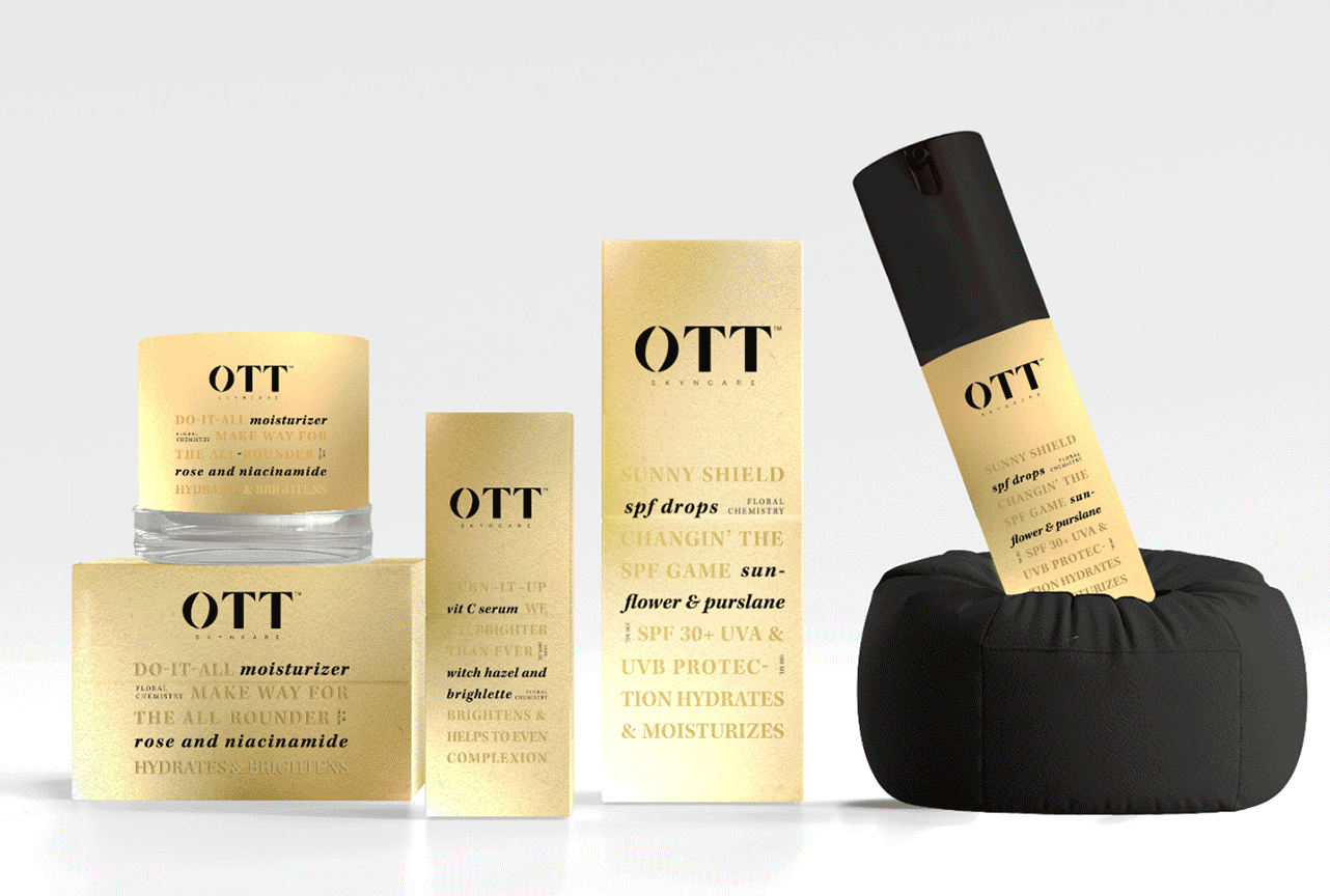
BRAND IDENTITY DEVELOPMENT
Our logo is inspired by the idea of ‘Floral Alchemy’.
The letterforms embody organic curves and precise sharp edges and corners to represent the way our products combine the best that nature offers with expert know-how.

The elegant curves of the ‘O’, represent the forms of the flower, visually cueing the concept of ‘Floral Alchemy’.
The sharp, angular lines of the Ts represent the precision and simplicity that comes with the research and scientific aspect of our process


Introducing:
The perfect harmony of the best that nature can offer & a deep understanding of skin health.
Harnessing the therapeutic powers of the finest, most lush flowers and combining that with well-researched, powerhouse ingredients. OTT uses scientific innovation to bring the best out of a 60% natural blend of ingredients, creating products that transform the customer’s experience of getting to the healthy, perfect skin of their dreams.


TONE OF VOICE & BRAND COMMUNICATION
We recognised that ‘science’ can be daunting and natural can be ‘boring’, and so we decided to infuse some fun and wit into it.
We wanted the brand to come across as vibrant, bold and exciting. While we do want to make sure the reliability as an effective skincare brand, expertise and scientific approach came across - we tried to keep things real.
We communicated with passion and enthusiasm to convey the strong belief in the goal that the brand was working towards and that translated into the way the brand spoke. We put our points forward with confidence. While keeping our witty, fun personality in mind, we don’t want to trivialise our expertise or intimidate our audience. Which is why we made sure that the language we used is simple and devoid of overly scientific jargon.


THE WEBSITE
The main challenge of the design for the website was evangelising the idea of the brand, along with making product purchase easy. A big part of the problem of skincare and beauty shopping online is a clutter free experience. Since we were launching with only 8 products, it became important that the website helped the consumer understand the brand proposition and celebrate the limited product portfolio and the benefits.
EXTENDING THE BRAND UNIVERSE
As with most brands we create, extending how the brand will exist on social media is a part of what we do to maintain consistency in personality, visual language and overall brand impact. This includes demonstrations of the varying content pegs that would ideally be a part of the variety of communication they would require to put out there for awareness.
