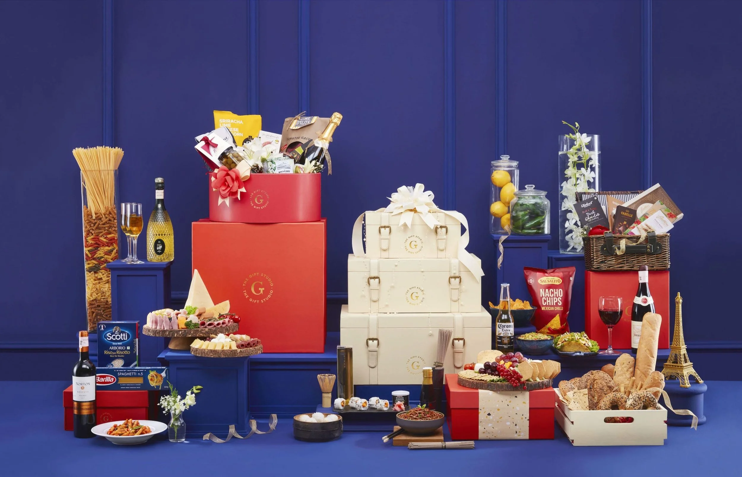
The Gift Studio
IDENTITY | BRANDING | packaging design and SYSTEM | KEY MESSAGING
We partnered with RPSG group on their new venture to create the brand identity and a whole host of packaging for a customised online gifting service.

We worked intensively with the core FMCG team of the RPSG group to create a system of customisable packaging that’s luxurious and practical at the same time. To make a brand that’s inclusive as well as exclusive was one of our challenges. To allow for periodic reinvention as the category demands without diluting the familiarity and core of the brand was a part of our constraints while imagining the universe for The Gift Studio. The output is a product of a very strong collaboration in some pretty tough times and timelines!
THE BRAND IDENTITY
Identity Explorations
Our brief was to create a distinctive and thoughtful identity suitable for gifting. We delved into various concepts that capture the enduring essence of gifting, which is deeply intertwined with human emotions, attitudes, and meaningful moments. Ultimately, we went with an identity that is not only compelling but also durable, capable of withstanding evolving styles and trends while remaining timeless.
The Final Logo
Gift wrapping is the most significant aspect of gifting and the bow on top binds the gift together. This identity is inspired by the form of the bow, translating into a simple yet aspirational identity with the use of typography. It had legs to be both - an independent brand and go under the Nature’s Basket umbrella.


PACKAGING SYSTEM
Laying down the building blocks
Prior to delving into branding considerations, we first had to envision the operational aspects and strategize efficiently to avoid potential operational challenges. Recognizing that packaging curation would be handled by external vendors, we prioritized establishing operational mechanics and initiating production ahead of the branding phase.
01: Setting the Brand Palette
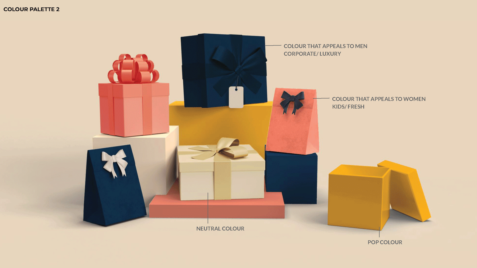
We explored multiple palette systems that would capture the spirit of gifting and the varied consumer profiles that the brand would be catering to.
02: The Mechanics of Packaging
The unveiling of a present is a layered journey. Right from the decor and first impressions made by the appearance of the box, to the textures and quality of elements. We juxtaposed different finishes, dimensions of elements and materials to add to the visual and tactile details while opening the gift. The challenge was to come up with a modular system of decor elements that would work seamlessly across all structures of packaging, along with allowing for flexibility and customisation.

An array of structures will be available in multiple sizes. Will contain the branding and be in a select range of brand colours.
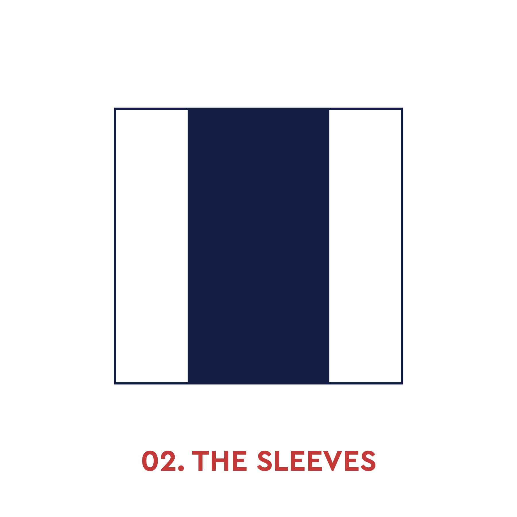
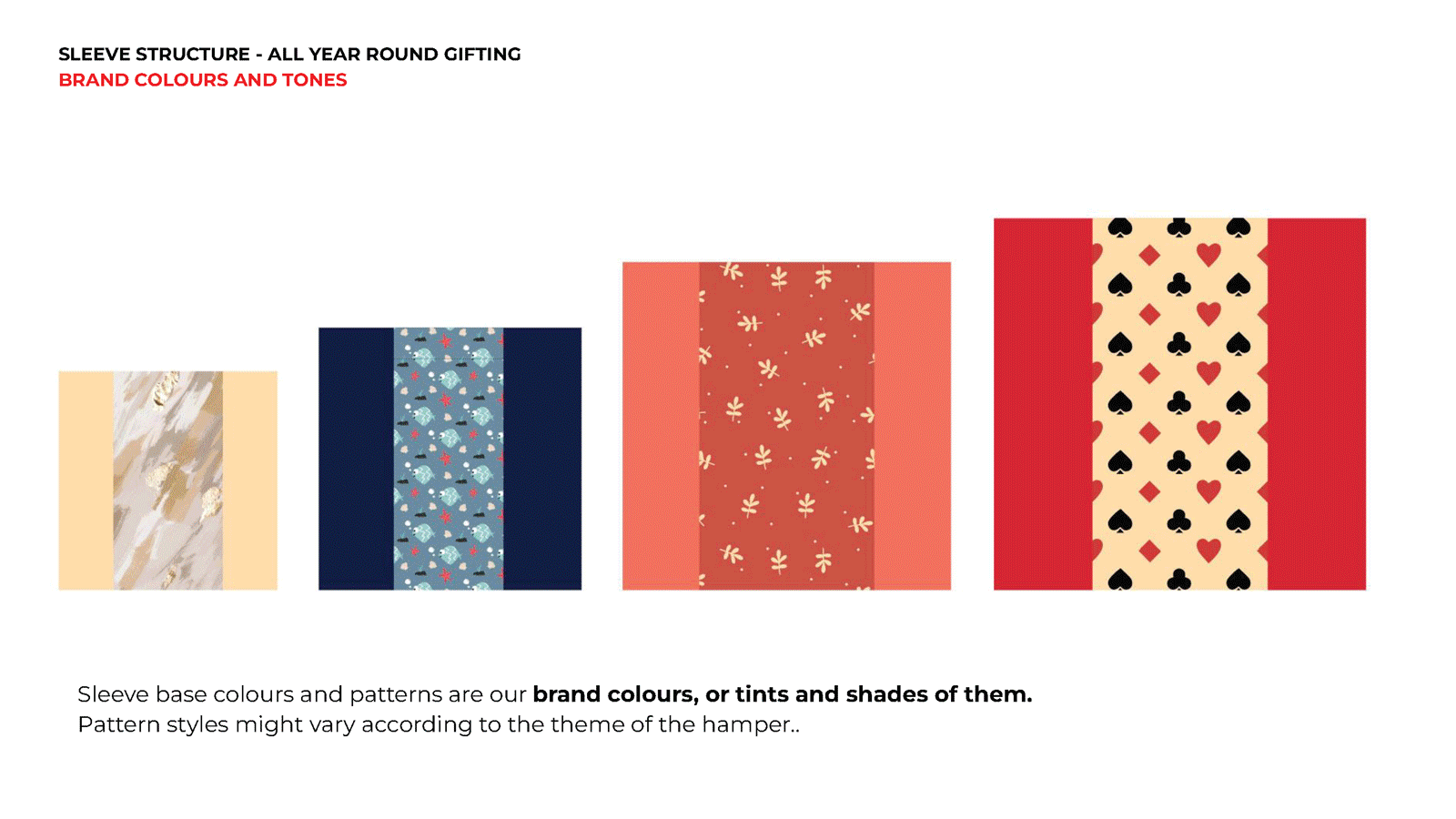
Sleeves are available as an option to bring a custom look to the gift.

Elements that enhance the gifting experience. Would follow a particular theme for the season and follow the selected brand colour palette.
01. Understanding the different Primary Structures we had to work with and consider the complexities in terms of sizing and material
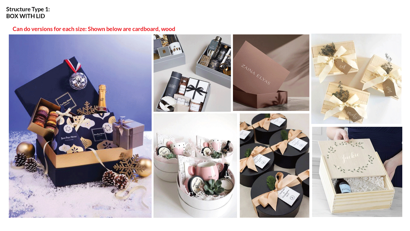

This is where we realised that we had to keep the packaging structure layered vs one dimensional.
02. Adding a sense of customization and freshness via modular Sleeves

03. Experimenting with tertiary elements to add flair and finesse to the gifting experience.
The Embellishments


The Gift Tag

There are 3 parts to the structure - The Brand Tag, The Middle Tag, The Name Tag.
The brand tag and the name tag can be used interchangeably in terms of colour combos. The middle tag is the only changing element based on the collaborations we do.