THE PANT PROJECT
Glyph worked with the incredible folks at Banswara Textiles to create a brand that simplified the buying experience for men’s tailor-made pants. It was a privilege to work with a team that dared to revolutionise and challenge the very concept of ‘bespoke’. The balancing act of reducing the options that are often one too many, but allowing for personal choices was one of the biggest tasks we watched them expertly solve for. The brand identity was designed to further this goal. We used the metaphor of a simple dictionary, a tool we all use very often, one that’s familiar but not intimidating. The identity uses elements of the signs and glyphs used in dictionaries, while the communication added clever definitions to words used across different collateral.
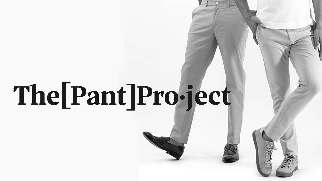
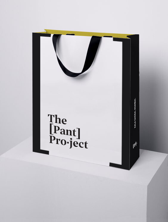
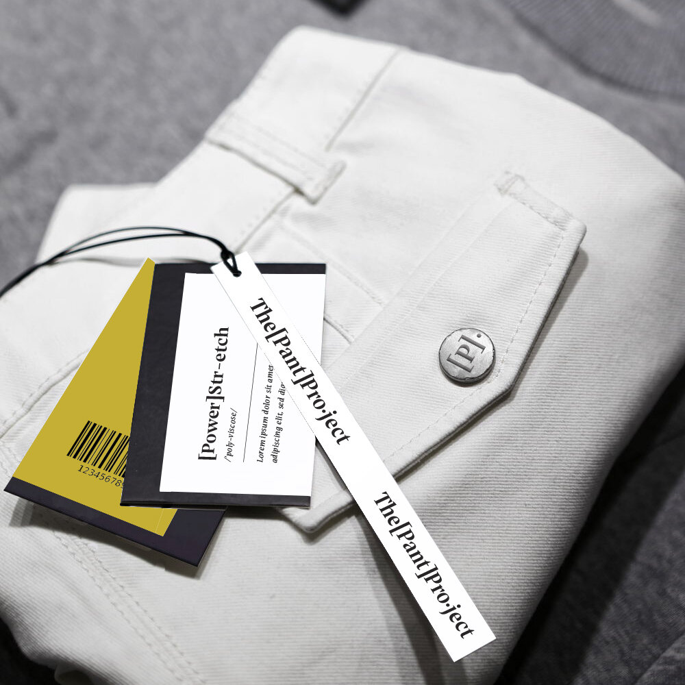
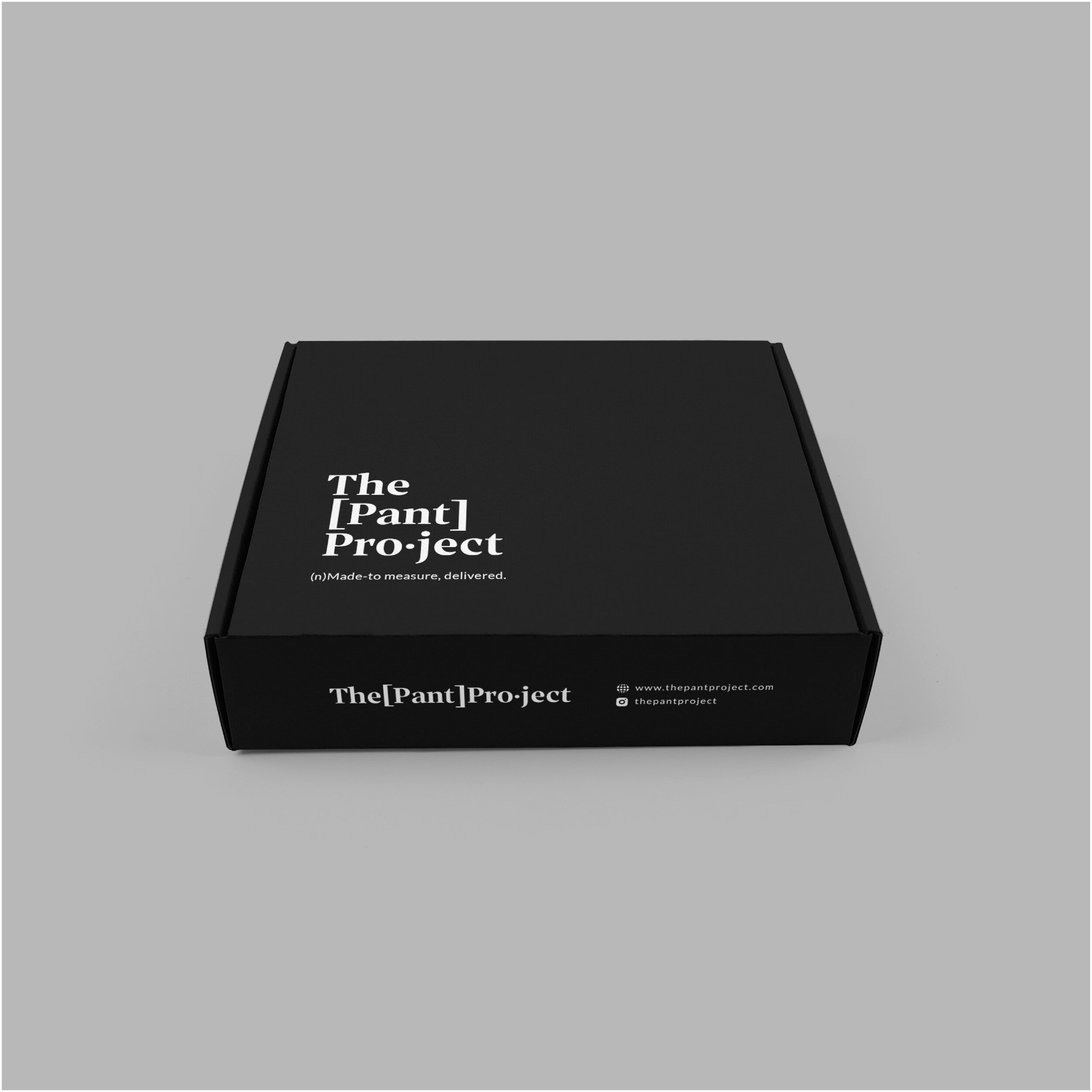
Pictured above: Images of the final collaterals for the brand.
When we took a closer look at the fashion scape in the country, we found that pants took a bit of a beating. Most customers would worry that the ‘fit’ wouldn’t be quite right. For us, therein lay our distinguisher.
SURVEYING THE CATEGORY
With e-commerce soon becoming the future of retail, geographical affinities for customers will soon cease to exist, and that will open up the whole world of brands to compete with. It became doubly important to lay a solid foundation that could withstand the porous political boundaries that ‘free worldwide shipping’ would bring along with it. And like most projects, we always begin with immersing ourselves in the category. We like to know who pre-dates us, what they’re saying, and what they look like. We also like to read about their product - influencer reviews, paid promotions or features, customer rants online, everything. We looked far and wide, beyond borders and closer home too. We scrutinised their customer experience and customisation systems. Our learnings from here were shared with the Banaswara team, and together we incorporated that into the Pant Project going forward.
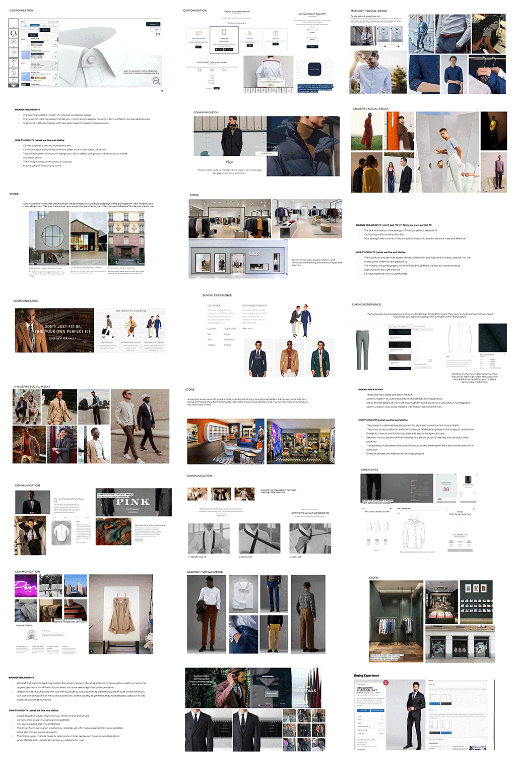
We made detailed observations on brands, their design, their communication, what their primary USPs were, how they positioned themselves, and what the promised experience vis a vis outcome was.
THE BIG BRAND IDEA
Based on our research, our core values and proposition, we proceeded to devise potential directions that explored different interpretations of the big brand idea. In order to help visualise this, these ideas were accompanied by visual references that could serve as a starting point for the brand language and customer experience.

DESIGN EXPLORATION
Based on a selected brand idea, we proceeded to design a few interpretations that could extend to unique and distinctive brand language. Since this was a brand that was launching in the age of digital commerce, we ensured that our designs accomodated and and extended to the web and social media.

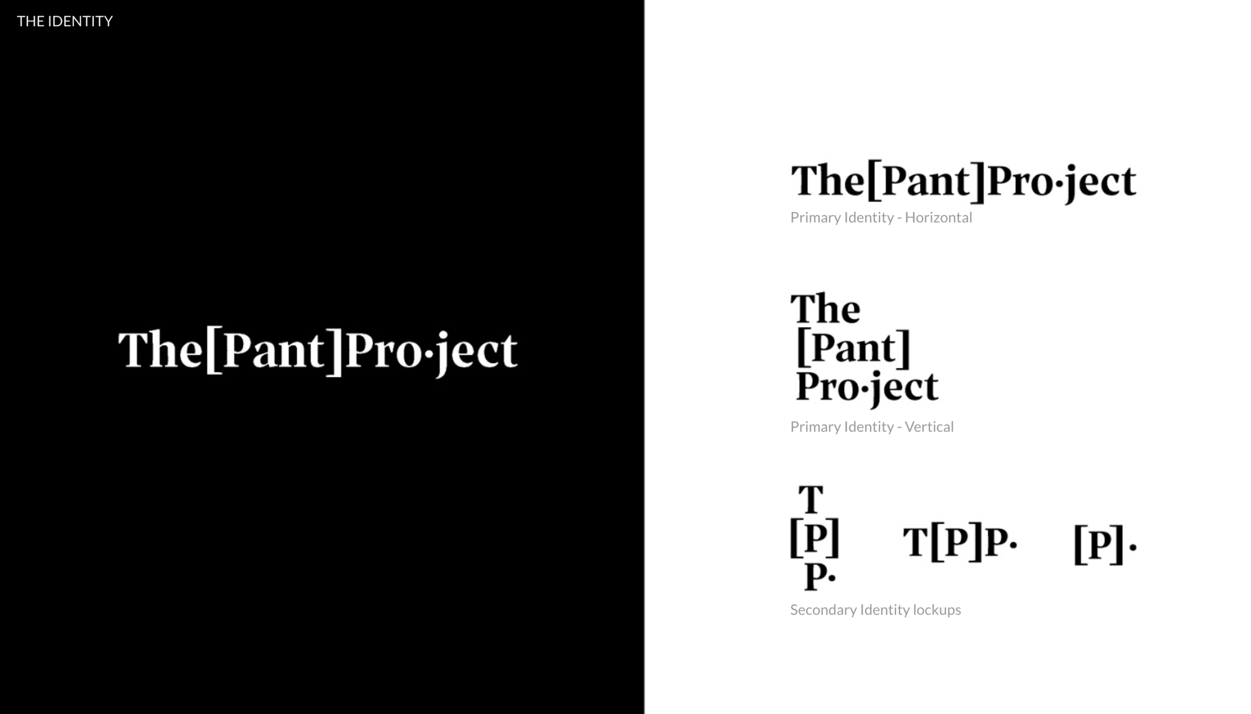
The final identity succinctly and impactfully conveyed the expertise of the brand, along with the brand idea. The typographic word mark was created to be ever changing and ever evolving. Being a retail brand, below you will see some key customer touch-points where the brand comes alive. These points of interaction need to be functional above all.
But we managed to sneak in a bit of our brand language in, which to us was a big triumph.