VILASA
Introducing Vilasa by Tattva spa. A range of products that bring that spa experience to your home. We worked with the Tattva spa team to design the branding, packaging and visual language for a brand that believes in preservation of the mind, body and spirit. Inspired by places of escape, the brand language is inspired by landscapes that are often the places we dream of, or runaway to for our mental and physical wellbeing.

THE INSPIRATION
One of the first chain of spa brands in India, their experience with designing and delivering spa treatments is immense. With Vilasa, they aim to enable people to care for themselves right from their homes. The brand language is built around the idea of safe spaces for healing the mind, body and soul, tranquil vistas that inspire and rejuvenate the senses. Using elements from nature, beautiful landscapes that suggest an escape from chaos.

How we have interpreted ‘TRANQUILITY’
VISUAL ASPECTS
Minimalism
Simplicity
Clean / Uncluttered
Soothing
Discrete
PHYSICAL ASPECTS
Calming scenery
Escape
Nature
IDEOLOGICAL ASPECTS
Embracing individuality
Being at peace with imperfection
Wholeness, completeness,
Self actualisation
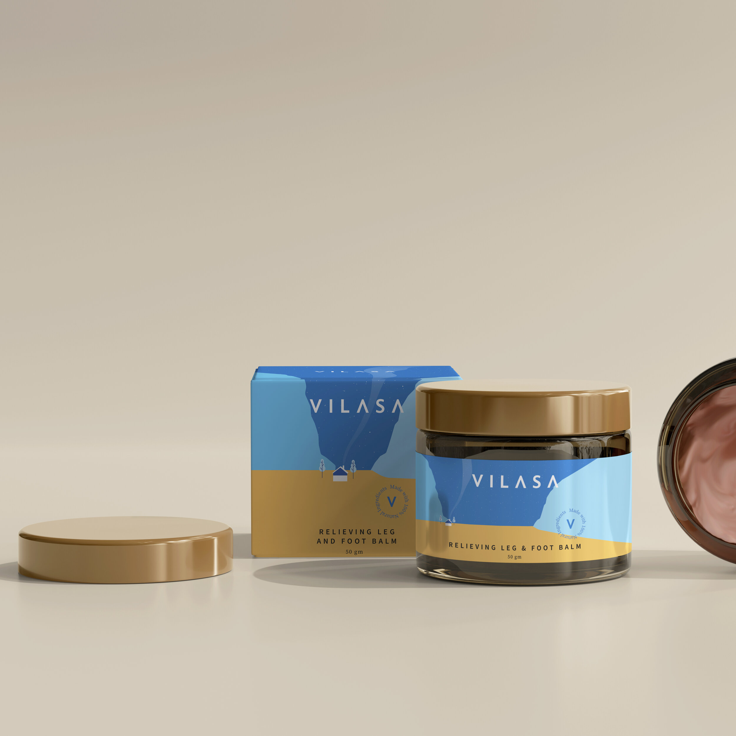
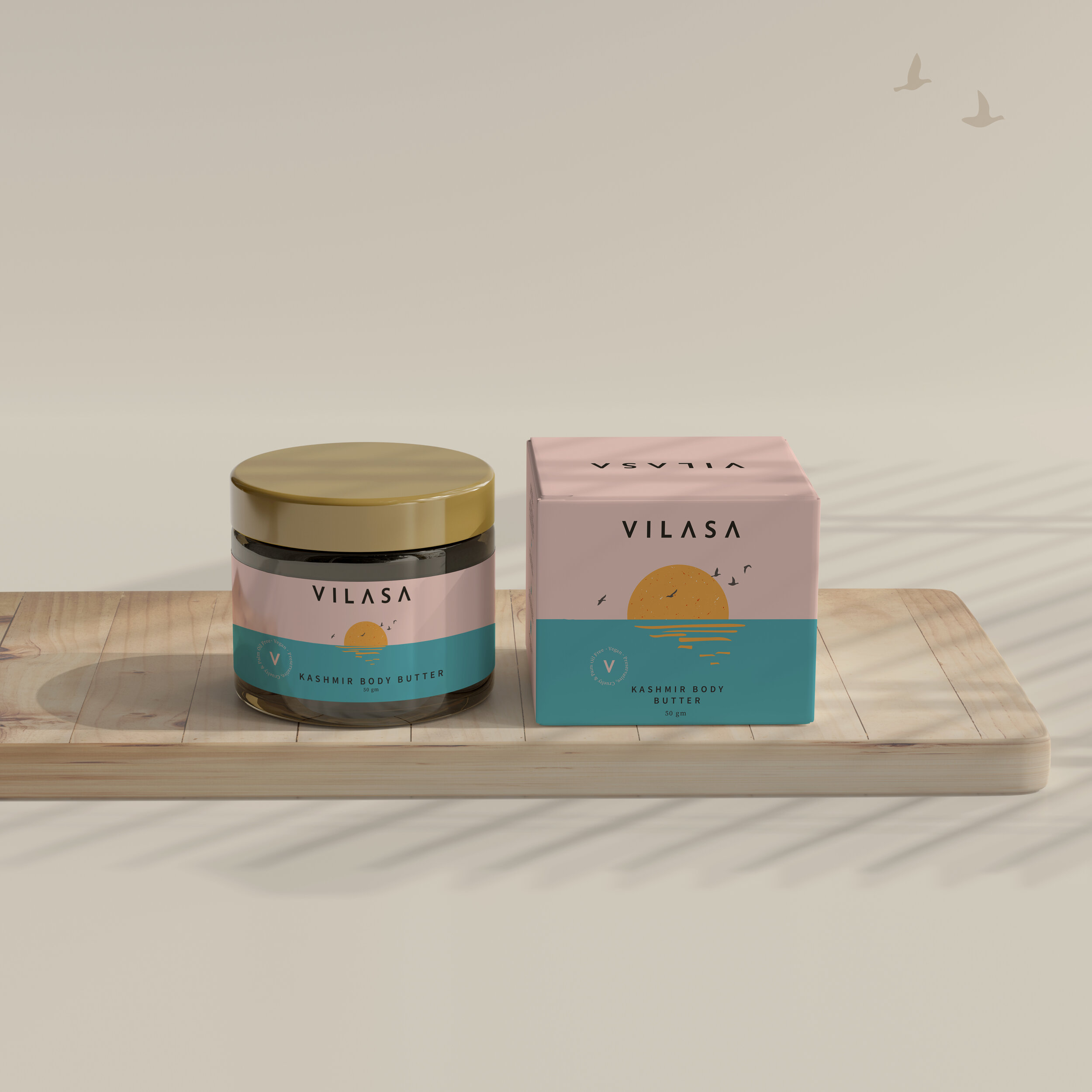
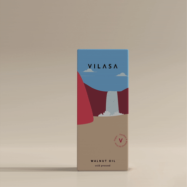
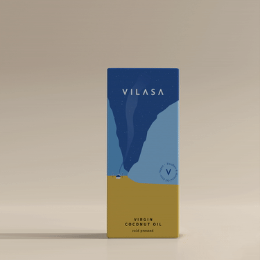
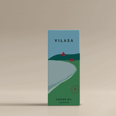
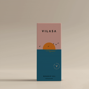
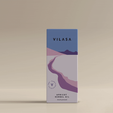
ILLUSTRATIONS FOR THE 5 BENEFITS
Since the big brand idea was centred around benefits associated typically with spa treatments, we re-evaluated how to classify the product range. The easy way out would have been to simple run with what is conventional. We decided to look a bit closer at the true benefit of what the brand promised and passionately believed in.
While we had found the essence of what was the brand truth, we were also presented with yet another problem - the category was over-crowded, over-saturated, with no real distinctive propositions. Everyone was chasing the same dream, and promising the same physical improvements to their appearances. How does one stand out?

Not just did we challenge the conventional product architecture that pre-existed, but we turned that into the most visible & memorable brand asset.
Each product benefit has a leading visual which best represents the feeling of it. The visual is modified with minor changes in colour / proportion based on the variant and structure. This became a massive brand asset.
THe packaging


EXTENDING THE BRAND UNIVERSE
As digital commerce increasingly becomes the primary strategy for most new age brands, we’ve found that their communication becomes the first mode of discovery for customers. Therefore it becomes increasingly important to ensure that the narrative and visual language of social media channels is on point with the brands ethos.
